The burgundy color belongs to the group of red shades, is a kind of purple. This is the color of Bordeaux red wine from France, it is rich, warm, very bright, sometimes even aggressive. Bordeaux can also be obtained in a natural way from the powder of shells of Mediterranean mollusks.
- Shades of burgundy - variety
- Instruction for making burgundy color
- The combination of burgundy and other colors
- Shades of burgundy in the interior
- Tips & Tricks
In painting, this tone is created by mixing primary colorsthat artists are well aware of. How to get a burgundy color, what colors should be mixed - it is worth considering in more detail.

Shades of burgundy - variety
Since ancient times, burgundy was considered the imperial color, it was widely used in heraldry and symbolized strength, domination, power, generosity and piety. Now shades of burgundy are used in the design of apartments and houses, creating a wardrobe. Confectioners love him, using special food colors for mixtures, creams.
When mixing paints, gouache, you can make different shades of burgundy. They can be cold and warm, light and darker, depending on the set and number of components. Here are the basic tones of Bordeaux:
- Marsala. Pastel burgundy, is very fashionable in clothing and interior. It bears nobility, grace, luxury.
- Sangria. The name comes from the drink of the same name (sangria - Spanish wine with pieces of fruit). It is a soft burgundy with a reflection of purple and lilac.
- Burgundy It is a maroon color, very saturated, looking incredibly spectacular.
- Carmine. This shade of red-purple, light, is also widely used in interior and art.
- Falun Red Another variation of maroon. Paint of the same name is used in Scandinavia to paint houses.

to contents ↑Also, artists highlight other shades of burgundy - wine, pomegranate, ruby, maroon, burgundy rose, mahogany, berry jam, strawberry jam, red orchid.
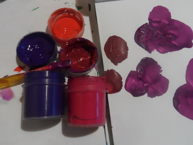
Instruction for making burgundy color
You can get Bordeaux by mixing paints in different ways. A classic option is the combination of red and blue. So that in the end, the purple tone does not come out, you must strictly observe the proportions of the dyes. It is required to take 4 servings of red tint, dilute it with 1 serving of blue. Mix both components carefully until the veins disappear. Here are the variations to get this paint:
- adding a yellow color will make the tone warm, soft;
- the introduction of bright scarlet paint instead of red will help create a very deep burgundy shade.
Similar experiments can be carried out not only with gouache, but also with watercolor, oil, stained glass paints, tempera, dyes for fabric or food. As a blue color, it is best to use ultramarine, dark indigo, Prussian blue. With the introduction of yellow, one must be careful.If you add it too much, the color will turn out dirty, brownish. Red should prevail in burgundy, whatever the shade required by the master.

There is another option for getting Bordeaux. To create a cool tone, you need to combine red, a little brown and a bit of black. It will turn out a very dark shade, which is bred with white to obtain the desired color. Watercolor can be diluted with plain water. Also, instead of blue, some artists add dark blue to the red color. This allows you to create warm burgundy tones.
to contents ↑The combination of burgundy and other colors
A combination of burgundy and black is considered classic, although in an apparel or interior such an image may seem gloomy. It is better to use in addition any pastel shade that dilutes dark tones:
- beige;
- light gray;
- pink;
- silver;
- pearl;
- lavender;
- peach;
- olive.

It looks very interesting burgundy with gray, catchy, bright - with white. In the style of the apartment or in painting, it is recommended to take burgundy and light colors equally. Bordeaux and blue, golden, silver enhance each other's brightness, and the last two options give greatness and solemnity. Unusual, spectacular combinations are burgundy with green or yellow, although such tones can oppress each other, you must be careful with them.
to contents ↑Shades of burgundy in the interior
Lush classics in apartment design are often emphasized by burgundy in combination with gold. In the most expensive hotels, such a gamut is inevitably present, and it is appreciated in the rich houses of the East. Also in different styles with the help of this color they emphasize certain zones. For example, wine-red curtains in combination with a light veil look good. Burgundy is also appropriate for wraps of sofas, upholstery, decorative pillowcases.
Sangria color is used in the design of rooms for girls. It is combined with white, light pink, using for the manufacture of furniture facades, textiles. In the kitchen, the Bordeaux in the interior is combined with coffee, white, beige, terracotta.
to contents ↑
Tips & Tricks
When decorating, you need to immediately calculate the area that is supposed to be painted. Self-tinting should be carried out in one step, because it will be difficult to make a new portion of paint with exactly the same shade. It is advisable to think over the interior in advance so as not to overdo it with the burgundy and not to make the room too dark. In company stores, any tone can be selected according to the catalog, so if in doubt, it is better to use automatic mixing of colors with the main composition. This guarantees a high quality repair in the apartment.


