The selection of paint is an important task that inevitably arises during the design of the interior during repairs in the house. A good choice of color combinations will allow zoning of the room, creating a cozy atmosphere in it. How to choose the right colors of paints will be discussed in this article.
- Color matching
- Selection by number
- Computer selection
- Hand mixing
- Colors in the interior
- Features of using different colors
- Visual adjustment of room sizes

Color matching
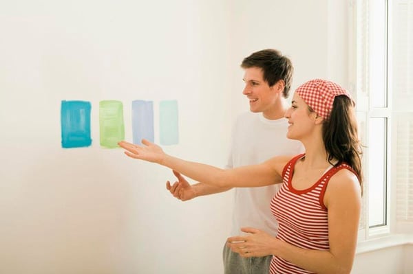
If the desired color scheme is known for sure, it remains only to go to the store and buy the appropriate paint. However, designs rarely match the standard color palette from manufacturing companies. And even if the desired shade exists, it still needs to be found among hundreds and thousands of samples, which is not easy.
To facilitate the search procedure, several technologies have been developed, including:
- search by code assigned to a particular color;
- computer selection using a special program;
- self-mixing to obtain the desired result.
Selection by number
Serious manufacturing companies conduct research work, as a result of which, more and more new shades of colors with their characteristic names appear, for example: “sea wave” or “electrician”. There are dozens of such names. How to choose paint among this variety?
Especially for convenient search, color tables and color fans have been invented, where each shade has an alphanumeric code. Using this abbreviation, it is easy to find the necessary sample or create a recipe for the color you like. However, it is worth noting that universal tables do not exist, since each company catalogs colors in its own way.

Sometimes the desired shade can be created right in the store, if the store has the appropriate equipment. The right tone is obtained by mixing the base paint with other dyes.
When choosing a paint and varnish material according to the catalog, it is important to pay attention to some of the nuances of this process:
- Paints of some companies (for example, Tikkurila) are based on a white-tinted structure. In other words, the initial appearance of the paintwork is white. If necessary, the ordered dyes are added to the base. This approach is not very effective in terms of obtaining saturated color. Most often, the finished paint turns out not as bright tones as it seemed when looking at the sample.
- The white background on which the samples are placed in the catalogs creates significant contrast, so the subjectively bright colors seem more intense than they actually are. Conversely, soft pastel colors fade on a white sheet. After staining, the visual perception of the selected color may be completely different than in the store.
- When choosing a product, it is recommended to take into account lighting (both artificial and natural), since light has a considerable effect on color perception.
Computer selection
Computer paint selection is used when you just need to copy an existing sample. Even if you need to paint only a small fragment of the damaged coating, there will be no color difference between the old and the new paint.The technology allows not only to obtain an exact copy of the sample, but also to maintain the recipe for further shade generations.

To get the right shade, you just need to bring a small piece of decoration with the desired color to the store. Using a scanner, the operator will determine the proportions of certain dyes included in the painted surface. After this, it remains only to acquire the necessary paint.
to contents ↑Advice! The resulting recipe is recommended to save. The fact is that if in the future a similar composition is needed again, it will be very simple to find it - it is enough to show the previously compiled instructions in the store.
Hand mixing
You can choose the color of the paint by experienced mixing. For this, special equipment will not be needed (except for the mixer). An obvious drawback of this approach is that it is based on experiments, and therefore it is hardly possible to get an exact copy of the desired shade.
Advice! Since it is almost impossible to get two identical shades, the paintwork should be diluted only once. In other words, you need to immediately correctly calculate the right amount of paint, which is enough to paint the entire surface.
To roughly navigate in the selection of colors, the table below shows the methods for obtaining the desired shades. According to the table you can study color mixing methods, which will further simplify the receipt of the desired shades.

Colors in the interior
When choosing a color scheme, most people are guided by feelings. While one color evokes positive emotions, the other can affect the psyche in exactly the opposite way.
Features of using different colors
- White color is considered the most universal and neutral background. It goes well with all colors. However, the complete dominance of white is not always the best solution. It is recommended to dilute white with bright colors.
- Pink helps to clearly zone the rooms (for example, to divide the room into the kitchen and dining areas). It goes well with cream.
- Orange contributes to the awakening of the energy forces of the body. Using this color, you can give visual integrity to the disparate elements of the room. Orange is combined with white, green-yellow, cream tones.
- Blue color relaxes and tunes in relaxation, helps to calm down, tunes to sleep. It blends best with blue and gray.
- Red stimulates activity, stimulates motility and feelings.
- Yellow acts tonic, contributes to the stability of the nervous system.
- Green helps to establish trusting relationships, promotes measured actions, a lyrical mood.
- Violet inspires, but at the same time calms, activates the thought process.
to contents ↑Note! Excess or too long pastime surrounded by bright colors can lead to opposite sensations. For example, too much red tires, and an excessive abundance of white instead of a feeling of cleanliness and freshness can lead to boredom and even depression.
Visual adjustment of room sizes
Using the right color selection, you can adjust the visual perception of the size of the premises: make them wider or narrower, higher or lower, and also divide them into separate sections. Elongated rooms can be made visually shorter by painting a short part of the wall in a dark tone.
Light colors are suitable for small areas, and in order to create a feeling of comfort in the room, it is recommended to use dark intense colors. With the help of color, you can mask, make all kinds of room flaws less accentuated, including structural irregularities, cracks or stains on the walls.
For rooms with windows facing the south or east side, the best choice is rich dark colors. However, if the windows face north, it is better to choose light colors.

