Choosing the right paint color for walls is not as easy as it might seem at first glance. It is necessary to rely not only on the feeling of comfort of a particular color, but also on many other circumstances, including color compatibility, size and purpose of the room. Below we will examine in more detail the nuances of choosing paint colors.
- A bit of color theory
- General rules
- Color perception
- Room dimensions
- Additional factors when choosing a color
- The choice of color depending on the room

A bit of color theory
There are three types of colors: primary, composite and complementary. Primary colors include red, yellow, and blue. Compound colors are mixing colors (e.g. pink). Achromatic colors are called optional: black, gray and white.
Contrast is the sharp opposite of colors, expressed in conspicuous combinations. When two contrasting colors are near, they emphasize and reinforce each other. Examples of significant contrasts are red-green or blue-orange combinations. There are special tables indicating the contrast of colors in relation to each other.

Colors are warm (yellow, green, red) and cool (cyan, magenta). Warm tones are associated with summer warmth, fire and the sun, and cold tones are associated with cold, gray sky and depth. However, this division is rather arbitrary, since it is largely based on the emotional perception of a person.
to contents ↑General rules
When choosing a color, you should adhere to a number of difficult rules:
- First of all, you need to correlate the selected color with a specific room. It is especially important to consider the strength and nature of the lighting, since light can significantly distort the color of the coating.
- The maximum number of colors in a room is three. If you exceed this norm, the room will seem too colorful. It should be noted that shades are not included in the specified standard, and black, white, chrome colors will organically look in any color scheme, since they do not look like independent colors, but rather like their absence.
- You should decide on the main color that will dominate the gamut.
- Bright colors are usually not worth using for painting large areas. Brightness is more suitable for highlighting small details.
- You can make a monophonic surface more diverse not only with multi-colored paints, but also with texture. For example, if you process the same paint with different types of rollers, you get an interesting patterned coating.
- Adjacent rooms will be perceived as a continuation of each other if they have at least one identical design element. If between the multi-colored rooms a uniform molding is painted on both sides, adjacent rooms will be more harmoniously combined with each other.
- The color scheme should not discord with the ceiling. The best option is to paint the ceiling with the same paint used for walls, however, with a lighter tonality.
- You should not choose a color based on the fact that the room is empty. Out of touch with furniture, carpets, textile and decorative elements, it is impossible to make the right choice.
- It is difficult to make the right choice while in the store. Surely the rack will be illuminated by fluorescent lamps that will distort the true tone of the paint.
- The same paintwork will look different on different surfaces. For example, on a smooth surface, the paint will appear lighter, on rough surfaces it will be darker, and on matte surfaces it will be warmer. Moreover, the matte surface is able to give warmth even to cold tones. Polished coatings convey freshness even to hot colors (for example, red).
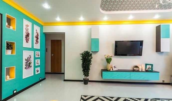
- To give the room brightness, you can paint adjacent walls in sharply contrasting colors.
- Typically, the walls serve only as a backdrop for interior items. However, you can go a different way, making the walls the main element of design, and furniture and other elements only complement the main theme.
to contents ↑Note! During sunset and dawn, the light is significantly different in spectrum. Between natural and artificial lighting, the difference is even more noticeable. For example, a fluorescent lamp gives a yellow tint, and dawn lighting - a soft pink.
Color perception
To determine what color to paint the walls in, it is necessary to understand that each color carries an emotional component and unconsciously causes a certain reaction in a person.

For instance:
- White color makes the room perceive more spacious and voluminous. However, the significant presence of white creates a feeling of its complete dominance. In addition, large-scale white surfaces do not correspond to the concept of comfort, are rather boring and create the atmosphere of a government, for example, office building.
- Red is the color of aggression, passion, anxiety. It has been proven that red surfaces help enhance metabolism in humans, as well as stimulate sexual arousal. You cannot go too far with red, otherwise a person will quickly get tired in such a room.
- Blue and green colors look very natural, as they resemble water, leaves and sky. The abundance of such tones gives a calming and relaxing effect. Green and blue are ideal for decorating the bathroom. Separately, it is worth noting that, despite the relaxing effect, the green color helps to concentrate.
- Yellow tones are a great option for a living room or dining room. They have one beginning with sunlight and give a sense of security, while not exerting a soporific effect.
- Gray and brown let you focus. The brown palette looks noble, expensive and elegant.
- If the color gamut of paints contains orange, the body receives a positive emotional charge. However, if you overdo it with orange, the person falls into a drowsy state.
- Violet promotes mental work while relaxing the nervous system. Color is considered particularly suitable for the design of children's rooms.
- Black color can be perceived as a source of danger and depression, but being moderately dosed, it gives the room solidity and solemnity.
If there is a need for a comfortable, relaxed atmosphere, it is better to prefer warm neutral tones: peach, cream, yellow, milk-coffee, lilac, etc. If the goal is to create an interior that would give vitality, it is recommended to choose more energetic tones: green, red, orange, bright blue or pink. Cool colors, such as blue, white, emerald, will bring coolness to the interior.
to contents ↑Room dimensions
With the right selection of colors, you can adjust the perception of the real size of the room.

Basic Rules:
- For a small room (for example, a kitchen), it is desirable to choose bright colors and bright artificial lighting - this will visually increase the space.
- If the ceiling is too low, you can paint it white, making it appear taller. Ceiling light skirting boards will help to enhance the effect.
- The high ceilings of many people also create a feeling of discomfort. Correct the situation will help a dark ceiling in combination with light walls. Moreover, this can achieve a double effect: the ceiling will seem lower, and the area of the room is larger. To further enhance the desired effect, you can use the appropriate lighting.
- Best of all, visually expand the room with cold tones: green and blue. The pale blue tone especially effectively gives the impression of a higher ceiling.
- The wall will seem taller if the ceiling moldings are painted in a color similar to it.
- In small rooms, too contrasting solutions should be avoided.
- If the room is too small, you should not paint the walls or decorate them with conspicuous elements, as this will only emphasize the tightness of the room.
- In large rooms, deep and dark tones are recommended.
- If you need to visually reduce the space, apply yellow, red or orange.
Additional factors when choosing a color
Before deciding what color to paint the walls, you should ask yourself a number of questions:

- Do you travel often? Perhaps one of the things you saw during the trip will inspire you to create a specific color palette.
- Do you have any hobbies? Using the background associated with hobby (green golf course, white snow on the ski slope) will give the room additional comfort.
- Do you like to spend leisure time in an apartment or a house? If so, then maybe you should think about calm, pastel colors.
- How much time do you spend at work? Keep in mind that the white walls are easily soiled and they require careful maintenance.
- Does work often bring stress? Flashy bright colors do not contribute to peace of mind.
- Do you have small children? Calm midtones like children and do not affect their psyche excitingly.
The choice of color depending on the room
- Living room. If you like to watch movies, it is recommended to use deep tones - they will help create the feeling of a cozy movie theater. If the room is often used for games, you can add a wow factor, i.e. use elements that attract special attention (for example, accent wall or decorative painting). A deep red or orange tone is conducive to conversation.
- Canteen. Gilded moldings are suitable for giving the room a festive atmosphere, but this is more true for the dining room with banquet functions. For a family atmosphere, neutral, muted tones are more suitable.
- Bedroom. Most often, the greatest comfort can be achieved with pastel colors.
- Bathroom. As mentioned above, the best colors for this room are green and blue. However, women applying makeup in the bathroom should be aware that green color disturbs the perception of complexion when displayed in the mirror.
- Kitchen. Traces of dirt are more visible on light walls. Blue tone reduces hunger.
The tips above will help you figure out the right color. The most important recommendation is not to rush when choosing a color palette, not to succumb to a momentary mood and approach the choice systematically, taking into account all possible factors.

