Scientists have found that the color of the walls in the office greatly affects the efficiency of the workflow. Some shades can calm, others, on the contrary, invigorate, suggest creative thoughts, create an excellent mood. What color is better to choose for wallpaper in the office? Designers and psychologists have a number of tips and advice on this issue.
- Choosing a color palette for the office
- The right color in terms of design
- The opinion of psychologists
- Colors inappropriate at office - checklist
- Colors for the cabinet and their variations

Choosing a color palette for the office
Managers of many companies do not attach much importance to office design. Walls are painted in neutral tones - gray, white, beige or glued wallpaper of similar colors. Others, on the contrary, want to make the office unusual - they invite a designer who develops a unique project, after which the premises are finished. According to experts, the second option is preferable and pays off faster even at high costs. The advantages of creating an interesting interior at the workplace are as follows:
- increasing the ability to work for employees;
- increasing the attractiveness of the company to customers;
- company rating growth due to image improvement.

Many companies even increase profits - a beautiful design of cabinets has such a beneficial effect. It is a matter of choosing a color suitable for all parameters or a combination of colors - only then can a repair be considered successful. There are a number of principles that should be followed when choosing shades for walls:
- Direct impact on humans. The tone of the walls should be tuned in a constructive manner, while not irritating, not straining the eyes of employees and visitors.
- Cabinet dimensions. Black, other dark tones visually make the room smaller. On the contrary, white, other light colors "expand" the cabinet. Matte surfaces look good in spacious cabinets, glossy - in small ones.
- Illumination. If the room is poorly lit, dark tones are not suitable for the interior. In offices with large windows, even darkened walls will not disturb the harmony of light and shadow. By the way, the lack of light can be compensated for by sconces, chandeliers, floor lamps, spotlights. Traditionally, warm tones are used in rooms with windows to the north, cold to the south.
- The style. Some style decisions imply or exclude the use of certain colors in the design. For example, a loft includes walls and interior items in beige, brown, gold tones, Art Nouveau - a combination of black, white, gray, silver. The avant-garde style is based on combinations of bright, juicy shades - light green, cherry, lemon, etc. It is necessary to take into account the color of the furniture - it should be in harmony with the chosen shade of the walls.
- Design rules. Experts advise painting offices, corridors, halls in two main colors, while allowing moderate accents of the third color. The first tone should be about 60%, the second - 30%, the third - no more than 10%.
- Colors and shades. The office looks great in which the walls combine a combination of the base color and one or two of its tones, halftones.

The right color in terms of design
Designers approach the issue comprehensively. By inviting an experienced specialist, you can be sure that he will choose the color of the walls correctly.Will take into account all the nuances - lighting, shade of furniture and decoration materials, the size of the cabinet and windows, the tone of the ceiling, its height.
It is preferable to visually expand the boundaries of the office - this makes the work of employees more comfortable. It is also worth knowing the wishes of the manager and employees, because they have to be in the office for a long time every day. And, of course, the designer takes into account the chosen and consistent style. Features of style decisions are as follows:
- Reception This is the "face of the company", attracts customers, so the reception should be catchy. Well here will look like wallpaper under a tree, bright colors or accents.
- Offices of employees. It is important to adhere to a single style of the premises, although depending on their size, shades of the same color may darken or lighten.
- Head office. A strict or “advanced” style without frills is preferred in it - classic or modern, minimalism.
- Kitchen and lounge area. Here it is better to use light, relaxing, unobtrusive colors that will help relieve stress of the working day.

The opinion of psychologists
The color palette used to repair an office can greatly affect a person’s mental health. Before painting the walls, it is better to clarify the opinion of specialists in this field. According to the science of psychology, colors affect employees in this way:
- Bright, catchy tones prevent concentration, distract from the work process, in some people they provoke migraine. By the end of the day, the employee feels tired due to overexcitation of the nervous system.
- Calm tones enhance performance. They do not violate the processes of memorization and analysis of information.
- The combination of warm and cold tones has a beneficial effect on the psyche of employees. This is a good option for painting walls in the office.
The favorite color of psychologists is green. It is not only visually pleasing to most people, but also increases the concentration of attention of those who work with computer equipment. Also green is good for vision. Too dark the color of the walls of the office can depress mood, oppress, provoke depression - such tones in the interior should not be in large numbers.

Colors inappropriate at office - checklist
Pink and raspberry colors are not used for offices. The first sets up for a frivolous mood, and the second completely generates aggression. Gray is considered a neutral color and, in general, will not have a harmful effect. But he is so calm and boring that he can reduce the productivity of employees. In offices where there is an abundance of gray, workers usually do not have a clear motivation to work, are passive, and are not initiative. Gray is best used as an additional color - along with a more cheerful one.
Not suitable for painting walls and black, except that, like a bright spot, accent. If there will be a lot of it, it can provoke negative memories, oppress a person. The abundance of dark blue and purple leads to depression, often causing conflicts between office workers. As for yellow, the opinion of psychologists is twofold. They say that yellow pleases the eye, uplifting. But he does not allow to concentrate on solving complex problems, therefore, should not be used in large numbers.
Colors for the cabinet and their variations
The following are basic guidelines for using different colors in offices:
- White. It will visually increase the space, provide a sense of efficiency, rigor, but in a significant amount it becomes faceless and can inspire sadness. It is better to combine it with dark tones or add bright details - red, green, blue.
- Brown. This color causes a feeling of security, but is not suitable for every office. Where clerks, accountants, economists sit, a lot of paper is processed, brown walls can cause a depressed state. On the contrary, in the office of the investigator, he will look perfect. Brown is always liked by visitors and those employees who are not in the office all the time.
- Blue. Perfect for mental workers, “refreshing” thoughts. But do not darken it, since blue does not act favorably on the body. Blue is well combined with beige, white, yellow.
- Red.Color invigorates, encourages action. It does not apply only in offices where negotiations are underway - there is a risk of conflict, misunderstanding. Ideal red for employees whose work requires a creative approach.
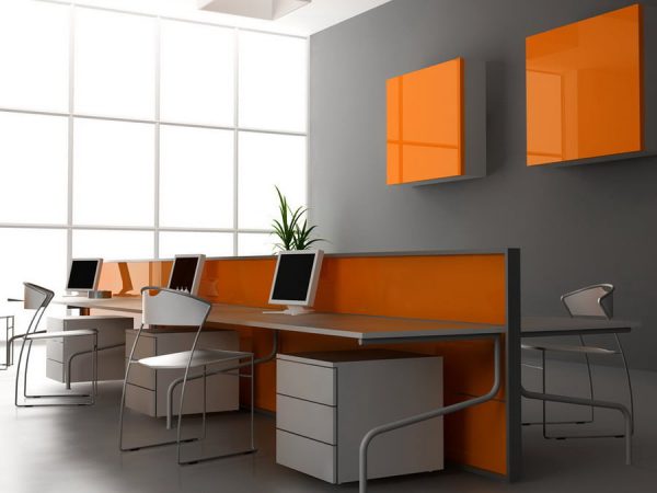
- Orange and peach. Positive colors increase labor productivity. Too caustic tones irritate the eyes, so you should choose more calm shades.
When choosing a color for office walls, you need to consider the possibility of painting. It is not necessary to make the room dull, monotonous - bright elements that may enliven the atmosphere may well appear on the walls. It is best to use green, blue, peach colors, but variations are possible according to individual preferences and style.