The yellow-orange precious gold metal is universally associated with solar heat, life-giving energy, the radiance of fame, beauty, and wealth. Using it and shades in the “gilding of living spaces”, the golden color in the interior is a good, modern solution: a balanced alloy of shiny metal with “strong” tones easily transforms the ordinary “footage” into respectable apartments.
- The ideology, meaning and characterization of a “complex” color
- Stylistic relevance
- Classic Gold
- Refined and luxurious golden East
- Contrast and Binder Gold
- Gold color in minimalism
- Golden ratio
- Golden hue in detail
- Wall decoration
- Furniture
- Fixtures
- Other accessories gold
- Golden couples

The ideology, meaning and characterization of a “complex” color
Gilding is the oldest decoration and decoration technique, a proven way to create a warm and comfortable atmosphere. Golden range (from saturated amber to sand magic of fawn buffalo) visually expands the space, adds air and light to the room, envelops with glare and haze of shades.
Gold is the choice of strong, determined and self-confident people: this is not kitsch and bravado, but a quiet existence in the energy base, a simple contemplation of a miracle.

Design using golden style is a complex and crucial step, requiring a sense of proportion, innate tact and the finest taste from the master of interiors. The use of gold in the interior is a non-trivial task: the smallest imbalance destroys solar magic, shifts the “dosimeter of perception” to the area of pompous satiety, vulgar “wealth”.
With the correct (thoughtful) “metallization”, golden arrays, fragments and inclusions become the hallmark of the room, smooth out the flaws of architecture, increase comfort indicators.
to contents ↑
Stylistic relevance
There are many styles in the art of decorating living spaces: each format is linked to a specific era, rhythm, and plastic. Golden finishes and accessories are appropriate and harmonious in many movements. Gold is surprisingly versatile.
Classic Gold
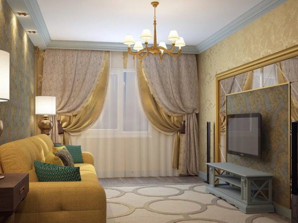
Classic reigns in the world of decor. This style is intuitive, it disciplines and reassures with its elegance, rigor and chivalry. The classic interior demonstrates the excellent taste of the owner, his social status and financial security. Focusing on the classical style, it is difficult to meet the "modest" budget: this format adored luxury and wealth, expensive interior design.

Modern classics were slightly assimilated (moved away from the palace pomp), but the main traditions and features of the style were preserved. The principle of classics with gold is luxury. Gilded furniture made of precious woods, floors made of natural materials, colonnades, stucco moldings, mosaics, antiques. There is simply no way to do without gold. Smooth, clear lines with soft transitions and calculated appropriate gilding throughout. Light shades of beige, white, cream are in perfect harmony with bright shine or matte pressing of gold.
to contents ↑Refined and luxurious golden East
It is impossible to imagine an oriental style without gilding, brocade pillows and bedspreads, dim lighting in warm yellow tones. The effect of unlimited comfort, a leisurely flow of time and luxurious ornateness lies in the details: the east is a “delicate matter”. The result: canopies, massive gilded frames, low tables and sofas, golden brocade, mosaics and inlays, complex and ornate ornaments.
The East captivates with luxury and comfort, gives rise to mystery, mystery, intrigue. The alliance of gold with rich red color adds authenticity to the eastern format. “Hot blood” and eternal gold are the leitmotifs of the eastern interior.

Contrast and Binder Gold
A typical picture of an eclectic interior is a peaceful “cohabitation” in one room of several styles, a mass of seemingly absolutely incompatible things. Indiscriminate chaos actually requires thoughtfulness and careful study.
Gold is an excellent reference point for eclectic confrontations: a noble metal is active and productive in this style. Solar metal in eclecticism plays a connecting role: “motley” decoration, decor, objects and artifacts must be combined in some way, unobtrusively and cunningly linked into a single whole. Centuries-old recognition and enchanting energy of the “golden calf” - perfectly mixes any mix, with its brilliance and radiance only enhancing contrast, idealizing eclecticism. A gold thread easily and naturally braids around, links: contrasting and binding gold in eclecticism is the leitmotif of the design project. The main thing in the process is not to get carried away and not slide into sloppiness, a spectacular pile of pros and cons.

Gold color in minimalism
Minimalist style is the interweaving of three basic colors, perfect purity of lines and strict rationing in detail. Gold in the style of minimalism shifts to "supporting roles": emphasis, zoning, the formation of energy nodes of space. Light wallpaper of golden tones is an excellent solution: the bedroom will be charged with charm and sophisticated intimacy, the living room will be filled with friendliness and warmth, the kitchen-dining room will receive the necessary visual and functional space. The golden fleur adds to the chilly minimalism of humanity, comfort and much-needed softness.
The main difficulty of the practice of minimalism is not to slip into a “dull gray”, stylish officialdom, barracks boredom.

Golden ratio
Experts from interior design have long been practicing the dogma of the golden ratio. The golden balance, declaring the undesirability of even multiples, helps not only to correctly “load” the footage with furniture, but also to optimally balance color saturation. The ideal obliges to maintain balance: sixty / thirty / ten. The primary color is “cut through” by the secondary and contrastively accented by the third paint.
to contents ↑A very interesting and spectacularly working 60 percent gold base, supplemented by thirty percent beige gamut with ten percent interspersed with blue or gray-green. The proportions are tentatively arbitrary, but they help to correctly measure the combination of base gold with accompaniment and accenting (reinforcing) tones.
Golden hue in detail
Sunny golden color gives a positive color to any interior, but the ancient magic of the metal of wealth requires caution and correctness. The unconditional law of interior design says: "the devil is hiding in the details."
Wall decoration
When making a fundamental decision to use gold in wall decoration is best limited to accents. These are paintings and mirrors in golden frames, metallized borders and moldings.When using paint or wallpaper in sunny tones, everything else should be outside the “golden front”. The prevalence of warmth and earthiness of dense gold tones visually reduces space, "golden plaster" is contraindicated in nooks and small-sized "dark ones". The pressure and abundance of gold depresses: on large "runs" the precious metal is inappropriate.

Furniture
The interior is filled with an abundance of golden details: furniture with brocade upholstery and a rich decor front - adds charm, solidity and solidity to the room. Gold is a good form-forming element that clearly builds rhythm and energy. But solar metal must be dosed, carefully calculated and appropriately incorporated into the interior concept. Furniture with gilding is good in classicism, fundamentally necessary in Arabic motifs, appropriate and quite productive in minimalism, art deco and even hi-tech.
to contents ↑Fixtures
The backlight accentuates and activates the golden decor of the space (no matter the room or hall), and the light sources themselves harmoniously merge into the solar concept. The format and constructive design of the fixtures is a fruitful and productive “golden” theme. Gilded light constructions (floor lamps, chandeliers, spotlights, spotlights, etc.), equipped with warm, yellow spectrum lamps, luxuriously and stylishly realize the “golden factor”.
to contents ↑Other accessories gold
An interior artist who has embarked on the “road of golden pavers” should be aware of the fact that Susality is positively correlated, and in which cases it is simply contraindicated. Gold with proper positioning is a universal “living water”, a cure for gloom and dullness. Elegant baguettes, frames, heavy curtains or tulle with a metal print, brocade textiles, gilded utilitarian artifacts diversify the decoration, shift the temperature and energy background of the interior to a positive.

But when the golden dose is exceeded, the “golden calf” is piled up excessively, the magic of metal destroys the charm and aristocratic sophistication of the room.
to contents ↑Golden couples
The sunny golden hue is friendly and in contact with most colors of the rainbow. Saturated shades will only appear and will sparkle with the addition of gold highlights.
- Gold and snow-white - an ultra-elegant alliance. This pair is appropriate in any corner of the apartment, such a double captivates with its airiness, clarity and amazing softness;
- Gold and black - the canon of aristocracy. In this interweaving of opposites, a “neutral band” is necessary, the participation of white: in black and white confrontation, gold is most effective;
- Golden and gray - soft and comfortable version. Half black absolute, fashionable gray smooth the brightness and richness of the gold tint. This combination: modesty and tactful combination of gray, emphasized by the vitality of gold, - forms a surprisingly cozy and stylish atmosphere;

- Sunny and blue are a complex, but very productive pair. Dark blue tones tell the whole world about wealth and strength, and the presence of gold only confirms the given. The depth and saturation of blue accentuates the brightness of gold well: two "strong" colors pull a common harness;
- In the green palette with "solar discharges" only gentle emerald shades are in harmony. Soft green gamut is a wonderful background on which gold accessories “work” well;
- Divine in its power, the union of gold and red. In the golden crimson, burgundy glare is ideal, a dense and bewitching beige is appropriate, all variations of autumn madness;
- A spectacular combination of gold and violet is the destiny of creative natures. The best counterparty to the golden calf in this "color forum" is considered to be lilac, purple, purple variations.
Gold is an ideal material, an effective player in the market of interior design. In creative interaction with shades of noble metal, tact, courtesy and correctness are required: only in this case the golden color in the interior will reveal nobility, wealth and originality.