Different shades of green prevail in nature, therefore they are considered natural, pleasant to the human eye. Green color in the interior is often underestimated, and in vain: it is not only remarkably combined with other tones, but also very favorable for the human psyche and physical health.
- Description and color features
- Color psychology
- Most popular shades of green
- Combination with other colors
- White
- Beige
- Brown
- Gray
- Yellow and orange
- Red
- Blue
- Green color in the interior
- Living room
- Bedroom
- Children
- Bathroom
- Kitchen
- Hallway
- Furniture
- Accessories
- Curtains in a green living room
- In which styles are green shades appropriate?
- Modern style
- Country
- Modern
- Provence
Description and color features
Green color can be warm and cold depending on which tone is additionally included in its composition. So, the introduction of a droplet of yellow makes the greens soft, warm, and the addition of blue, on the contrary, cools it. Green can also “warm up” if you combine it with shades of the corresponding color temperature in the design. For example, one of the most popular solutions is a combination of green and yellow, reminiscent of spring nature and sunlight.

Green is well suited for small apartments, Khrushchev, because it has the ability to visually increase the room, expand its boundaries. This applies to light and medium tones of greenery, and deeper, darker shades do not give such an opportunity, but serve to attract attention. Experts consider the green color flexible: it looks great in any style, suitable for walls, furniture, ceilings, used in accessories and textiles. It can serve as a background and be used accent: the scope for imagination is very wide.
to contents ↑Color psychology
In psychology, green has a positive meaning. It helps to achieve psychological comfort, balance, with proper use it relaxes. It must be remembered that too active, eccentric people will not be able to achieve relaxation with the help of green: this natural shade is more suitable for soft natures with a penchant for any kind of creativity.
Among other things, green gives a sense of security, increases self-confidence. Bright tones of greenery improve performance and have a beneficial effect on overall well-being, which is why they are often used in accents as accents. Green is also suitable for cafes, restaurants, and kitchens: it contributes to a good appetite. Also, color has a real impact on health: strengthens the immune system and gives rest to the eyes.

Most popular shades of green
Professional designers use special color tables that reflect all the basic tones, the subtona of green. In the interior of the rooms, they recommend using no more than two shades of green at the same time, otherwise the situation will look defiant and overloaded. The most popular tones are:
- blue-green (turquoise) - adds coolness to the room, used where windows overlook the south side of the house;
- gray-green - is considered a classic combination, gives the room elegance;
- yellow-green - ideal for poorly lit rooms and apartments where it is not cozy enough;
- light green - a bright, light green tone, can be a background in the interior;
- emerald - a wonderful color for accent applications;
- olive and pistachio - a good basis for walls, floors, blend perfectly with white, yellow;
- herbal - the natural color of plants, leaves, gives the room cheerfulness;
- Khaki - a dark, but not annoying color, well suited for accents;
- lime - a cheerful, sunny hue, inspiring thoughts of a hot summer;
- mint - a fashionable shade that is often introduced into modern interior styles.

The most preferable when decorating the premises are light green shades. They are associated with spring, youth, tenderness, children like it very much. Such tones eliminate bad thoughts, improve mood, and therefore are well suited for the nursery, hall, bedroom and even the bathroom. With a different palette of green, care must be taken: with excess, it is possible to create a pretentious, unnatural appearance of the room.
to contents ↑Combination with other colors
Green combines wonderfully with many popular shades. There are exceptions to this rule. For example, greens with violet look bad, except for light lilac. Do not use green with acidic shades: the latter give the interior artificiality. The following are the most famous green partners.
White
Details or a white background are perfectly combined with green, giving the interior lightness and airiness. This palette is perfect for most rooms in the house, visually increasing the room. Bright green should be used sparingly in such a design so that its share is no more than 1/3. White-green interior can be decorated in any way, for example, to make the walls snow-white, and furniture - green in combination with white accents. A tandem is also used in black and white details on a light green background, which will look stylish and unusual.

Beige
Shades of beige are most often the main tone, and green in the form of accents. This design is easy to do with your own hands, because it is almost impossible to spoil it. The combination of these colors has a beneficial effect on the nervous system, therefore it is recommended for the bedroom, living room.
Brown
The tandem of brown with green is often used in a modern style, art nouveau, minimalism, country, provence. It is especially suitable for a wooden house, because it resembles a duet of leaves and tree bark. Usually green is used as a background, while brown are furniture, picture and photo frames, doors, and floors. All shades of chocolate can be used in textiles, curtains, drawing on tulle.
Gray
The combination of gray and green looks stylish and beautiful, gives the room elegance. It is important not to use dark gray tones with dark greens: only one of the shades should be saturated. The interior in such colors is perfect for decorating hallways, offices, offices, living rooms.
Yellow and orange
Yellow, orange are used against a green background in the form of spots of decor. These tones are designed to revitalize the interior, so you should not use them in too much quantity. A kitchen with a green set can be decorated with a yellow apron tile, a bright lampshade of a chandelier, and cushions on chairs. In the living room or bedroom, it is permissible to use light yellow wallpaper, coupled with voluminous green details: they can be curtains, carpet, armchairs, furniture covers.

Red
Shades of red, pink are used together with green infrequently. Too bright tones will look aggressive, and sensations of warmth, coziness will not work. If desired, you can use red with greens in a diluted state, mainly in the classic interior. Juicy tones are taken as the basis except in eclecticism, where sharp contrast of colors is important.
Blue
Usually greens with blue is used in the arrangement of children's, bathrooms, kitchens. The colors are close to each other, so you need to carefully enter them into the interior. Usually they make the walls light green, and against their background they have blue, dark blue furniture and decor.

Green color in the interior
Depending on the type of room, green can be used in different ways: accent, in the form of a background or large details.
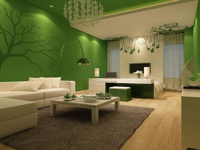
Living room
Too much greens cannot be used in the living room. This room is designed to relax and receive guests, but do not make it too relaxing. It is best to introduce color in the form of accents: a green sofa or upholstered furniture with original wraps, decor on the wall, vases, curtains, carpet, photo wallpaper will look great. If the room is large, you can select a relaxation area with a corner sofa, a coffee table and arrange it in green colors.
to contents ↑Bedroom
In the room for sleeping, the use of green will be a very good option. It is best to pay attention to pastels, light tones: pistachio, olive, soft grass. You can dilute the finish with a bed, a brown wardrobe, curtains in dark green stripes. If the room faces south, you can combine greens with cool shades that will absorb excess light and visually cool the interior.

Children
In the child’s room, saturated, but soft shades should be used that will give a positive mood. Grassy, bright green tones here are perfectly combined with milk, caramel, beige. Such an interior will help in learning, contribute to relaxation and restful sleep, but will not extinguish the activity of the child.
Bathroom
In this room, bluish tones are often combined with greens: they will remind of the sea, create a pleasant, harmonious atmosphere. To avoid the feeling of dampness, paints must be selected correctly and diluted with white, gray, cream colors. You can introduce thematic patterns in tiles, accessories into the design: for example, a mirror, like a porthole of a ship, decor in the form of waves.
Kitchen
The kitchen set can be issued completely green, although designers usually advise not to use this juicy color on too large areas. It is better to combine beige and green shades in the facades of furniture, highlight one wall with greenery or apply color in accessories. Green lampshades, curtains, curtains, watches, kitchen appliances, pot holders look great against the background of natural wood tones.

Hallway
Due to the lack of windows, it is not recommended to design the living room in very dark colors. So that the situation does not come out gloomy and boring, the design must be carefully thought out. An example of a successful decoration of the corridor is as follows: floor, ceiling - beige, walls - pastel green, accessories - dark green or brown.
Furniture
Green furniture is a bold and original solution. Usually in modern styles, dark, muted shades of furniture are used in combination with metal elements and strict lines. If the owners do not plan to completely change the furniture, it is enough to purchase the right textile, it will completely update the look of the bed, chairs, sofa group. Cabinet furniture can be decorated with interior stickers of the desired shade.
to contents ↑Accessories
It is the details that can give the room a complete, harmonious look. It is recommended to purchase accessories in a contrasting color compared to the tone of the walls in order to highlight them, to attract attention. Of the green elements, living plants and trees, tulips and other flowers in a vase look great. Interesting lamps, floor lamps are suitable for decorating a room.
Curtains in a green living room
Correctly selected curtains can enhance the effect of the stylistic direction. Their shade can be dark or light: depending on the rest of the interior, the size of the room, the level of illumination. Any solutions are suitable for large rooms, and in small rooms it is worth using only light fabrics without large decor.

In which styles are green shades appropriate?
Different shades of greenery are widely used in a tropical or eastern type of design, in marine style, Mediterranean style, art deco, English and eco-direction. Some varieties of design literally come to life with the introduction of green details and look incredibly attractive.
to contents ↑
Modern style
Usually in this direction of design, achromatic tones are used, which makes the interior seem dull. Elements of natural greenery, various accents, and decor will help to dilute it. It must be remembered that LED lighting, often used in this style, can distort the tones of green, and they will be perceived differently in the evening and in the afternoon.
Country
For this style, it is worth choosing shades of greens that are old and “burnt out” in the sun. Usually, combinations with pastel colors are used, furniture for antique is introduced into the interior, modest natural textiles. Embroidery, tablecloths, rugs with ornament, interesting furniture covers are welcome.
Modern
For this style, it is advisable to use high-quality materials, introduce mirrors, gloss, metallized surfaces, stone into the interior. Usually green is used in the form of details: mosaic apron in the kitchen, candlesticks in the living room, as well as lamps, blinds, flooring decor.

Provence
Provence is ideal for creating a cozy, warm atmosphere in the house. If we are talking about the kitchen, you can make a headset of a greenish tint, while saturated tones should be avoided. In the bathroom you can use green tiles, in the living room and bedroom - fabric lampshades, curtains. The finishing touch will be interesting paintings, candlesticks, lamps, frames that make the interior harmonious and elegant.


