Each year, Pantone Color Institute chooses the most fashionable shade that designers and fashion designers around the world are adopting. In 2020, this is Classic blue - a classic, deep blue color that expresses calm, positive mood. Despite this choice, there are other trend tones that can be combined with blue or used in the interior yourself.
- General color trends and the best "representatives" of the palette
- Other varieties of blue
- Mint
- Lilac
- Pink
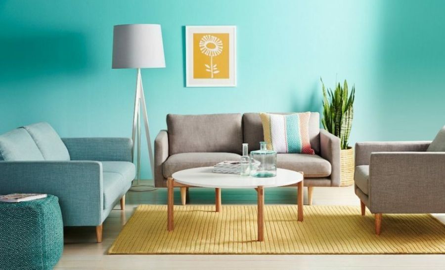
- Mustard
- Graphite
- Light gray tones
- Gray green shades
- Thunderstorm shade

General color trends and the best "representatives" of the palette
In 2020, designers are advised to use calm, muted tones from the natural palette in the interior. These include the colors of the sea, forest, sky, fields and meadows. No less popular in the new season will be various shades of gray, brown, green, lilac and beige.
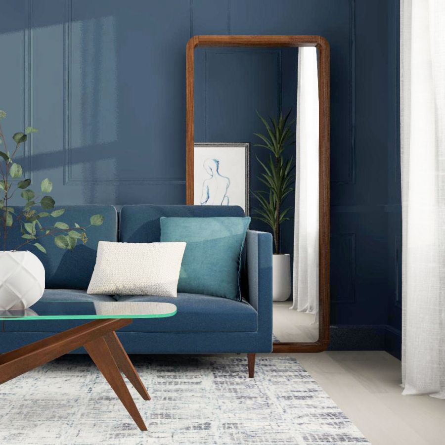
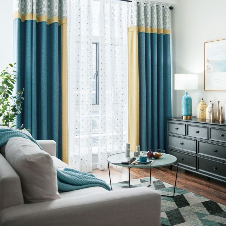
Other varieties of blue
In addition to the most fashionable classic blue, the Pantone Institute advises paying attention to the brightened Bright Cobalt, which is ideal for the interiors of houses and apartments. In addition to the trendsetter of trendy colors, this shade is recommended by manufacturers of expensive premium paints Sherwin-Willaims and Farrow and Ball. By the way, in the collection of wallpapers and colors Farrow and Ball there are beautiful muted tones - Imperial Purple, Scotch Blue.
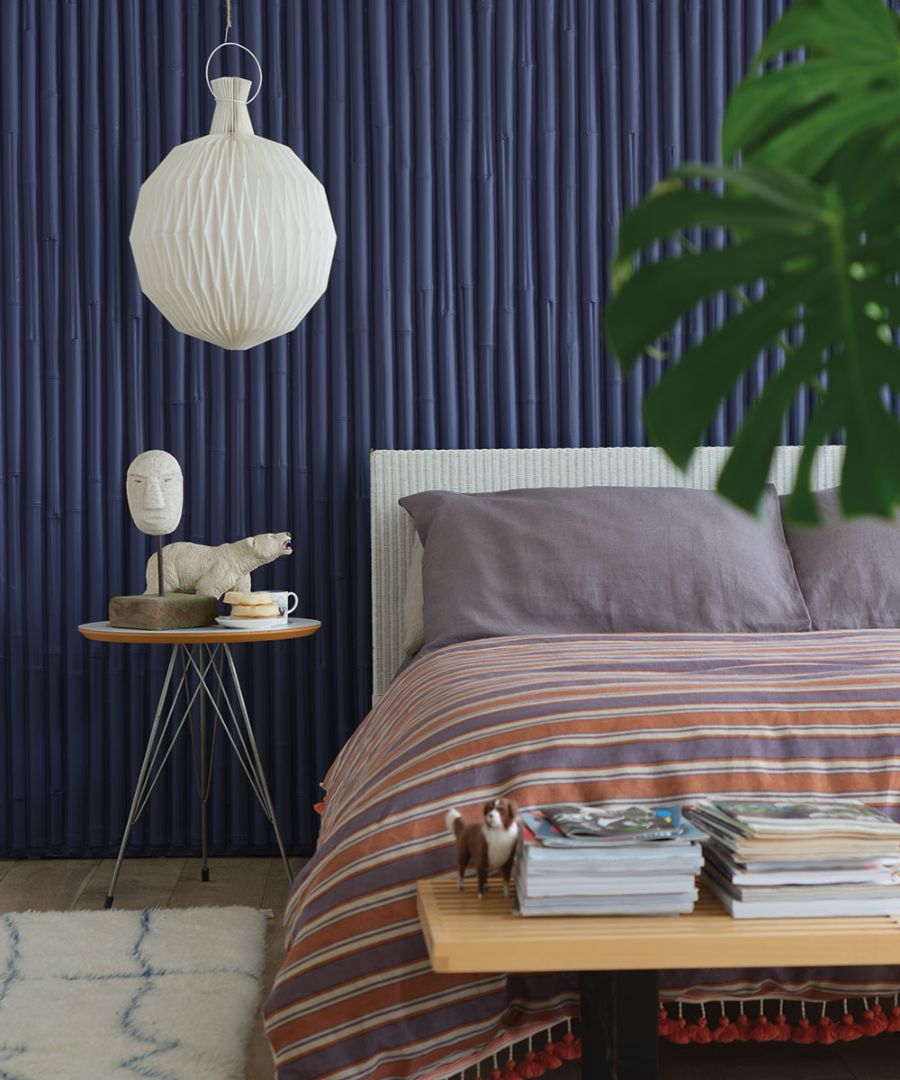
No less attractive for interior decoration is the color Naval (marine, navy) - It is saturated, bright, catchy, but very comfortable. It is best to use blue tones as a background in different rooms. In small rooms, they can look dark, so in such cases it is worth using them in furniture, accessories, textiles.
The pale blue color of Purist Blue is soft, tender, and is muted, because it contains an admixture of gray. In order not to “cool” the room too much, it is worth using Purist Blue dosed, for example, in the color of the curtains.
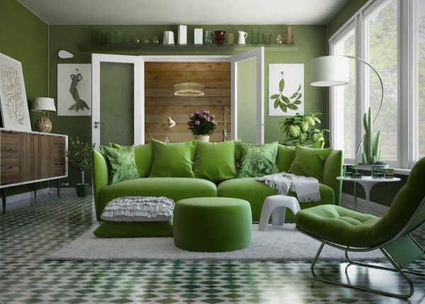
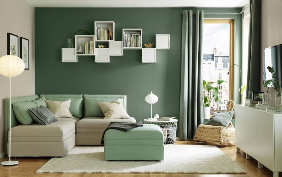
Mint
Mint colors have long attracted designers and decorators. They are so fresh, cool, and pleasing to the eye that they are projected to be popular for years to come. For example, Neo Mint is included in the palettes of the most popular manufacturers of paints and varnishes as the most promising.
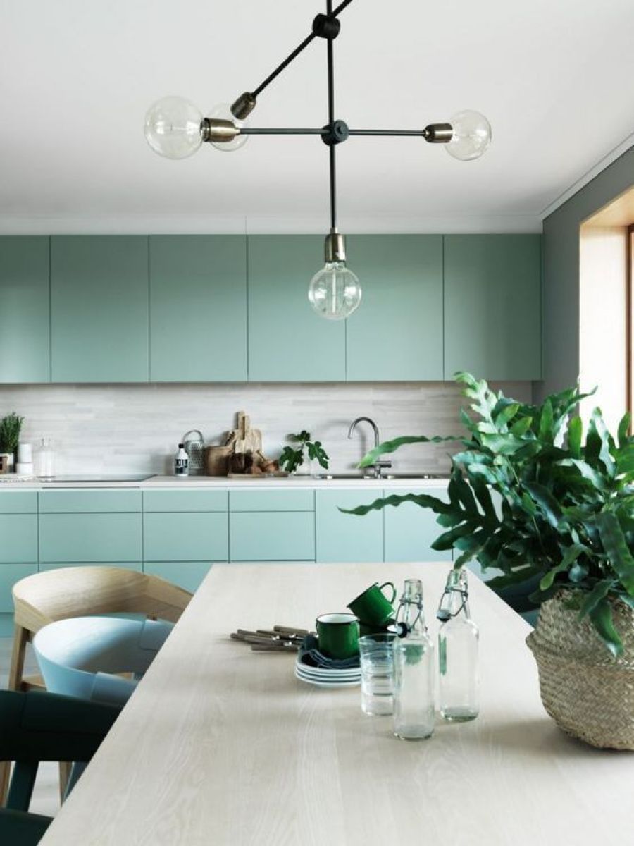
The mint shade literally saturates the room with air, although it carries some danger - with its abundance, the room may look cold, uncomfortable. Mint should not be abused if the windows face north. The most successful use of color is the design of furniture, photo frames, and decor. In the southern rooms, you can apply wallpaper with a mint pattern or background, coupled with wooden trim.
Lilac
According to Pantone, in 2020 the Cassis color will be very popular - a shade of “bleached” black currant. It came from Ultra violet (the trend of 2018) and looks very much like currant ice cream, since it includes an admixture of light pink First light (“First Light”). The new shade will ideally fit into the bedroom, the nursery, it is combined with blue, pink, gray tones and is considered neutral in relation to gender differences.
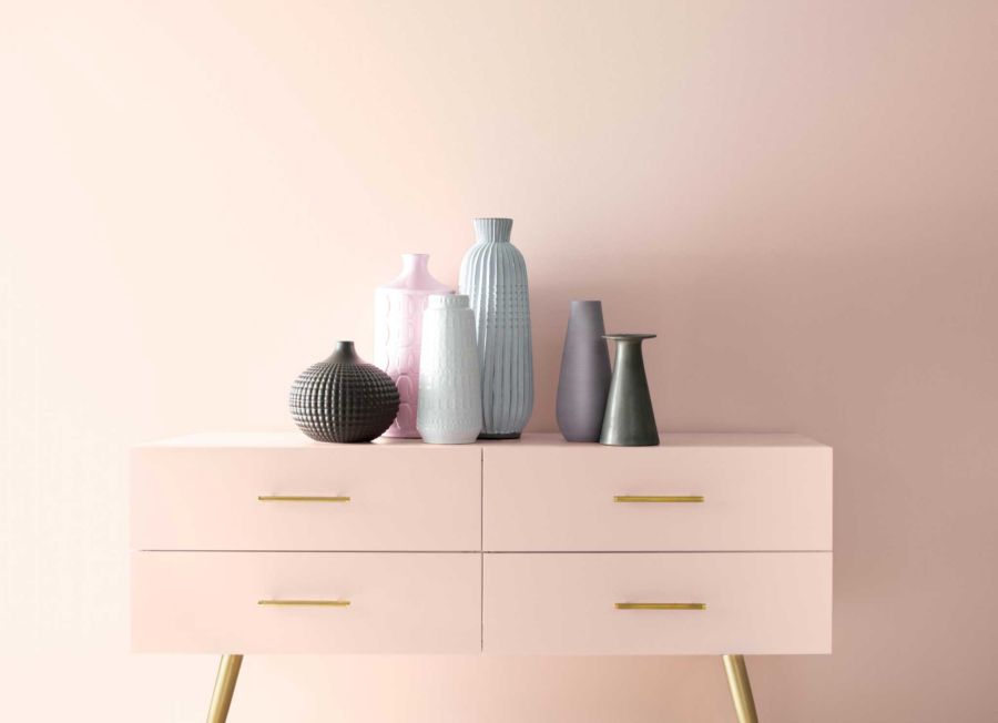
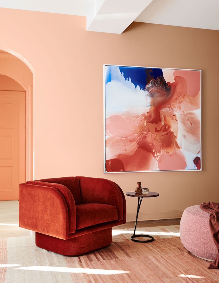
Pink
Milky pink Cantaloupe is a cross between an orange, peach, melon, diluted in white or beige. It is darker than the shade of cantaloupe, muffled and calm, albeit optimistic, uplifting. Obviously, the color came from Living Corall, which was considered the most fashionable color of 2019 (according to Pantone). Cantaloupe can be called universal: it can be a background, basic in any room, and also suitable as a room decor.
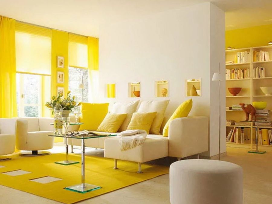
Mustard
Color Mellow Yellow is a mixture of yellow, brown, earthy, saturated, but soft, close to natural tones. Designers often use such shades in the interior, because they are easily combined with many pastel colors. Mellow Yellow is considered soft and neutral, it fits perfectly into any room. Particularly suitable for Scandinavian-style rooms, as well as for various modern trends.
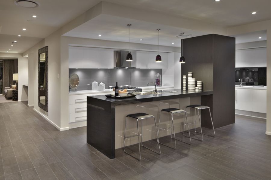
Graphite
Recently, designers are increasingly less likely to use pure black in their work. In 2020, the most popular of the black line will be a graphite tone, passing under the name Jet Black. It is best to introduce it into the design in the form of accessories and parts along with achromatic colors (white, gray).
Light gray tones
Given the recommendations of Pantone, you can easily choose the background color for the design of the room. For example, in 2020, Tranquil Dawn will be fashionable - a gentle pastel shade that includes blue, green and gray in highly diluted variations. It resembles the color of the morning sky and fits perfectly into any interior as a base.
Another complex, but very beautiful shade is Back to Nature, which in 2020 was chosen by the manufacturers of paints and waxes for wood as one of the main ones. It is a light mixture of cappuccino, gray, olive, meadow greens. This shade is warm, pleasant to the eyes, muffled. The interior in such colors will be calm, relaxed.
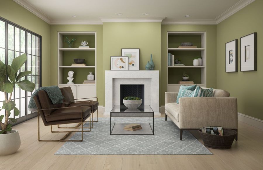
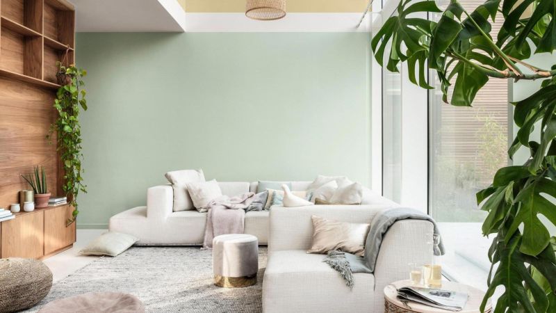
Gray green shades
The most fashionable of the green tones, the specialists of the Institute of Colors considered “herbal green” (Sap Green) and “green duck” (Duck Green). They have a smoky gray admixture, although quite saturated, bright. In the interior, murals, photographs, paintings, panels with the participation of such shades will be especially successful. Lighter variations are used as a background in the interiors of country houses.
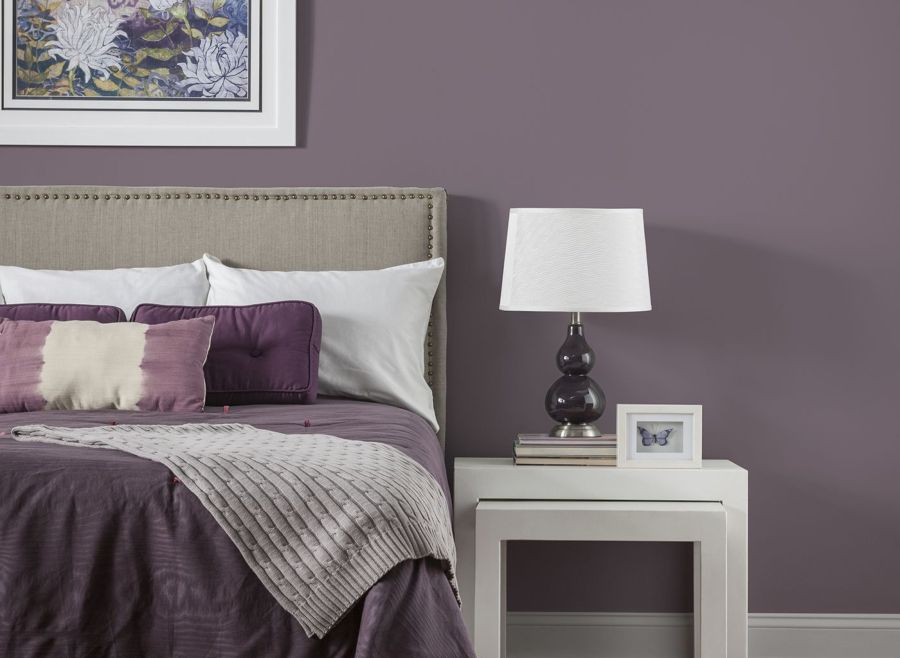
Thunderstorm shade
Gray-violet shades in dark and pale varieties are another trend of the new year. These include delicate tones (e.g. Canyon Earth), weightless, airy colors (Pale Powder) and some other shades. They are great for decorating a bedroom, living room, nursery, however, require dilution with more joyful colors.
Applying top-end palettes for interior design, you do not need to think about their relevance and success in design. Experienced decorators and “color designers” have already appreciated the visual appeal and impact of shades on the emotional state of a person. It remains only to choose the right gamut from the new line of colors in 2020 and use it in practice.