When developing the design of the room, one of the most important points must be taken into account - the color combination of furniture, wallpaper, and decoration elements. Color greatly affects the mood, psychological state of a person, besides it is able to visually reduce, enlarge, refresh or, on the contrary, make the room dark. A successful combination of colors in the interior of the kitchen is especially significant, because it affects the appetite and even the health of residents.
- Basic color combination rules
- Rule 60/30/10
- The main subject for emphasis
- Wall decoration
- Work apron
- Countertop color
- Kitchen furniture color
- Accessories and Textiles
- Style decision
- The color wheel - why is it needed
- Process colors
- Monochrome colors
- Contrast colors
- Adjacent colors
- Achromatic colors
- Theory of color combination in the interior
- Color matching
- Incompatible colors
- We consider lighting
- Complete lack of windows
- Windows on the north side
- The windows face south
- Color and room height - interconnection
- Characteristics and successful combinations of primary colors
- Red
- Blue
- Blue
- Green
- Yellow
- Orange
- Gray
- Purple
- Brown
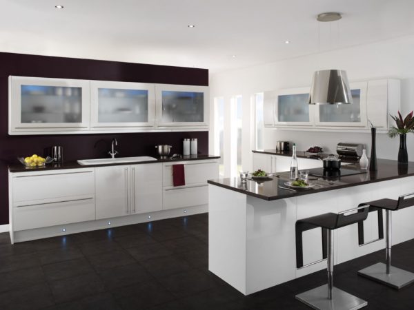
- The black
- White
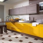
Basic color combination rules
Experienced designers know very well how to make the kitchen attractive and eliminate color congestion. For walls, furniture facades and other details, you can not immediately choose all the shades you like. The color palette includes several basic tones and many halftones, and the lack of order in their combination leads to a chaotic mess in the interior.
to contents ↑Rule 60/30/10
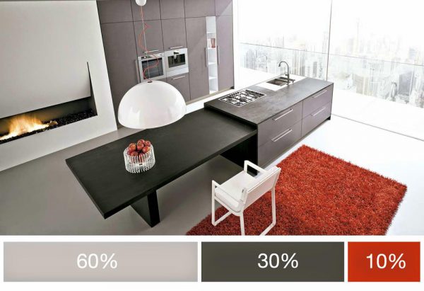
Despite the fact that there may be several shades during design, all of them are required to fit into only three color schemes, which are distributed in this ratio:
- 60% - dominant color (background, main tone);
- 30% - complementary color;
- 10% - bright details, accents.
The main color should not be too catchy. On the contrary, against its background, other colors must be clearly visible, which will give the room a style and originality. The 60/30/10 principle is ideal for those who like to introduce saturated colors into the interior: orange, red, burgundy. Too many of them will lead to a glut of the design, but application for accentuation will help to decorate the kitchen. The predominant tone is best chosen from a calm range, because it should relax and tune in a positive way.
to contents ↑The main subject for emphasis
First you need to determine the subject that will create the main impression of the room. It is his tone that is chosen first, and then a combination of colors in the kitchen is pleasant to the eye. The emphasis, if desired, can be done on wall decoration, work apron, furniture, countertops and even small accessories, appliances.
Wall decoration
Sometimes designers recommend using catchy wallpapers, beautiful murals and collages on the walls. Such a kitchen will look stylish, but only with the exception of congestion. Flooring, furniture should be unobtrusive, serve as a soft addition to bright walls. Accessories are also best done in a neutral appearance and color. The combination usually looks like this: colored walls, plain furniture in a contrasting shade (gray, brown, beige).
On the contrary, with the "modesty" of the walls, which do not have significant decorations or are completely covered with plain pastel-colored wallpapers, it is worth choosing interesting furniture and details. This technique is often used in the classical style: white or other light walls and the presence of paintings, beautiful chandeliers, gilding. With light walls, all shades of wood are ideally combined: oak, wenge, walnut, etc.
For the kitchen, where the walls are finished with natural stone, there are peculiarities of design selection. The stone itself is a striking element of the decor and combines with little. This material will lose all external gloss in combination with color details. It combines well only with white, beige, cream colors, some shades of wood. Only white marble gives more room for imagination: it is possible to pick up brighter furniture to it, although it is better to pay attention to wood colors. The design in the "stone kitchen" should be as simple as possible and not include artificial materials, especially plastic.
to contents ↑Work apron
The overall impression of the kitchen depends on the beauty of the work area. Furniture should not be selected to match the apron: the latter will become invisible. A motley photo apron against the background of walls with a bright pattern will look elaborate: such an interior is too intrusive. If the kitchen is colored, an apron of saturated tone is not used, this law is known to any designer.
Here are the most successful and poor combinations of aprons and kitchen furniture (upper and lower cabinets):
- Red apron. Fits black, gray, brown, white furniture, mirrors are welcome. You can not use pink, coral, orange, burgundy tones.
- Blue, blue apron. Harmonize white, the color of natural wood. Blue is also well combined with light green, lilac, black. Do not combine blue and blue in the kitchen, as well as dilute them with shades of red.
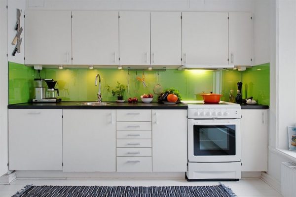
- Green apron. Well suited yellow, sunny and white. The combination of shades should also be taken into account: to pick olive not bright yellow, but sand, to light green - yellow with an admixture of orange.
- Stone or stone aprons. Wall decoration with marble, another stone obliges you to buy furniture, mount the floor from similar materials. The ideal combination of stone with veins with furniture in the color of these veins. Stone window sills look good in combination with the same apron.
If the kitchen apron has a bright pattern, pattern, insert and ornament, it is recommended to duplicate such decor on curtains, a chandelier, a floor covering. The main thing is not to overdo it, but to make furniture and walls in neutral tones.
to contents ↑Countertop color
Selecting a countertop is also better at the initial planning stage of design in the kitchen. In order not to become attached to her appearance, it is better to choose a modest, discreet product. Bright, attractive countertops oblige you to consider the rest of the finish, otherwise the room will be perceived as overloaded.
Stone countertops are a popular option in modern kitchens. Unfortunately, installing a part from this natural material can ruin the whole idea if it is not supplemented with a “pair”. So that the countertop does not look like an extra object, you need to combine it with stone window sills, part of a wall or floor with the same decor. It is forbidden only to make the kitchen apron similar to the surface of the table: the coatings will merge.
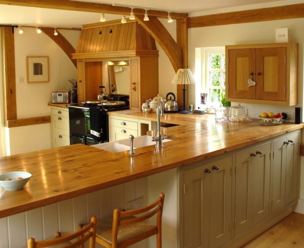
to contents ↑Natural wood worktops are ideally combined with wooden furniture, a kitchen table, windows, shelves. The top and bottom of the cabinets should not coincide in shade, although it may be similar in texture and color scheme. Excess unpainted wood in the kitchen can make it look like a bath or a sauna, which looks ugly!
Kitchen furniture color
A beautiful combination of colors depends heavily on furniture, because a kitchen set usually takes up a lot of space. The easiest way is for those who have not yet bought furniture - you can choose absolutely any option. If you already have a headset and a dining area, you will have to focus on them.
White walls are ideal for furniture in natural wood. The interior can be complemented with details of any color except brown. White furniture, on the contrary, requires walls of a contrasting shade, and absolutely any tone will suit it - from red to turquoise. If the headset is red, it is allowed to select the finish of gray, white, metallic color, mount various mirror surfaces.
White and beige finishes are suitable for brown furniture, other colors can greatly spoil the look of the interior. The floor in the presence of furniture in the color of cappuccino, wenge and other shades of brown must be made light. It is better to add only white elements to the blue and lilac kitchen, and yellow details to the green one. Such an interior will look harmonious.
to contents ↑Accessories and Textiles
It happens that the designer offers to focus on accessories - beautiful details in the kitchen. Furniture and walls in this situation should be made inconspicuous: modest options from unpainted wood, white or cream finish of the walls are suitable. The floor is also better to veneer under a tree, preferably light shades. Usually they focus on little things in the styles of country, ethno, provence. Particularly popular is hanging beautiful curtains, tablecloths, contrasting with the background or furniture.
to contents ↑Style decision
Choosing a color scheme for the design of the kitchen, do not forget about its compliance with the chosen style. Here are some guidelines for choosing colors:
- classics, art deco - deep tones, contrasting shades;
- provence, shabby chic - pastel colors;
- Scandinavian style - light, natural tones;
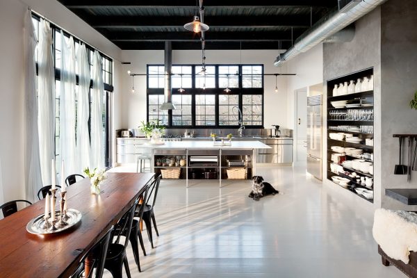
- loft, industrial - dark, muted colors (wood, brick, metal);
- boho, retro, pop art - any bright colors;
- minimalism, eco-style, country - the colors of nature (sand, green, wood).
The color wheel - why is it needed
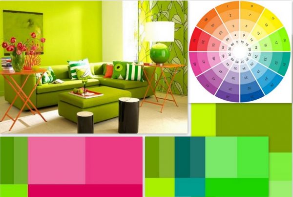
For the convenience of the work of designers, artists, stylists, a color wheel was invented, in which the main, auxiliary, additional tones are combined. It is divided into 12 segments, where tones that are close in hue are nearby, contrasting tones are opposite each other. With the help of a circle, it is easy to choose harmonizing or contrasting shades for the repair of the kitchen, living room and any other room.
In the center of the circle is a triangle, at its vertices are the basic tones - yellow, blue, red. Next, on the ribs, are the colors obtained by mixing the base ones, and the outer “hoop” of the circle is represented by many shades and complementary colors. It is recommended to decorate the kitchen after clarifying what the colors are and how they fit together.
to contents ↑Process colors
In any color combination table, you can see a triad of basic tones: red, yellow, blue. You can apply them in one interior, in this case the kitchen is called three-color. In the color wheel, the base tones are adjacent, so they can be used together. However, only one color should dominate, and the other two can only complement it and create beautiful accents. The design of the kitchen uses different shades of basic colors. Here are examples of successful combinations:
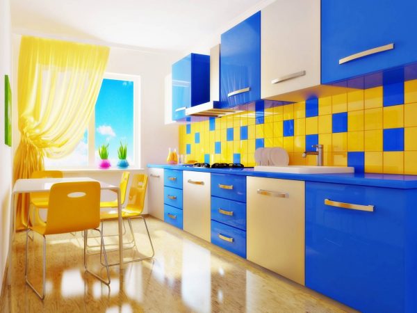
- blue, yellow, red;
- pink, lemon, blue;
- peach, light green, lilac.
to contents ↑
Monochrome colors
The monochrome kitchen is a room decorated in one basic color and its shades. The more there will be more, the more original the picture will turn out. It is permissible to dilute the interior with white, silver is also suitable for this purpose, because they are ideally combined with any tones.
There are a number of recommendations that will help make the kitchen more beautiful and boring:
- the darkest or lightest of the shades should dominate;
- in dark tones you can zone the room, adjust the layout;
- the use of different textures will also help to decorate the interior;
- interesting accents are allowed - they will only benefit the general idea.
Contrast colors
By contrast, we mean those colors between which there are three segments in the color wheel. Such combinations are used to create an original, bright interior. Nevertheless, it is necessary to combine contrasts carefully so as not to get the effect of aggressiveness and absurdity. One tone must be chosen as the main one, and in contrasting color it is supposed to balance it.
You can choose pale tones: the room will be calm, peaceful. Some people prefer bright and deep colors to give liveliness to the interior, but too saturated colors bother you faster, which should be taken into account when planning a kitchen design. It is better to make the walls and furniture calmer, and the curtains and accessories brighter to achieve a harmonious picture.
Good combinations of contrasts are:
- purple, yellow;
- blue, orange;
- light green, pink;
- red, gray;
- beige, brown;
- lilac green.
Adjacent colors
Adjacent colors are also called analog. They are located next to each other in the color wheel in adjacent segments. You need to understand that these are not shades of the same color, but completely different tones (yellow and light green, orange and red, green and blue, etc.). Usually, only two adjacent colors are used when decorating a kitchen: one is taken as a basis, the second as a complement. You need to use tones of the same brightness, saturation.
Achromatic colors
Black and white are considered achromatic colors. When using them, the interior of the kitchen can be called achromatic. This option is popular in high-tech styles, minimalism. The following color combinations will also be achromatic:
- metallic and white;
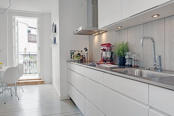
- gray and white;
- white interspersed with olive, brown.
to contents ↑The leading role in the achromatic interior should be given to lighting. So, with a bright cold light, you can beautifully emphasize the texture of white furniture, highlight the necessary details and zone the kitchen.
Theory of color combination in the interior
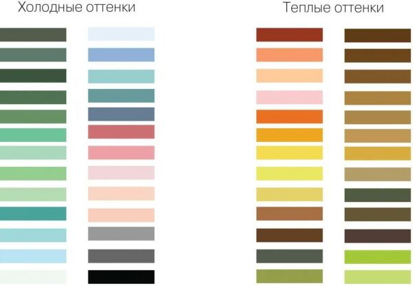
When choosing a scale for the interior of the room, you need to pay attention to the overall color temperature. The room may be dominated by warm or cold colors. The first come from red, have a subton in its composition (shades of yellow, green, red, orange, brown). The second - derivatives of blue, these include purple, cyan, blue, turquoise. Black, beige, gray, white are considered neutral. Warm tones look better in large rooms, cold tones in small ones.
Other design tips for self-made kitchen:
- at low ceilings, the floor, ceiling, opposite the entrance to the wall, are made light, the remaining details are bright;
- with high ceilings, the floor, the far wall are painted in a light tone, the rest are saturated;
- light furniture will help to dilute the dark shade of the walls;
- the gradient looks beautiful - increasing the saturation of the shade from floor to ceiling or vice versa;
- weak contrast blur the boundary between the surfaces, strong - emphasize;
- a vertical wallpaper pattern stretches the walls, makes the room taller, a large ornament reduces the size of the room, and a small ornament expands it.
Color matching
To the main gamut of colors (red, blue, yellow), which combine perfectly with each other, white and black are ideal. Warm shades successfully harmonize only with warm: for example, in one room it is not recommended to combine golden yellow and cold yellow, lemon.
to contents ↑Incompatible colors
Orange color does not look good with light green - gives the room pretentiousness. Also, the interior will be ugly, where they combine blue, red and green colors, purple and light green, dark brown and blue. But almost any color looks great with white, and most light colors with black.
We consider lighting
From the point of view of illumination in the kitchen, it is possible to shape the color scheme of the interior in different ways. They depend on the amount of light, the location of the windows and a number of other factors.
Complete lack of windows
Sometimes in the kitchen there are no windows at all, in which case the lighting will only be artificial.Lack of light must be compensated by the light color of the main surfaces - floor, furniture, walls. To dilute the colors make bright accents: a catchy apron, accessories in contrasting tones. They mount a good illumination of the working area, and fill the walls with beautiful elements: watches, decor, paintings, shelves.
to contents ↑Windows on the north side
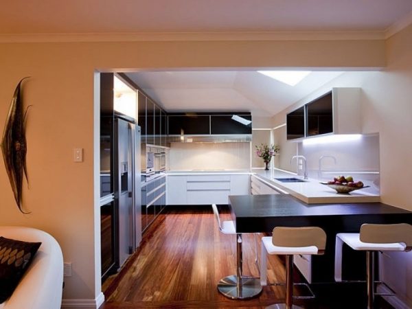
Usually there is little light in the windows located on the north side of the house. Excessive dimming can be smoothed out by decorating in warm, sunny colors. Golden, yellow, orange shades diluted with white elements will look good.
The windows face south
South windows, by contrast, can be overly lit, especially in the summer. Kitchens of this type are best designed using cold colors. Similar colors will reduce the brightness of natural light, which can cut eyes.
Color and room height - interconnection
The low walls in the kitchen can be visually raised. To do this, the floor is decorated in dark colors, the walls with light colors, and the ceiling with white. If, on the contrary, you want to visually reduce the height of the walls, the ceiling is painted in a darker color or the suspended ceiling is mounted in the appropriate tone, and the walls and floor are made lighter.
to contents ↑Characteristics and successful combinations of primary colors
In the design of the kitchen you can use a wide variety of colors. It is worth considering the most popular, as well as their combinations with other tones of the palette.
Red
This color is very appropriate in the kitchen, but you need to be careful with it. If you overdo it and make red furniture, an apron, walls, then the room will oppress, spoil the mood. It is better to use red in small quantities - in the color of curtains, accessories, dishes. This tone is successfully combined with white, green, black, yellow.
Blue
This color is suitable only if the room is well lit. It is recommended to use it for those who are looking for calm, peace, want to increase self-confidence. Overloading the kitchen with blue is not worth it, after all, it's a rather dark shade. It goes well with white, gray, purple, brown, red, yellow.
Blue
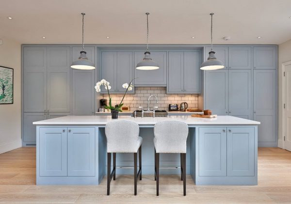
The delicate blue color for the kitchen is very good, it gives the room freshness, novelty. It can be used to create the basic tone of walls or furniture, especially in combination with white, beige or gray, which will give the kitchen lightness, airiness. Blue is combined with midtones of blue. It is recommended to shade blue with a darker decor, curtains, borders on the walls. The colors of natural wood and stone combine well with a blue tone.
to contents ↑Green
This color adjusts to positive, provides a charge of excellent mood for the day, and relieves stress in the evening. Green does not affect appetite in any way, it is considered neutral. A good pair for this color is red, also yellow, brown, orange will suit it.
Yellow
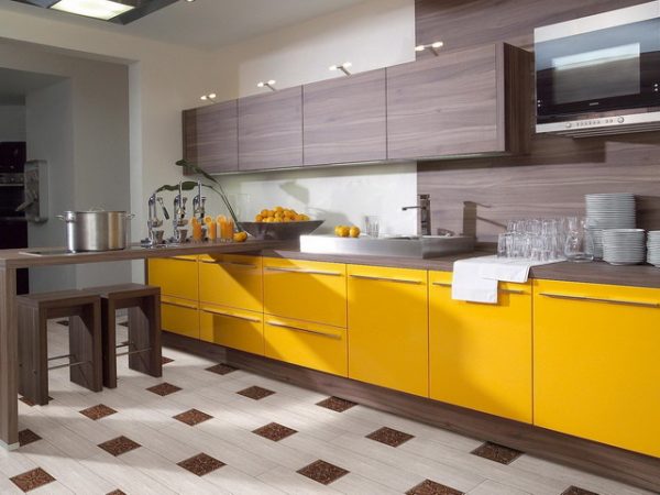
Yellow shades invigorate, warm, amuse, although they can be annoying in too much. Usually it is recommended to use yellow as an additional color in the kitchen in combination with red, blue, lilac, blue, green, gray, as well as black and white.
Orange
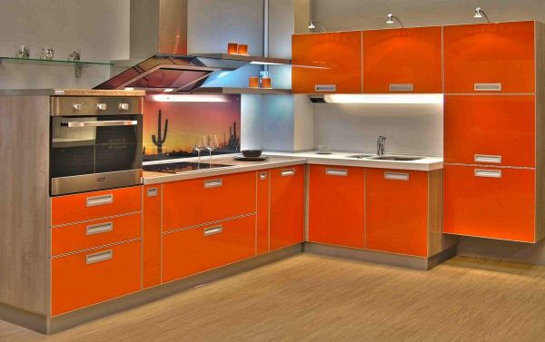
Orange looks perfect with white and gray. It can and should be used in the interior of the kitchen: a bright tone will give the room a cheerful look. Too much orange is also not an option, it is better to use it for decorating borders, individual cabinets, wall paintings, prints on the tiles of a kitchen apron. It looks interesting orange kitchen appliances, flower pots.
to contents ↑Gray
Gray is great for the main tone of the kitchen: it is universal, so you can combine almost all other colors with it. But the abundance of gray depresses, spoils the mood, drives into melancholy. For poorly lit rooms, where the windows are on the north side, gray is completely contraindicated. This color is best combined with pink, yellow, white.
Purple
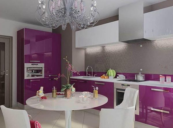
You need to use purple carefully, and it is very difficult to do.It simultaneously excites and soothes and is allowed to be used in design only in small quantities. As the main one, violet is used only in a light pastel shade. It blends violet with white, gray, brown, yellow, red and blue.
Brown
This color is popular in the interior, it is different shades of brown that have the species of natural wood. You can use brown in flooring, textiles, furniture facades. A prerequisite is the dilution of the color with lighter shades: white, beige, milky, as well as blue, blue, green.
The black
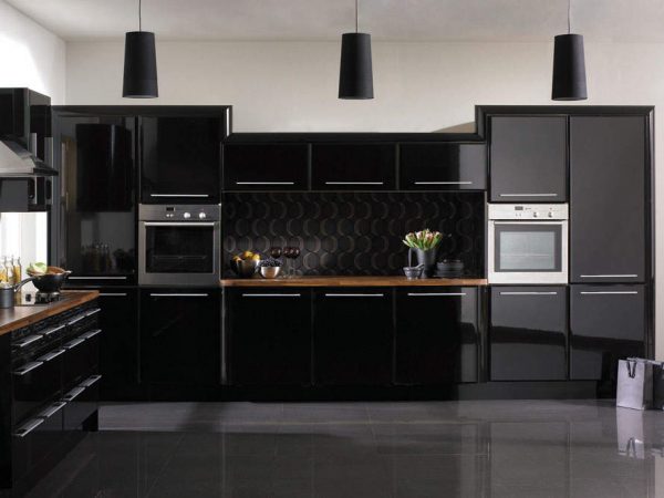
This tone is designed to give the kitchen a more austere, solemn appearance. It is used limitedly so as not to make the room gloomy. Usually, black elements in the kitchen are apron elements, photo frames and chandeliers, vases and chairs, a dining table cover and wallpaper prints. Black is combined with any colors, the main thing is that they are not dark either.
to contents ↑White
White is considered the basis of any color scheme. It is combined with all colors, without exception, in the kitchen it can be primary or secondary, serve as the background and color of accessories. The most beautiful combinations are white and lilac, purple, pink, blue, coffee. Previously, you can make a color model of the future kitchen using a computer program: this will help you come up with the most comfortable and attractive combinations and not make a mistake in choosing.

