People who prefer chocolate color for the interior of the house can be understood. It is really beautiful, pleasing to the eye, a deep color that has many shades for every taste. Fans of light colors will choose the color of milk chocolate, connoisseurs of dark - bitter. But his main advantage is that he gives people a sense of psychological comfort. It causes positive associations, especially with the beloved by many chocolate. People living in such an interior feel calm, safety, comfort, as if in childhood, when a bar of chocolate was strongly associated with a holiday and gifts.
- Advantages and disadvantages
- Design options
- Walls
- Floor
- Ceiling
- Furniture
- Interior features in different rooms
- In the living room
- In the bedroom
- In the kitchen
- In the bathroom
- In the hall
- The combination of chocolate with other colors

Chocolate color also satisfies the most sophisticated tastes of those who prefer stylish interiors: it looks elegant, noble, not flashy. It is also indisputable that it fits perfectly into design solutions that correspond to the most relevant styles today:
- classic with her floral ornaments on the dark;
- Art Nouveau is one of the basic colors of the style;
- loft - open ceiling beams, wall, coarse shelves of chocolate shades fit perfectly into the industrial-bohemian style;
- country and ethno - the color looks very natural, "natural", and therefore works perfectly in these styles, wood, ceramics, textiles of such shades are widely used for interior decoration;
- hi-tech - here the color is also beaten in beautiful combinations with basic gray.

Advantages and disadvantages
The chocolate color in the interior has the following undeniable advantages:
- noble and unobtrusive: the right color scheme does not bother him for many years;
- universal in terms of compatibility - in harmony with many colors;
- is dominant - if you choose it, the rest of the gamut should be adjusted to fit it. Knowing in which combinations it looks the most spectacular, you can choose from many options for interior design;
- psychologically comfortable for people of any age;
- if you prefer natural materials - it’s easy to find them with chocolate color and its shades. The wood of many trees used to make furniture is painted that way. Take a closer look at the dark nut. Of the exotics, wenge, chocolate limbus, rosewood, ebony have such shades. Chocolate shades of leather and textiles are also not uncommon.
There is only one serious minus for this color - it requires a good taste. Otherwise, it will make the poorly lit room gloomy, and the small one tiny.

Another drawback is rather from the field of curiosities: there is an opinion that in interiors of this color it is uncomfortable for people who, for whatever reason, have refused sweets. If health does not allow sweets or you are losing weight, think about how you will feel inside a chocolate candy!
to contents ↑Design options
So, you have opted for chocolate color in the design of your interior. How does it work on different planes of the room? Remember, you should always “dilute chocolate” with lighter and brighter tones. For inspiration, you can see photos of chocolate interiors that are pleasing to your eye.
Walls
Painting or wallpaper will look great in a room with good natural light. If the room is dark, it is worth considering the options for artificial lighting (by the way, this color unusually "plays" with the right lighting). For a room with such walls, furniture and accessories of lighter and brighter colors will be required.

Floor
Floors of various shades of chocolate - this is actually a traditional option. Think about what shade you need so that it does not seem that the room is falling into the abyss. The color harmony of the walls, ceiling and floor is important. On such a floor contrasting carpets look advantageous.

Ceiling
The light ceiling is an outdated idea. With today's variety of ceiling coatings and lighting options, designers are actively using the darkest colors in the design of the ceiling. In the spacious room, the chocolate-colored stretch ceiling in combination with lighter (beige, cream, pale golden) walls will look unusually spectacular. If the coating is glossy, with well-chosen lighting, the ceiling will look unusually impressive.
Be careful with a small room: it is better for her to choose a shade of milk chocolate, too dark a ceiling will “crush” the space, creating a feeling of a hole or a dungeon.

Furniture
It is not difficult to pick up modern furniture or make to order any, including your chosen color. Even if the budget does not allow natural wood, today they make a high-quality veneer that is visually indistinguishable from it. If you plan furniture in dark chocolate shades, then design the walls and ceiling in bright colors. If the room itself is chocolate, light furniture of the same or contrasting shades will look very advantageous.

Interior features in different rooms
This wonderful color can be used for stylish decoration of all rooms in the house. Everywhere it will be used effectively and will be able to perform various tasks.
In the living room
Before creating a design plan, decide what the living room is for? If you make important appointments with business partners, the chocolate color should create a sense of elegance and respectability. If you are going to socialize and relax with family and friends, it should also contribute to comfort and relaxation. He can do both.
We achieve elegant severity and nobility by combining chocolate with white, beige and light blue, an atmosphere of playfulness and relaxation - with red and orange.

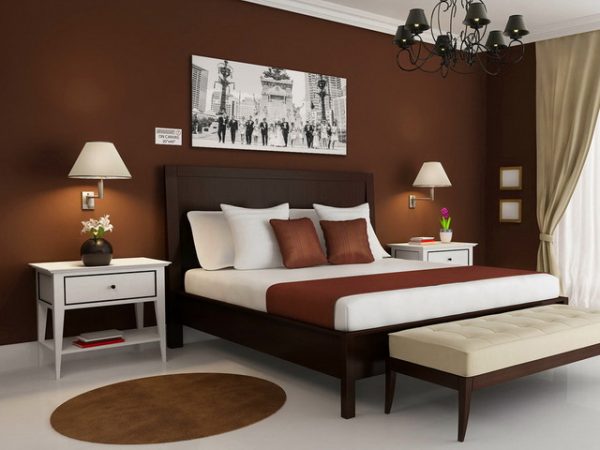
In the bedroom
The bedroom is a special place in any home: here you should have a good rest. The first rule of color is comfort! No platitudes about “calm” tones are needed: people are different, and someone falls asleep perfectly amid a riot of colors. If you want a lot of chocolate color and you want to fall asleep in a gift box of gilded foil with truffles, please! If you are interested in a more classic design, make the furniture, curtains, carpet and all textiles in this color, and the walls-floor-ceiling - lighter. Hint: turquoise is combined very effectively, unusually and subtly with chocolate.

In the kitchen
The kitchen is a place where chocolate color is extremely appropriate! But “overshoot” is not worth it: it is recommended to use it either in furniture or in the decor of the room, against the background of a lighter wall finish. A separate area made in chocolate will look exquisite: a work or only kitchen apron. Light chocolate shades look cozy in the kitchen.

In the bathroom
If the bathroom is small, it’s risky to make chocolate in the background: the space will visually decrease. Here fragmentary blotches will look better: stripes of tiles, furniture facades, rugs. A very effective option is a wall mosaic made of tiles of various shades of chocolate or its contrasting. The combination of this color with white and golden looks elegant, more fun and relaxed - with red, orange, bright blue. In the spacious bathroom, you can use large-sized tiles of deep chocolate shades, matte or glossy. Thoughtful lighting will create any desired effect.

In the hall
The theater begins, as you know, with a hanger, and the house with a hallway. She creates the first impression of the house and its inhabitants. Do you want to be perceived as a respectable person? The entrance hall, dominated by natural chocolate-colored wood, is a win-win option, just a classic. If such a serious impression is not required, the facades of the cabinets, skirting boards, doors and decor elements of this color in combination with soft beige, yellow, cream, white will look great. The entrance hall is often darkened, in this case, choose a color scheme based on artificial lighting. In the darkness, that chocolate and black are the same, but in the light, the advantages and disadvantages of the design are clearly visible.

The combination of chocolate with other colors
White and chocolate - a combination of classic, traditional and absolutely universal. If it seems uncomfortable and boring to you, it is permissible to dilute it with bright color spots, always contrasting: orange, golden, even red, green and bright turquoise are possible.
Chocolate and beige are related, blend perfectly. Many people like the two-color gamut without other splashes. In addition, the interior can be interestingly diversified due to various textures; textiles and wood look good in this gamut.
Red - the color is energetic, saturated, invariably attractive look. Only calm red with calm chocolate will be more likely to conflict than make friends, the third, dilution color - beige, white is appropriate.
But orange, oddly enough, with a "sweet" color blends better. If the chocolate is not too dark, and the orange may be muffled. The darker the first, the brighter the second should be! These two colors are also perfectly complemented by beige and white.
Yellow goes well with chocolate. But the bright yellow interior design still looks risky, it is better if it is not the background. And the muted shades of yellow look more noble.
Green and chocolate immediately cause associations with nature, and rightly so: the first recalls fresh greenery, the second - the color of the earth. A room with such a combination will be cozy and cool, like on a hot day in the forest. If the shades are chosen correctly, you can achieve a completely elegant impression.
Blue is combined with chocolate very elegantly, but it is better if it is its shades: blue, gray-blue, turquoise, gray.
Be careful with the golden color: it is certainly effective in combination with chocolate. But if you go too far with its use in the interior, your guests will decide that you are a gypsy baron or a pop star of the 90s.
Pink and chocolate are something tender, childish or girlish, right? Suitable for nursery and bedroom. But pink should occupy most of the space, the second color will be effective for furniture, decor, accessories. Why is that? Just imagine the opposite combination: chocolate space and pink furniture. This is not even extravagant, but simply ridiculous and annoying.

The most rare combination of "sweet color" with purple and dark blue: the impression of this design is disturbing and "funeral-gothic." Curious, but with black, subject to the presence of dilution shades, interesting options are obtained. Harmony with gray is hard to find, but hi-tech style designers cope.
As you can see, the chocolate color in the interior is endless possibilities for imagination and scope for design creativity. Sweet to you life!