Gray is one of the most commonly used colors for arranging apartments and houses. Its shades are suitable for almost any room, do not spoil the aesthetics, even in small-sized housing.
- Color advantages
- Grayscale
- Combinations of gray with other colors in the interior
- Beige
- Brown
- White
- Green
- Blue
- Pink
- Turquoise
- Yellow
- Purple
- Blue
- Red orange
- Gray color in the interior
- Kitchen
- Living room
- Bedroom
- Bathroom
- Children
- Hallway
- Cabinet
- Accessories for gray interior
- Jewelry
- Lighting
- Textile
- Bright accents
- Natural materials
- The effect of gray on the walls, floor, furniture
- Gray painted walls
- Gray wallpaper
- Gray floor
- Gray ceiling
- Gray furniture and decor
- Gray color and popular interior styles
- Loft
- Hi-tech (techno)
- Provence
- French classic
- Scandinavian style
- Retro
- Art Deco
- Antique style

Designers really appreciate gray, because it fits nicely into most famous styles: loft, classic, provence and many others. Gray color in the interior is considered the most soft and versatile, so you should take it into service when planning a repair.

Color advantages
The color scheme of the room has a great influence on the mental state of a person, and is also important for his physical well-being. Each color causes certain emotions that affect the mood. In psychology, gray is considered a neutral tone. Usually it is chosen by those who do not live by intuition, but think rationally. Gray walls are often present in offices, because they do not distract from work, they look reliable and friendly.
Gray color has a lot of advantages:
- he is considered discreet and very stylish, noble;
- shades of gray are in perfect harmony with other tones of the palette, it is easy to choose suitable color combinations for them;
- the color is suitable for most rooms and design areas, can be a backdrop or serve as decoration in the form of textiles, skirting boards, furniture, small details;
- the color is practical, non-marking, surfaces painted by it will last a long time and can be easily restored.

The negative effects of this tone can occur with excessive use. To the interior does not inspire melancholy, fatigue, it must be diluted with brighter accents.
to contents ↑Grayscale
According to the color tables, gray belongs to achromatic tones. It can be obtained by combining blue, red, green in equal proportions. There are different shades of gray, of which the following are considered the most popular in interior design:
- light gray;
- gainsborough;
- silver;
- dark grey;
- platinum;
- Marengo
- charcoal;

- cadet gray;
- dark blue gray;
- gray;
- nickel;
- light blue gray;
- dull gray;
- graphite.
Combinations of gray with other colors in the interior
Gray tolerates almost any combination of colors, as it fits most well-known warm and cold shades. Bright tones are appropriate that contrast with it, creating a special mood. Next to gray and pastel, powdered shades that provide an atmosphere of lightness in the room will look no worse.Below are the most common colors that can be considered as companions for achromatic tones.
to contents ↑Beige
Both of these colors are considered neutral, so they can be combined with each other. Especially interesting is a pair of light beige tones with a pale steel color. The room will look incredibly airy, since both shades are close to white.
If the interior uses beige and dark gray tones, it is better to add white accents - curtains, curtains, make the ceiling light. The introduction of bright details is also not forbidden: yellow, peach, orange elements will fit perfectly into such an interior.

Brown
Usually brown is introduced into the design in the form of wood tones (oak, cedar, wenge), warm chocolate shades. Such a combination will make the room cozy, add home warmth to it. Gray will be a great backdrop for wooden furniture, no less well, he himself will look like a flooring with brown furniture.
White
Steel color may become the backdrop for white details. Most often, such a tandem is used in the kitchen, in the bedroom, in the hallway.
Green
The gray-green interior is inherent in eco-style, country. On greens, gray looks very advantageous, creates an interesting contrast. Light gray in combination with rich green is no less beautiful, together they have a relaxing effect, make the room cozy. Living plants, a green carpet, a plaid, blinds, a pattern on tulle or drapes can act as greenery.
Blue
Blue color is introduced into the achromatic interior to give it airiness, warmth, freshness. This duo is suitable for classics, marine style, when diluted with other light tones, it can become part of Provence. Gray wallpapers with a blue ornament look attractive, as well as blue curtains, textiles, decorative elements.

Pink
Gray is very successfully combined with pink, moreover, the combination is considered very fashionable, stylish. The shade of a rose will give the interior tenderness, romanticism, and together with gray will have a relaxing, calming effect. For areas of loft, high-tech, you can take both colors in bright variations, but pink in a small amount. Another option for a successful room design is a combination of pink and purple and graphite with the addition of green or white accents.
to contents ↑Turquoise
Light shades of turquoise can be taken as a basis by installing gray furniture in the room with dark turquoise pillows and capes. The reverse combination is also possible, when the walls are made in grayish tones, and the accents are turquoise, the interior will also look advantageous. Such a mixture of colors is well suited for the bathroom, living room, corridor (in the latter case, all shades should be light or richly diluted with white, milk details).
to contents ↑Yellow
If the room has too many shades of gray, yellow will help to brighten their dullness. He will create an original image of the apartment, add juiciness and warmth. Gray-yellow in the interior of the bedroom, hall can be combined with black and white, for example, in the form of decorative elements: monograms on cabinet furniture, frames for paintings or mirrors.

Purple
Saturated violet loses its weight next to grayish tones, it becomes neutral in value, of course, with an accent introduction. More delicate shades of lavender, lilac, coupled with gray, are ideal for a living room, a Provence-style bedroom.
Blue
When combining gray and blue colors, an important rule applies: if blue is dark, then the second color should be light, light, cool. For bright blue, you need to take dusty, muted grayish shades.
Red orange
The interior based on steel and red tones is considered one of the most complex, but elegant. The situation will not be warm, but it will certainly attract attention.The kitchen, bedroom, and nursery are not suitable for this type of decoration; it is best to use a similar tandem in the living room or bathroom, abundantly diluting the decor with white details. If you want brightness and catchiness in the interior, it is better not to take the muted shades of red, but to replace them with raspberry, red.

to contents ↑Saturated orange in large quantities can be tiring, so it is used in the form of accents on a grayish background. Their bright colors should choose red, carrot, orange: they will give the room a charge of vivacity.
Gray color in the interior
Due to the variety of shades, steel color can be used in different rooms, it allows you to make smooth transitions from one tone to another or to design a room in contrast.
Kitchen
In this room, gray may not seem quite familiar, because most often there are used wood or white, beige shades. But in a modern ergonomic room, it will be very appropriate to look at a steel or graphite kitchen set, a gray dining group. The table and other kitchen furniture in dark colors look great against the background of light walls, batteries, a refrigerator and other white appliances. For a small kitchen, it is recommended to additionally introduce light colors in textiles, roller blinds, paintings, sockets and switches, vases.
An excellent option for rooms located on the north side of the house will be the decoration of the walls in gray tones and part of the facades of the kitchen set in bright, sunny shades (orange, yellow). Also gray in the kitchen can be countertops, porcelain tiles on the floor. It is important to provide good lighting for the kitchen so that the corners with twilight do not violate the overall aesthetics of the picture and do not make it gloomy.

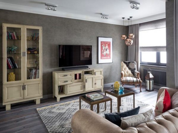
Living room
In the hall, steel shades will create a pleasant atmosphere in which it will be comfortable for residents, to relax and make friends. It is better to use muted tones of gray here, and in rooms with good natural light - cold shades of this color. For small rooms, in contrast, apply light warm tones that add a sense of spaciousness.
to contents ↑To make the living room look more lively, the interior is diluted with bright spots. The room should be decorated with interesting decorative elements, set beautiful furniture. Glass tables and chandeliers, metal elements: original door handles, forged parts look good in combination with gray.
Bedroom
In a room for sleeping, it is better not to conduct experiments on mixing a large number of shades. Here, 1-2 tones of gray are taken as a basis, diluting them with milk, caramel, pearl, cream colors. An example of a successful interior will be grayish wallpaper with light wooden furniture: a bed, a wardrobe. Adding bright colors to the interior is not worth it: they will not contribute to a full sleep. It is better to introduce accents of blue, lilac, pale green colors.

Bathroom
In the bathroom, you can use light gray tiles on the walls, decorate the floor in a darker tone, while making plumbing and textiles white. The bathroom in grayish tones must be perfectly illuminated, because most often there are no windows of its own, and the room may seem gloomy.
Children
Many believe that steel shades are not suitable for a child’s room. This is not so, because this color in its light colors gives a feeling of freshness, airiness. Pastel shades of gray will become an alternative to overly sterile white, moreover, they will be more practical. But the accessories and accents in the nursery should be made bright, colored and change them as the child grows older. So, in the girl’s room, curtains, a sofa, cabinet furniture can be pink, and then replaced with sets in brown, olive, beige colors.
to contents ↑Hallway
Steel tones in the corridor are the most acceptable option for this room. Walls, linoleum or laminate will be non-marking, because spots and dust on them are almost invisible.Depending on the style, gray tones can be combined with a brick wall, decorative plaster, liquid wallpaper, shabby boards, stone, wood, MDF panels. It is better to make the stretch ceiling white, and also introduce some more light elements so that the room does not look too hard.

Cabinet
In the design of cabinets, gray is used to give rigor and elegance. You can use all its shades, up to dark, combining them with each other. Parquet, laminate and interior doors in rich brown tones look good in addition to steel. Such an interior is harsh, brutal, so men especially like it. For some relaxation and a mood for a creative wave, it is recommended to introduce a little blue into the atmosphere, and green to increase the working capacity.
to contents ↑Accessories for gray interior
There are practically no materials with which gray color would not harmonize. It is universal and can be present in a shade of natural, natural and any artificial surfaces.

Jewelry
The interior in grayish tones can be supplemented with beautiful details: vases, figurines, souvenirs, mirrors and paintings. They go well with gray pearl, silver, chrome, bronze, glass, crystal elements.
Lighting
With the help of lighting, you can seriously change the overall picture in the room: make it darker or lighter. Grayish tones like the abundance of soft natural light, it is then that a person will see the purest shades that lift the mood. Artificial light is better to use in excess than in deficiency, otherwise gray will give shade. You should use a central chandelier, sconces, floor lamps, spotlights, and so that the light plays, creates a pleasant atmosphere.
to contents ↑Textile
Steel, silver curtains, a veil with a grayish pattern will give comfort to the bedroom or living room. Also, to enhance the feeling of home warmth, it is worth using rugs, carpets, in the kitchen - towels, tablecloths and potholders. It is better to purchase textiles made from natural materials: cotton, linen, wool, although a small percentage of synthetics will reduce the rate of color burnout.
to contents ↑
Bright accents
It is advisable to always decorate the room with interesting details: pillows with a beautiful pattern, warm rugs with a long pile, vases and floor lamps. Any room, even the most strict, can revive plants and flowers: orchids, violets, callas.
Natural materials
The introduction of natural textures: stone, brick, wood, fur, rattan, bamboo will help diversify the interior in steel tones. This will bring notes of peace and comfort to modern and industrial areas, characterized by the severity of the lines.
The effect of gray on the walls, floor, furniture
You can use gray tones in the decoration of floors, stairs, walls and even ceilings. The main thing is to choose the right combination and lighting.
Gray painted walls
Steel color can dominate the situation: it groups individual elements into a single whole. You can use acrylic, latex, silicone paints in the wall covering, such options are very popular in the loft, minimalism styles. In classical directions, gray-blue tones or pastel shades of gray are more acceptable. In this case, the windows should be large in any case, so that the room does not lack natural light.

Gray wallpaper
This option is closer to the classics, it is extremely often used in the living room, in the kitchen. Light colors, gray-pearl, gray-beige shades of wallpaper, canvases with a pattern or stripes, geometric patterns are welcome.
Gray floor
This method of floor design is well suited for French, Scandinavian style, classics, as well as high-tech. The graphite coating on the floor goes well with gold, beige or white tones of the walls. You can apply the grayish options for laminate flooring, linoleum, which will create a stylish and cozy atmosphere. If the floor is quite dark, it is better not to overload the room with massive furniture, otherwise the feeling of spaciousness may be lost.
to contents ↑Gray ceiling
Usually, pearl, silver, pastel gray tones are used as a shade for a custom ceiling. You should not make intricate ceiling structures at the same time: they will create an excessive shadow.

Gray furniture and decor
Gray furniture is an original, but rather rare solution. Pale shades of this color in furniture are perfectly combined with a dark floor, neutral walls, give the atmosphere prestige, luxury. Metal floor lamps, vases, candlesticks will help to decorate the interior.
Gray color and popular interior styles
In different styles, the conditions for using gray may vary, so you should consider the most famous of them in more detail.
Loft
The style of the "attic" or "attic" almost never does without gray tones. Paint of this color decorates the walls, they also use textured plaster or brick. Gray roller blinds, a “mouse” sofa, and coarse beams on the ceiling will fit perfectly with the loft style.

Hi-tech (techno)
Here, steel shades are also used often, combining with white, black, red colors, metal details and gloss.
Provence
Usually grayish tones are used in combination with lilac, blue, pink, which gives the interior softness, tenderness.
French classic
The ideal option is to paint the walls in gray-pearl color, which will be an excellent substitute for white and help visually expand the space. This style is not characterized by contrasts, only soft color transitions are allowed. Beautiful color combinations - gray with golden, cream, coffee, pink.
Scandinavian style
Here, the steel color will look good together with white and beige, while all textures should be as close as possible to natural ones. You can’t allow contrasts, you need a calm, but somewhat cool atmosphere.

Retro
In retro style, grayish tones can appear in the most unusual forms: “newspaper” wallpapers, chess coverings, interesting accessories and figures. Accent walls of a steel palette with a rough texture are allowed.
Art Deco
Here gray is in perfect harmony with other achromatic colors (white, black). Dark gray-blue tones are often used in the form of accents. The interior, if desired, is diluted with bright details.

Antique style
Antique is impossible to imagine without grayish shades. The interiors in this style necessarily contain a stone finish: marble, granite, as well as bronze details, plaster columns and exclusive elements. Acceptable colors, except for steel, are sand, white, beige, milk. Many expensive materials can be successfully replaced with modern artificial coatings that will look no less stylish and beautiful.