Contrary to popular belief, pink color in the interior is used not only in the design of girl's bedrooms. Using its various shades, you can create a harmonious and delicate atmosphere in any room, and even men will like the right color combinations.
- Color features
- What does pink color mean?
- Shades of pink
- Combination with other colors and shades.
- Pink with white
- Pink and cream
- Pink with gray
- Pink and green
- Pink with yellow
- Pink and blue
- Pink and red
- Pink with lilac
- Pink and black
- Pink and brown
- Suitable styles
- Modern style
- Classic
- Shabby chic and vintage
- Provence
- Scandinavian style
- The use of pink in different rooms
- Bathroom
- Kitchen
- Bedroom
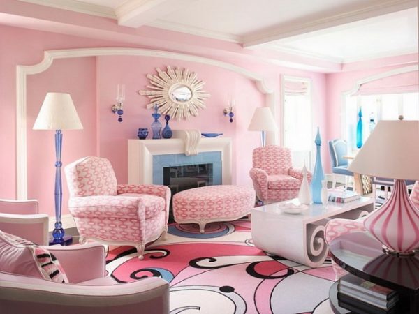
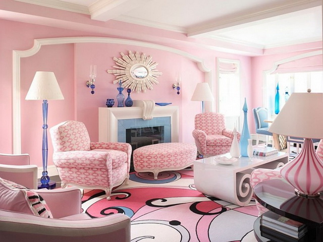
- Living room
- Children
- Hallway
- Features of color selection for interior elements
- Curtains
- Furniture
- Textile
- Decor and accessories
- Room decoration
- Walls
- Floor
- Ceiling
- Doors
Color features
Pink tones in interior design are used infrequently compared to the "classic" shades. Although the pink color looks very impressive, it is also able to lighten the room, give it spaciousness. An excess of shade can be a serious mistake of the designer: the room will tire a person. But with moderate inclusion in the interior, this gentle tone is able to calm, helps to relax, relieves stress.

What does pink color mean?
The colors are based on white and red - a neutral tone and a powerful, passionate hue. White softens the energy of red with its purity and innocence, turning it into a completely new color in value. Pink shades are natural, natural. They are visible in the first rays of the sun during the morning sunrise, coloring the heavens and inspiring hope. At the sight of a light pink object, the situation in a person leaves irritability and aggressive mood.
In psychology, this color symbolizes the feminine, as well as softness and the ability to smooth out “sharp corners”. Pink - the color of beauty, care, femininity - it sets up for positiveness and friendliness. Thanks to these properties, the shade is widely used in color therapy, because its positive effect on the state of mind has long been proven. In addition, the color has a very specific effect on the human body: if you look at the pale pink palette, fatigue, depressive mood pass, pressure normalizes.

Shades of pink
The color scheme of pink tones is multifaceted, it includes different shades: from pastel to purple-pink and fuchsia. Designers and colorists look for different colors on the tables, choosing the right combinations for a monochrome or contrasting interior.
The most famous shades of pink are:
- soft pink - a girlish color suitable for dreamers, romantics;
- light pink - a very delicate shade, ideal for the room of a newborn girl;
- pale pink - pastel tone, visually expanding the boundaries of the room;
- powdery pink or dusted - a muted shade that includes cool notes;
- raspberry - juicy, sensual tone, suitable for bright accents in the interior;
- dirty pink - the color of a faded rose, giving the room aristocracy;
- dark pink - a shade of purple wine, is used in the interior only in dosage;
- ashen pink - a warm shade containing weightless notes of gold.

Designers also use other light and dark tones of pink: flamingos, salmon pink, Hollywood light cherry, neon pink, lavender pink.
to contents ↑Combination with other colors and shades.
To make the room look harmonious, you need to apply the color of the rose sparingly, correctly combining it with other tones.
Pink with white
White perfectly complements pink in all its manifestations. Together they create an incredibly airy, delicate pair that makes the interior touching and exciting. An example of a successful decoration of a bedroom, a children's room is pink wallpaper with a white ceiling and the same accessories.
Pink and cream
All shades of beige, cream, caramel, milk look no less favorable against the background of the pink palette than white. This color combination looks elegant and stylish. If you use “dusty” shades of pink, the interior will completely lose its sweetness and can be used in the living room, which provides a strict style.

Pink with gray
Such a tandem is also very successful and pleasing to the eye. The design of the room in gray colors with a dilution of pink is considered elegant, noble. Textiles in pink and white from velvet, silk, with sparkles will perfectly complement the picture. Instead of gray, silver and all shades of metallic can be used.
Pink and green
As another color of nature, green perfectly complements the shade of a rose: together they give the room coziness, a warm atmosphere. Also, such a duet looks refreshing, uplifting, because designers often use it to equip a kitchen, dining room. Different shades of green can be used in accents: for example, as the color of curtains, wraps for chairs, a sofa or armchairs, and various accessories.
Pink with yellow
At first glance, the combination looks unusual, but due to its proximity to natural sunlight, it is widely recommended for interiors of living rooms, bedrooms, and nurseries. Yellow, the color of gold in its soft shades, blends perfectly with the dusty pink palette. For deep yellow, yellow-red or tan shades, it is better to choose a pastel pink palette and complement it with white, beige colors, otherwise the room will appear dark.

Pink and blue
Blue, turquoise can perfectly "get along" with pink, despite the obvious differences in tonality. It is best to use shades of blue and rose in the bathroom and only in their light variations: together they will give the interior a sense of airiness.
Pink and red
The most profitable duet will be pastel pink in combination with burgundy color, which is often used in a classic style. With the correct dilution of the light shade with dark, an interesting and elegant interior is obtained, but with a glut of red tones the room will be gloomy, repulsive.
Pink with lilac
To work with tones close to each other, such as lilac and rose, you need to be very careful. If the accents and proportions are chosen incorrectly, instead of mystery and romance, you will get a cloying picture that quickly gets bored. It is best to combine light pink tones and more rich lilac accents in the bedroom interior.

Pink and black
The combination of roses and a small amount of black accents is widely used in the design of living rooms, French-style bedrooms. Also in combination with other, more juicy colors, this tandem is inherent in oriental style.
Pink and brown
The shade of brick, as well as brown and woody notes, are no less often used by designers in conjunction with pink tones. This option is classic and can be introduced into the interior of a bedroom, hall, children's room.
Suitable styles
Compliance with the style orientation is no less important than the selection of the right color combinations. Pink will fit into various interior styles: vintage, classic and others.
Modern style
The design of the rooms involves the use of a variety of natural and artificial materials. Furniture should not have fanciful shapes: only straight lines are allowed. On the walls, the use of photo wallpaper or various geometric patterns is popular. Usually pink in a modern style is used as the main color of the walls, but only in its dim versions.

Classic
The classic style is based on smooth transitions, standard forms, modesty and restraint. Therefore, from pink shades, dusty, ash, pastel colors are most often used. Wallpaper can be plain or with a dull pattern. Combinations of pink with gray, wood, beige scales are welcome.
Shabby chic and vintage
In the vintage style, bright or muted pink shades are used accent, for example, as the color of curtains, chest of drawers, wraps on a sofa or bed. This will give the room a charm. The style of shabby chic includes gentle tones and cozy details, light pink in the decoration of the walls here will become one of the most acceptable options.
Provence
Warm, romantic Provence style has a touch of antiquity, while it is airy and gentle. Interior colors in this style are usually pastel, other light pink colors are acceptable. Ash-pink walls will look beautiful together with light furniture and greenish details.

Scandinavian style
Usually, white color prevails in this design direction: it is found both in the decoration of walls and ceilings, and in furniture. Materials must be natural, this applies to both floor coverings and textiles. Pink is used only accent and in a small amount.
The use of pink in different rooms
Pink color can be applied in almost any room. The main thing is to correctly enter it into the interior. This tone does not like too bright chandeliers, so it is better to disperse lighting systems around the perimeter. The room will be made cozy by soft, diffused light.
Bathroom
Pink is quite suitable for the bathroom, especially in combination with gray, peach, blue, white. The mirrors in the bathroom will look great: in them the pink color is reflected especially beautifully, gives a gentle tone. In the large bathroom, you can decorate two walls with a pinkish finish, in a small one it is better to use this shade for accent decoration on a white background.

Kitchen
Pale pink in the kitchen has a get-together, improves appetite. This can be a problem: against the background of such an air decor, the craving for sweets increases. But the general atmosphere will turn out to be cheerful, especially when diluting the color of the rose with bright tones: green, blue, orange.
It is possible to make pink only the dining room area, and the worker - to finish with a different, more modest color, for example, wood, coffee, beige. The wall covering does not have to be monophonic: pink drawings on the wallpaper, flowers and intricate ornaments are quite appropriate in the kitchen. The fronts of the kitchen in pink rarely look good, it is better to use only a dark crimson palette for partial decoration of furniture. But the tile of the kitchen apron may well have all shades of pink, with it the room will sparkle with new colors.
to contents ↑Bedroom
In this room, pink and its shades will be very appropriate. Even a man will like the decoration of the room in muted pink-beige, pink-peach tones, pastel and ash shades. The glossy stretch ceiling of white color is perfectly complemented by a composition of photowall-paper on one wall and modest monophonic wallpaper on other walls. If the ceilings are low, it is best to use light companion wallpapers to provide a zoning effect.

to contents ↑In the bedroom, accessories and textiles in the color of roses will be an interesting solution.For example, curtains or tulle can have an ornament of the same color as the frames for photos, paintings, vases, candlesticks and candles, interior figures and decorations. Original in the bedroom, decorated in vintage style, looks pink-salmon closet or chest of drawers.
Living room
The optimal solution is to create a cold pinkish background in the living room with wood, gray, white, and beige shades to complement its furniture. If the walls are brighter, the rest should be contrasted and as light as possible. In the Indian style, pink and orange are combined in the living room. To give aristocracy, the shade of a rose is combined with lavender, mint tones.
Children
Pink color is widely used in the design of girls' bedrooms. Of course, you can make the decoration or furniture bright by bringing the interior closer to the "Barbie doll style", but more often than not, such an atmosphere quickly bothers. It’s better not to introduce a lot of saturated tones, but give preference to those that are able to pacify, cause a feeling of magic and tenderness. The base color should be pastel or pale pink, and for juicy shades take the game corner or use them in accessories.

Hallway
Decorating the corridor with a shade of rose is not common. Although the palette of pink flowers is rich, and you can even find a suitable one for this room. It is better to choose calm tones: pastel, with a hint of peach, haze in combination with gray or steel colors. To illuminate the corridor, it is worth using LEDs and spotlights: soft light will make a room without windows very cozy.
Features of color selection for interior elements
Decor, various accessories of pink color are very popular: they allow you to change the appearance of the room without cardinal decisions and repairs.
Curtains
Textiles on the window can create a cozy, warm atmosphere in the house. A delicate rose-colored tulle harmoniously looks with curtains of a darker color or, on the contrary, with contrasting curtains. For the kitchen, balcony, often used blinds, curtains, Roman curtains: they give the room sophistication and bring it closer to the modern style.
Furniture
In the living room, the main object of attention may be a sofa complete with armchairs in a light pink hue. Particularly impressive, such furniture looks on a dark brown floor. In the neoclassical style, such a solution as dusty pink velvet furniture is popular, it is also suitable as an element of oriental design.
The bed with a leather pink headboard will bring romance to the bedroom interior - the product is perfect for the styles of shabby chic, Provence, and romanticism. A cabinet of such an unusual shade, especially a restored antique one, is an integral attribute of vintage and retro styles.

Textile
In addition to curtains and tulle, from textile products of pink color, designers often advise plain rugs with long nap: they fit perfectly into Provence, classics, shabby chic, Scandinavian style. Cushions for chairs, sofas, chairs and stools can be in harmony with the carpet, while the interior will look finished. In the kitchen, a touch of tenderness will be brought by napkins, tablecloths and towels with tints of shades of roses.
Decor and accessories
Various decorative elements are introduced into the interior at the last stage. Pink is a delicate, romantic color, but accessories can also have a strict form, this will make the design more interesting. Candles, lamps, lanterns, plates and figurines suitable for a particular style will refresh even the most modest-looking room. Accents can have a brighter color: for example, a shade of fuchsia, they will look great in a beige and pink interior.

Room decoration
Pink color can participate in almost any type of finish, it is only important that it is dosed and correctly applied.
Walls
To adjust the space of the room and choose the right combination, usually use two colors in the main wall decoration. The pink and white gamut is considered to be classical, in minimalism and modern style it is worth using wallpaper, paint in pink and gray tones.For walls, photo wallpaper with floral motifs, tiles or unusual pink brick are also suitable.

Floor
Sex of the color of a rose is a very non-standard solution, but a carpet of such a shade may be relevant when arranging a room for a girl, bedroom. Also, some interior styles use pink and white marble floors. A dirty pink tile combined with white walls and bright decor may be suitable for the bathroom.
Ceiling
False, suspended, multi-tiered ceilings - an interesting option for the design of the living room or bedroom. Glossy coatings visually increase the space and perfectly harmonize with wallpaper with photo printing, especially when the pattern or shape of the ceiling echoes the decoration of the walls.
Doors
Doors of an unusual hue will become a catchy, elegant detail of the interior. If you draw in pink not only the door frame, but also the floor or window frames, you get an interesting combination.

Sometimes it’s enough to use several contrasting details to completely update the interior and make it unique and memorable!