The color scheme plays a huge role in the comfort of a person in the house. Also, the main color of the room performs a number of practical functions: visually changes the parameters of the room, adjusts the quality and quantity of light, and even affects the mood. To achieve positive effects, you need to know the rules for the selection and combination of tones.
- Features and psychology of color
- The role of color in the interior
- Shades of orange
- Combinations with other colors
- The black
- White
- Green
- Yellow
- Blue
- Beige
- Gray
- Brown
- Purple
- Pink
- Orange in the interior of the rooms
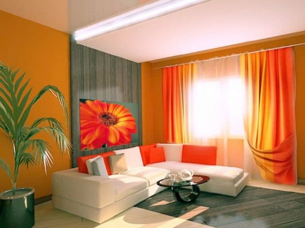
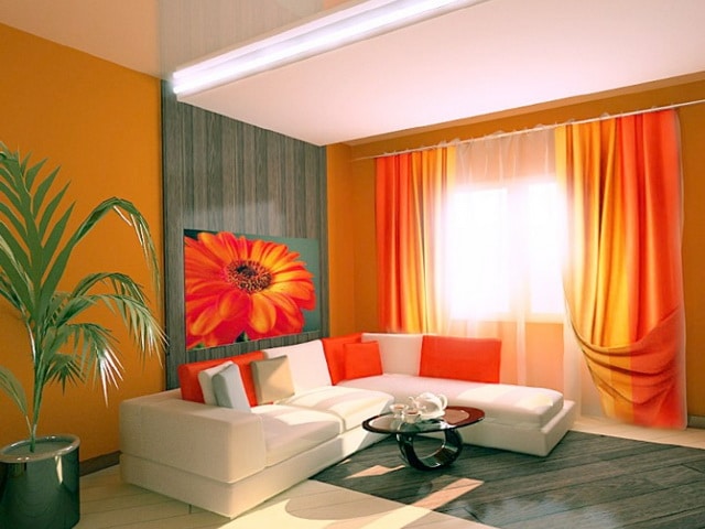
- Living room
- Orange kitchen
- Bathroom
- Nursery interior
- Bedroom
- Hallway
- Cabinet
- Orange Room: Decoration
- Walls, floor, ceiling
- Orange furniture
- Accents in the interior
- Style selection
- Classical
- Modern
- Country
- Loft
Orange color in the interior is popular and refers to fashion trends in design art. It is quite bright, but has a rich palette, so it can be matched to any room.

Features and psychology of color
An orange hue appeared as a result of mixing yellow and red. It is the warmest in the gamut and completely eliminates cold tones and subtones. In psychology, orange is considered one of the most energetic, purposeful colors, in addition to this, from the yellow "parent" he received a lot of friendliness and optimism.
Strong people with a bright creative beginning prefer orange color. He is also loved by children who seek to know the world. Shades of orange are characterized as sensual, dynamic, life-affirming, they are associated with youth and charisma. Orange tone has real benefits for the body: it has a beneficial effect on the work of the most significant organs (brain, gastrointestinal tract), improves mood, gives a feeling of happiness.
In orange, there is no aggression that is inherent in red, so it does not cause a feeling of anxiety and can be safely used in the interior. This color in its light variations expands the boundaries of the room, increases the volume of objects. He is able to change the purity of the primary color of many decoration elements, making it softer. Some tones of orange are completely absorbed (for example, pink), so there are certain limitations when designing an “orange” interior.

Shades of orange are very popular in design, they are suitable for almost every room. Especially popular is the kitchen in orange: it invigorates and causes a surge of energy in the morning. It is believed that the shade not only increases appetite, but also improves the absorption of vitamins by the body, although in excess it can quickly annoy a person.
to contents ↑The role of color in the interior
Since orange does not even have a hint of a cloudy mood, it is believed that true optimists choose it. In the interior, color evokes associations with the sun, a summer day, fruit and sea sand. These properties positively affect the overall atmosphere in the house, so the color is widely used in various interior styles. It is universal, not subject to division into "female" and "male" options. This allows you to use bright colors to equip the nursery, regardless of the gender of its owner.
Often, orange furniture is used in the rooms: headsets, sofas, armchairs, cabinets. It must be remembered that such objects will seem larger than they are, and in small rooms this can lead to a negative effect. Orange accessories, such as rugs, fluffy rugs and bedspreads, will also look more voluminous. All these color features need to be considered when you include it in the interior.

Shades of orange
This color does not have cold tones, all the available shades are soft, warming. Most often, muted colors are used for the interior, which, in addition to red and yellow, include an admixture of beige, brown:
- terracotta;
- ocher;
- salmon;
- bronze;
- rust;
- orange pink;
- copper.
As bright accents in the room, it is quite possible to use more rich, saturated shades: amber, coral, tangerine, honey, pumpkin, mahogany, international orange, carrot, gummig. Gentle light and pastel colors include light apricot, peach, cream and peach shades.

Combinations with other colors
When choosing companions for orange, you need to be careful, because not all shades are suitable for it. There are those colors that cause too extravagant combinations or are lost against the background of an orange.
The black
The combination of black and orange is suitable for daring, confident people, it turns out to be brutal and even a little aggressive. The color of the orange will look even brighter, which is not always appropriate. In a living room, it is better to dilute this combination with white, pale pink, beige shades.
White
This color is ideal as a pair for orange, emphasizes it, while softening itself and does not look cold anymore. Orange and white will look best in the kitchen, living room, bathroom.

Green
Green, like orange, is found in nature, and their combination will resemble a fruit basket or tangerine tree, and also be associated with holidays. It is best to choose the warm, soft shades of green so that it does not contradict the warmth of the orange tone.
Yellow
The combination of bright orange and delicate yellow colors is ideal for lovers of rich, cheerful interiors. Such a palette will bring summer notes, remind you of sunny days and return to a carefree childhood.
Blue
Different shades of deep blue have a positive effect on the emotional state of a person, symbolizing the sea, the sky. In combination with an orange, they create an attractive duet. Nevertheless, bright blue tones should be used to a limited extent, in the form of accents, because they are quite dark and can cause a depressive mood.

Blue combined with orange will remind you of summer with its clear, cloudless sky. Such a “natural” tandem will perfectly form the basis of the interior of a nursery, living room or bedroom, especially if the orange is also not too bright, but belongs to a light palette.
to contents ↑Beige
By its nature, beige color is very calm, so it helps to balance the juiciness, vigor of orange, reduce its "fiery". A good option would be a room in which the wallpaper, the paint on the walls is beige, and the furniture or textiles are orange.
Gray
The duo of orange and gray can be considered successful, since the achromatic tone muffles the excessive saturation of bright colors. However, an excess of orange can absorb gray, which will simply be lost on such a juicy background.

Brown
Brown is preferred by people who need a rest, longing for peace after a hard working day. The use of an orange palette will not allow brown to make the room dark and dark. The combination may look too strict, while giving solidity, elegance.If such an effect is not needed, it is worth using chocolate shades of brown in combination with flashy tones of orange: then the interior will turn out to be unusual and attracting attention. Beige, grayish tones will help to dilute the combination a little.
to contents ↑Purple
The combination of purple and orange is not always successful, because these colors are difficult to combine. The duet turns out to be too sharp, controversial, although it looks beautiful in living rooms and hallways. To the interior was attractive, the similarity of shades in such indicators is important:
- brightness / dullness;
- blur / saturation;
- cleanliness / dustiness.
The brighter both colors, the more aggressive the room will look, so the introduction of a light shade is a must. Ideal options are cream, white, gray, sand tones. It is better to complement the orange walls with purple decor, and not vice versa.

Pink
This combination is rarely used in the interior, since colors do not harmonize well with each other, if used in a duet. Merging, they visually create intermediate tones, and not always successful ones. This combination is also not expressive, although under certain conditions it may be unusual. You can improve the picture by applying different shades of pink as accents, as well as by diluting the duo with white, gold, blue, green colors.
to contents ↑Orange in the interior of the rooms
Most designers believe that orange tones are most appropriate in the kitchen interior, where they will have a friendly conversation during tea drinking. For the same reason, the color of orange is popular in the dining room, and it also stimulates appetite. For positive thinking, orange is included in the setting of a study. No less beautiful, the color will look to the nursery, because kids need a sense of joy and happiness. In the bathroom and other rooms, orange can also be used, although it has some limitations.
to contents ↑
Living room
If you apply the “right” shades of orange, it will create a unique friendly atmosphere in the living room. You can use it in the form of accents, for example, as the color of curtains, photo frames and paintings, wraps on the sofa. Textiles can make up the original composition, completely changing the appearance of the room. Looks great orange with brown furniture, especially against the background of beige walls.
Orange kitchen
Usually, standard bright shades of orange are used here, which make the room incredibly warm and juicy. Visually, you can expand the space with a light ceiling and walls in combination with an orange kitchen unit. There is another option: to make the walls pastel orange or slightly darker using chocolate furniture and light accessories, as well as appliances (fridge, microwave, kettle).
to contents ↑Bathroom
Here too bright orange colors will not be appropriate, because most often the bathroom does not differ in large dimensions. It is better to use more delicate shades - peach, light apricot, light salmon. Also, as a main finish, they often use beige tiles with a rare orange pattern, coupled with orange accessories. For the floor, you can apply soft tones - terracotta, rusty.

Nursery interior
The color of the orange will refresh the child’s room, give vitality, but with excessive brightness it can overload with its activity. As a background, he will quickly get bored with the baby, so it is better to use the lightest, pastel shades (peach, light apricot) for the walls. Such paints will look sunny from natural light, especially when located on the south side.
An excellent design option for a child will be the use of an accent wall. It can be made bright, but placed at the head of the bed so that it is not visible to the child before bedtime. Small children are often hung over the bed with a canopy of light color, which reduces the visibility of bright orange zones.In a nursery, this juicy shade is diluted with light shades of gray, blue, green, white, beige, cream.
to contents ↑Bedroom
In the bedroom, saturated tones of orange are not used: they will interfere with relaxation, will distract from a good rest. It is better to use a pastel range, which will give freshness to the room. Brighter tones are permissible only in decor: a pair of paintings, vases or bedspreads with a rug is enough to make the atmosphere more lively and joyful.

Hallway
Orange in the hallway will meet the hosts and their guests every day, giving a wave of positive. This juicy color will make you communicate, will charge you with an excellent mood before going to work. You can use mid-orange tones for walls or apply bright accents: hangers, rugs, bedside tables and key holders.
Cabinet
Gloss is not used in the home office: orange is acceptable only in a matte, soft, not too saturated version. Such tones will add warmth to the room, enhance performance. If the orange is dark, after a whole day of work, you can feel the heaviness, depression, because in this shade there is a lot of aggressive red tone.
Individual orange details will look interesting and modest in the office, which is made in chocolate and beige tones. For example, the color of orange or terracotta can have shelves, chairs, decorative elements, partitions.

Orange Room: Decoration
Depending on the interior, the purpose of the room and the preferences of the residents, orange tones can be included in various types of decoration or decor.
Walls, floor, ceiling
The walls in the room can be decorated with wallpaper, plaster, brickwork or paint. It is not necessary to use a plain orange coating, there are options for creating a more original interior. For example, you can stick murals or wallpaper-companions, attach interesting interior stickers or adopt unusual art techniques for painting walls. A kitchen apron can be laid out with orange tiles, but only on the condition that the color of the headset does not meet the orange or is not dominant.
Bulk orange floors - an original solution. Most often they are introduced into the interior in the styles of retro, vintage, modern. In the bathroom and in the kitchen, you can use tiles with an orange pattern, in the living room - beautiful carpets. Orange-colored ceilings are rare in residential buildings, although they will definitely make the room memorable. It is better to arrange the ceiling in a high room in such a way so as not to create a pressing effect.

Orange furniture
A sofa of juicy fruit colors will certainly become an object of general attention in the living room, clearly indicating the relaxation area and separating it from the rest of the room. It will be best if the sofa is made of velvet, thick fabric, leather. The color of armchairs and chairs can be combined with the tone of the sofa or these pieces of furniture become independent accents in the room.
In the styles of shabby chic, country, oriental stylistics, often bright cabinets are used, including antique ones. Their surfaces can be glossy and matte, with mirror inserts or with pieces of translucent plastic. Orange color in a cabinet or chest of drawers can have both facades, and individual shelves, drawers. An orange-colored bed is an infrequent phenomenon, it is much easier to make it into this juicy shade with the help of bed linen or a bedspread.
to contents ↑Accents in the interior
Accent elements are designed to create a mood in the room, to strengthen the stylistic orientation of the interior. Here are the basic furnishings that can have an orange color and give the room a finished look:
- pictures;
- curtains;
- unusual curtains;
- pillows;
- floor mats;
- photo frames.

Style selection
Depending on the style, the order of applying the orange color may vary: in some cases, it acts as a background, in others - as accents.
Classical
This style is characterized by restraint, the presence of simple lines. Orange here is used in the form of a moderate in color shade in combination with modest furniture without a hint of extravagance, pretentiousness. Mirrors that visually expand the area of the room will look good.
to contents ↑For small rooms, you should choose only light orange tones, because too bright colors will cause a visual decrease in size. Apply orange in the bedroom, made in the classical style, it is better in textiles, tablecloths, curtains, upholstery chairs. Preference should be given only to natural fabrics and finishing materials.
Modern
This style is highly functional. All objects and lines should be straight and simple. Bright patterns are not used for this design direction, preferably monophonic surfaces. It is permissible to paint one wall in a room in juicy orange or to zonize a space with it.
Country
Country style includes the maximum amount of natural materials, especially wood, forging, green plants. Various warm blankets, carpets, soft cozy textiles made of cotton, wool, linen will look good here.

Loft
Usually in this style, orange is used only in the form of rusty, terracotta or brick. Such tones are well combined with cold shades of metal, light and dark neutral colors. Small orange accessories will help soften the style, making the room more comfortable and inspiring a joyful atmosphere.