Have you ever noticed that some rooms can be called the most comfortable (they are kindly filled with good and pleasant memories from childhood), while others, on the contrary, cause irritation. How can this be explained? Here it is not a matter of furniture or furnishings; everything is much simpler.
- Too much white
- Inappropriate color zoning
- Low contrast
- Forgot about lighting
- Floor color selected last
- Missing primary color
- Contrast colors do not match
- The interior uses one color
- Furniture color not taken into account
- Using very vivid colors

Incorrectly selected colors can make even the most comfortable room repellent, therefore, painting the interior must be treated very carefully. If you are on the verge of redecorating and deciding what color it is to paint the walls in the bedroom, living room or nursery, then use our useful life hack.
Too much white

White color in the interior is not always a sign of perfect cleanliness and open space. Do not forget that such walls will be the most easily soiled, and if you have large windows in your room, then natural sunlight will bounce off them and blind your eyes, which is not very nice. Much more attractive are walls painted in neutral beige tones or in ivory color.

Inappropriate color zoning

Painting walls really helps to visually divide a living room into several separate zones: a bedroom, a work area, a living room, a nursery, etc. However, try to use monotonous painting, avoid gradients, motley thin lines and a mixture of several colors. This combination of shades will greatly irritate the eyes.

Low contrast

Solid walls, furniture, carpet, lampshade, wall clocks and photo frames - this combination makes the interior faded, dull and even alienated. Do not be afraid of experimentation (within reason, of course). Play in contrasting colors and you will see how your room comes to life and becomes unusually cozy.

Forgot about lighting

Above we mentioned the meaning of natural sunlight. Table lamps, chandeliers, sconces and floor lamps also play an important role. Doing “makeup”, do not forget about how your interior will look in the dark, when the walls are illuminated only by electric light. Perhaps you should choose a paint a few tones lighter than usual.

Floor color selected last

Most often we pay attention to the walls (since they are visually at eye level), then to furniture, home decoration and only then to the flooring. When making repairs, choose the color for it last, and then your concept will be concise and attractive. There is no need to make the floor too contrasting with the walls, since this way it will attract too much attention.

Missing primary color

Before you start painting, you need to determine the gamut. Red color does not combine with green, and gray - with purple. Such an interior will be frightening and will not give a relaxing and long-awaited rest. Properly select a palette and get a great interior solution. On the Internet you can find a lot of good examples.

Contrast colors do not match

Contrast can play into the hands, and can make the design intimidating and even vulgar. Avoid too sharp tones and transitions. Colors visually should be different from each other, but at the same time they do not "scream" and do not cause negative emotions.

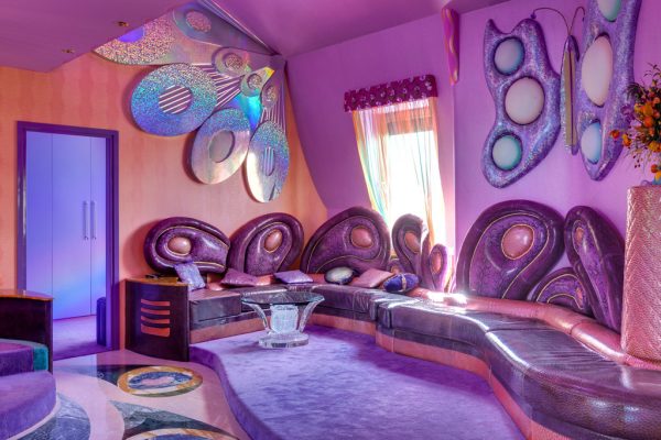
The interior uses one color

Monotony is not the best solution for living rooms. It can be suitable for a nightclub, but not for an apartment, especially when it comes to non-standard colors: cobalt, indigo and others. Break the concept into several halftones, and you will see how attractive your home will be.

Furniture color not taken into account

Furniture plays a key role. If the whole interior is made in pastel colors, then a bright green or orange sofa will turn into an unpleasant stain that will always be striking and distract attention from other household items. Try to make the furniture as concise as possible, not only in style but also in color.

Using very vivid colors

Always give preference to more neutral tones. Believe me, even if you are attracted by a bright yellow color (like a lemon peel), in the apartment where you spend the most time, it will be very annoying. “Mute” him, and you will probably see the difference.