By tradition, the main experts on color trends in fashion and other areas of life are employees of the Pantone Laurie Pressman color institute. The American company developed the Panton color model back in 1963, and since then it is from the tones of the standardized Pantone Matching System that the most beautiful colors are selected and fashion trends are determined. Experts presented a forecast for the most relevant shade of the future warm season. The color of the summer of 2019 is Living Coral, it was he who bypassed red, orange and yellow, which were also in the list of favorites.
- Living Coral - 2019 color
- Basic gamma
- Main palette
- Living Coral
- Fiesta / Fiesta
- Jester Red / Wine
- Turmeric / Turmeric
- Pink Peacock / Pink Peacock
- Pepper Stem
- Aspen Gold
- Princess Blue
- Toffee / Toffee
- Mango Mojito / Mango Mojito
- Terrarium Moss / Terrarium Moss
- Sweet Lilac / Sweet Lilac
- Neutral shades of spring and summer 2019
- Soybean / Soybean
- Eclipse / Eclipse
- Sweet Corn
- Brown Granite
- Apply Living Coral Color
- In social networks
- In fashion and accessories
- In cosmetics
- In product design
- In the interior and decor
- In packaging design
- What colors does Living Coral match?
- Focal point
- SHIMMERING SUNSET
- SYMPATICO
- TRIPPY
- UNDER THE SEA
Living Coral - 2019 color
Colors and shades on the catwalk serve as the main indicator of fashion trends, which then begin to be involved in all areas of design. Pantone Fashion Color Trend Report is a guide to color trends for each season, which is useful to the designer.
The ideal color of 2019, according to Pantone, is coral, or rather, living coral. It is truly unique: it combines a little red and orange, a drop of gold and sun. The choice of specialists was simple: in a century when a person prefers live communication to virtual, he lacks warmth and care. It is Living Coral that symbolizes the desire for support, coziness, comfort, personifies cheerfulness and optimism. This color is bright, but gentle, soft, besides it is included in the natural palette, natural corals have such a shade.

Basic gamma
The Pantone Institute used to be a single palette of 10 basic tones, but since 2017 the rules have changed. Now all the colors of the palette are divided into basic (neutral, combining with most other tones) and basic (most fashionable, used in clothing, design). The basic gamut now includes 4 colors that can be used as a base and combined with tones from the main palette. This will help to realize the boldest idea and create a fashionable image.
to contents ↑Main palette
In 2019, the main range included 12 tones, all of them are trendy, but coral is the leader.
Living Coral
Bright orange, softened by a golden glow, is a living coral. It is so soft and noble, full of determination and positive energy, that literally personifies the coming summer. Already in winter, coral appeared on the most fashionable catwalks, entering the line of clothing and even shoes.

Fiesta / Fiesta
Fiesta is a deep red-orange color that sparkles with passion, enthusiasm, brings notes of celebration, excitement and fun. It differs from scarlet in the presence of a soft orange undertone, which is why it is recognized as very effective.

Jester Red / Wine
This color resembles the usual wine, but is more muted. He is noble, passionate, perfectly emphasizes the whiteness of the skin.Elegant Jester Red is suitable for creating evening dresses, light sundresses for summer, for business style, as well as for leather products: belts, bags. It goes well with light red, red-orange tones and greens.

Turmeric / Turmeric
Orange-yellowish color, looks perfect on tanned skin. He gives thoughts about the orange fresh, fills with vitality, gives an excellent mood. It is not necessary to wait for the summer to wear turmeric-colored clothes, it will be relevant in the spring. Turmeric with green will look harmonious and green with blue.

Pink Peacock / Pink Peacock
This is a crimson color, already lit up in the autumn gamut. It can be worn in the summer, because creating a vivid look with Pink Peacock is not a problem. “Peacock” looks great with black, it also combines well with soft pink and white.

Pepper Stem
A discreet shade of young green with a soft yellow undertone is used to soften too bright tones of the fashionable palette. It is especially well combined with red, orange shades, suitable for satin, velvet, natural fabrics.

Aspen Gold
The presence of this color in the summer palette proves its popularity not only in the fall. There is no place for despondency in it, only the rays of the sun, the warmth of beaches, the taste of fruits. Color gives joy, vivacity, good mood.

Princess Blue
Fashionable palettes are never without blue. In the current season, the rule has remained unchanged: in the gamut there is a very rich, deep blue tone of Princess Blue. Royal color will be the only cold shade of the palette. It is used to create classic images with white, to form avant-garde models with any shades of the main palette.

Toffee / Toffee
The “toffee” color of toffee is a shade of chocolate with a soft undertone of cinnamon. It is designed to give a feeling of comfort, warmth, coziness, helps to soften the riot of bright colors of the palette, gives depth to the image. In evening bows, it is recommended to combine toffee with milk, beige, cream, in daylight - with any rich tones.

Mango Mojito / Mango Mojito
In the Pantone main palette, there is another tone from the yellow-orange-gold palette - this is mango mojito. He warms, inspires thoughts about the beach. In clothes it is combined with green shades, and for spring looks it can be combined with sand, beige.

Terrarium Moss / Terrarium Moss
This shade symbolizes spring and summer, is green, but unusual. The tone is deep, more like the color of foliage in the jungle, at the same time, discreet, soft. Terrarium moss is well suited for monoluk, and is also equipped with white, gray, olive tones.

Sweet Lilac / Sweet Lilac
This is a pinkish tone with a hint of lavender, very delicate and soft. It harmoniously looks with light, beige colors, as well as with deeper wine and blue.

Neutral shades of spring and summer 2019
For office and other everyday life, basic colors are useful, on the basis of which you can create a beautiful wardrobe. If desired, they are easily combined with brighter shades, but by themselves they will also be in demand.
Soybean / Soybean
Soft beige color with a natural look and natural appeal. This delicate tone is perfect for basic wardrobe items.
Eclipse / Eclipse
Dark blue color reminiscent of the night sky. It will replace black, will become a real highlight, an unusual detail.

Sweet Corn
Milky white shade diversifies the wardrobe, it will be contrasting for dark or bright colors, suitable for basic things.
Brown Granite
A luxurious shade of brown, very deep, not red, but not too dark, fits absolutely everyone.
Apply Living Coral Color
Where can I use the “live coral” color so fashionable next season? The scope of its application is diverse and is not limited to exclusively fashion shows.
In social networks
Orange is a popular solution when designing social networking sites. Coral looks no less bright, cheerful, it inspires, helps in communication and attracts the attention of a person with its warmth. This shade full of care is perceived as close, related, which is so important for establishing virtual contact.
In fashion and accessories
The color has been adopted by the most famous fashion houses: Hermes, Moschino, Marc Jacobs and many others. At Fashion Week shows, coral is observed very often, but in ordinary life it can also be used.
Living Coral is an inspiration for experiments; it suits women, men and children. With its help, changing patterns and saturation, you can create both everyday and sophisticated wardrobe options. “Coral” is also suitable for gloomy winter weather, it can be started to be used right now to combat melancholy.

In cosmetics
Coral color is suitable for any skin tone. On its basis blush, lipsticks, shadows, nail polishes, lip glosses are created. Sparkles, rhinestones, which are also used in the creation of decorative cosmetics, are perfect for this shade. Universal products are also created that can be applied as a blush, lipstick and eye shadow: in the color of “live coral” the makeup looks great.
In product design
Thanks to cheerfulness and positive color is used to create grocery packaging. Popular are not only the line of children's food, but also juices, sweets and even meat products.
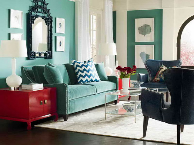
In the interior and decor
The coral tone in the interior is a bold decision. It is great for the kitchen, hallway, bedroom. As the color of comfort and warmth, “coral” is used in the design of carpets, upholstery, wallpaper, as well as accessories and textiles.
In packaging design
The warmth and affability of color - all that is needed to produce the perfect package that attracts attention. He literally beckons the buyer to take the goods, which is what marketers use with success.
What colors does Living Coral match?
In addition to designating the most fashionable shades, the Pantone Laurie Pressman Institute experts developed various color combinations where they used Living Coral and the matching tones.
Focal point
This palette includes coral, as well as its environment from more restrained, calm tones: gray, green, purple. The latter, coupled with the "living coral" literally come to life and become less stringent.
SHIMMERING SUNSET
This palette is called "flickering sunset." There are bright, bold colors, reminiscent of the sky illuminated by the rising sun or sunset. Coral looks great next to tan, purple, pink shades.
SYMPATICO
The tones of this palette are widely used for the production of decorative cosmetics, so they were combined into a separate palette. In addition to “living coral”, this includes pink, brownish warm shades, as well as two more orange-peach tones: “Coral sand” and “Sunny coral kiss”.
TRIPPY
The Trippy palette is the brightest, most explosive, it includes neon shades of all colors of the rainbow.

UNDER THE SEA
Corals live in the depths of the ocean, on tropical islands. This palette is reminiscent of this, where the main color of the coming summer is adjacent to blue, green, yellow, and lilac tones. The latter remind of the bright tropical fish living in corals. Any palette can be used to form a wardrobe and a modern interior, since it reflects the most fashionable trends in color.


