Red symbolizes passion, will, desire for victory. Designers are very fond of its different shades, so the red color in the interior is very popular. Difficulties can arise only when selecting companions for such a bright tone, because not all “neighbors” in the color circle are combined with it. It is better to use red to highlight accents, although in different styles it can even become the main background of walls or the color of furniture facades.
- The meaning of red and its shades
- Advantages and disadvantages of red in room design
- Red combined with other colors in the interior
- Red and white interior
- Red and Yellow (Orange)
- Red and beige
- Red and blue
- Red and green
- Red and brown
- Red and pink
- Red and gray
- Red and turquoise
- Red and purple
- Red and gold
- Red and black
- What styles suits red
- Classic
- Loft
- Minimalism
- Provence and Country
- Renaissance
- In which rooms is red appropriate
- Kitchen
- Bathroom
- Living room
- Bedroom
- Children's room
- Hallway
- In what details to implement color
- Floor, ceiling, walls
- Furniture, textiles and decorations
The meaning of red and its shades
The red color in the palette is considered the most emotional, passionate, sensual. In psychology, he is associated with pressure, strength, power, symbolizes leadership, determination, self-confidence. One has only to recall the color of the mantle of the royals, the armbands of the champions, on which path the "stars" stride to receive bonuses. According to psychologists, this shade increases performance and endurance, but in large quantities it can be dangerous, because it will cause:
- aggression;
- hatred;
- fear of danger.

It is noticed that modest, timid people do not like red color, although if it is available in the interior, it is possible to strengthen such qualities as determination, responsibility. In the design of apartments and offices, different shades of red are often used. These include both saturated and muted tones:
- brick;
- terracotta;
- scarlet;
- wine;
- burgundy;
- dark coral;
- alizarin;
- purple;
- blood red.
The brightness of the red color may depend not only on the specific shade, but also on the type of material. For example, red glossy plastic for a kitchen unit will look more defiant than matte MDF surfaces of the same shade. Calm red tones look restrained, therefore indispensable for creating elegant, rich interiors of the living room, study.

Advantages and disadvantages of red in room design
Typically, red is preferred by people who are bold, with an active lifestyle, as well as workers in creative professions. It is important only to choose a shade of this color, pleasant to the eye, and the house will be comfortable, convenient. The real advantages of using red in the interior:
- color style, especially with the right combination with other tones;
- increase physical and emotional activity;
- creating a festive mood;
- visual warming of the room;
- luxurious, expensive type of repair;
- improved appetite (if you plan a red kitchen);
- suitability for most rooms.
Only in the bedroom and the nursery with red should you be careful, because this color does not inspire thoughts of sleep at all, on the contrary, it excites, and in excess can completely contribute to the development of insomnia. Red color is able to negatively affect children - provoke increased hyperactivity, increase fatigue. When used incorrectly, rich red tones visually reduce the size of the room and the height of the ceiling in the room. It is noted that the shade kindles the appetite, so if you follow a diet, he is unlikely to be an assistant in the kitchen.

Red combined with other colors in the interior
In many respects, the successful design of a room depends on the correct combination of red shades with other colors of the palette. Playing with color, you can both create a real masterpiece, place accents, and ruin the aesthetics of the room.
Red and white interior
White paint or light wallpaper is the perfect match for red. White color neutralizes the excessive activity of the “hot” shade, symbolizes purity, visually expands the space. Due to the interesting contrast, such an interior attracts attention and is liked by many. It’s best to use the red on white technique, not the other way around. Sometimes, even a white refrigerator on the background of the red kitchen, the batteries look elaborate, so you need to place them away from the bright headset.
The red-white type of interior does not require additional accents, although some add a minimal amount of black details to it. For organic blending, the technique of monochromatic and patterned objects is used: drawings and monophonic coatings are used in different volumes. For monochrome design, you need to enter just a few solid objects. For a patterned interior, on the contrary, 1-2 plain accents are added. Examples of this technique: a colored carpet in a plain living room or a simple sofa with chairs in a motley room.

Red and Yellow (Orange)
Warm, joyful tones always contribute to an excellent mood. You can combine red with yellow in the kitchen, in the nursery, while it is desirable that the windows are on the north side. The effect of visual "overheating" of the room cannot be allowed, this causes visual discomfort.
In children's rooms, muted red tones are used in a minimal amount, diluting them with warm beige colors. Yellow can only serve as a bright accent, no more. A significant amount of saturated colors will reduce the child's attention.

Red and beige
The beige color helps to make the interior less catchy, muffles it, gives soft, calm notes. To enhance the feeling of coziness and home warmth, it is recommended to give the beige a dominant role, and leave the red in separate accents. Blotches of bright tone in the form of decorative elements, a pattern on the curtains, sofa, cabinet will bring liveliness to the interior.
Beige is best combined with such shades of red as scarlet, wine, raspberry, burgundy. If you take a bloody or purple tone, it is better to use not classic beige, but straw or sand. The transitions from one shade of cream to another, more saturated, will look beautiful. As for emphasis, they use one large element or several small ones: so red does not get lost on a light background. In a bright living room on one of the walls, wall-papers with a bright pattern will look great. With a moderate amount of decor, the interior will not become gloomy or aggressive.

Red and blue
The combination of blue, cyan and red in interiors is extremely rare. Designers prefer to avoid combining colors that are not the same in temperature effect (blue - cold, red - warm). Nevertheless, if you take a pale reddish tint as a background and supplement the picture with blue details, you can get an interesting option for decorating the room.
In the boys' bedroom, the blue base of the walls looks good with individual red accents in the form of a chandelier, a lamp, a child seat, a tulle pattern, and decorative elements. A marine style is also suitable, which can include soft, discreet reddish tones in combination with blue shades.

Red and green
Green is considered a good companion to red, but together they will seem saturated, sometimes too much, so they are not used in too bright variations. But the combination of light shades with diluting them with white or beige is a good solution. For example, a room may have a light ceiling and floor, doors, pale green wallpaper on the walls, and several red accents in different parts of the room.
Red and brown
The colors of a brick wall, natural wood, various varieties of laminate and veneer are considered related to red, as they contain an admixture of the latter. Brown is more restrained, down to earth, it not only successfully shades red, but also gives the interior elegance and solidity. The introduction of a drop of gold allows you to reproduce the chic Victorian style in the room.

Red and pink
Such a combination is allowed only if the room matches the oriental style. It is there that they love everything sweet, sometimes even cloying, just in such thoughts pink in a duet with red, dark orange leads. To experiment with oriental exoticism, you need to be careful not to make the design too strange and pretentious.
Red and gray
The combination of gray and red looks pretty nice, especially if the latter is represented by light shades. So that the room does not seem boring, it is better to dilute the red-gray interior with white, gold, beige details.
Red and turquoise
These two colors are rarely used together. Often, designers combine them if you plan to create an unusual, catchy, memorable interior. When the colors are not too dark, the “union” will be successful, give an excellent mood and give a feeling of comfort and prosperity.

Red and purple
Usually such a bright combination is used in the decoration of the kitchen. It is only important that the shades match each other in brightness, density, otherwise harmony in the interior cannot be achieved. It’s better not to add white and beige tones to this design, you need to reduce the saturation of the main elements. So that red does not tire residents, it is advisable to use it in small details on a purple background - in textiles, frames of photos, paintings, in watches, and in chairs.
to contents ↑Red and gold
Most often, red-gold duets are used in the design of restaurants, halls and luxury rooms in hotels. A similar combination is also suitable for art galleries, elite exhibitions, theaters. In small rooms, red with gilding looks elaborate, but for large rooms it can also be used to give the design respectability.
Red and black
Combine these rich tones with great care. Allowed only to add 1-2 small black elements in the red interior, otherwise the room will look gloomy.

What styles suits red
This beautiful, bright shade is used in various styles. Walls, furniture, decor and even a ceiling can be red - it is only important that all the decoration elements are in harmony with each other and correspond to the main idea.
Classic
Classic style is characterized by smooth lines, calm tones. Deep colors are often used here. For interior decoration, both red and burgundy, cherry are suitable. In combination with olive, gold, emerald, wood tones, the red color will only enhance the impression of the refined taste of the owners.
Most often, the accent role is emphasized in the classical style of the red-burgundy gamut. It is better to use it in textiles: blackout curtains, curtains, carpets, furniture covers. The presence of reddish drawings and ornament on the wallpaper is also allowed, which will look luxurious and cozy.

Loft
You can bring red color to this style in the form of a brick oven, fireplace, which are painted in a dark shade of red-red, terracotta. In general, a brown tone is more usual for a loft, but a reflection of red in it will only benefit. Distinctive features of the style are:
- urban motives;
- lack of small parts;
- plainness of the walls;
- simple furniture without frills;
- the presence of dark notes.
to contents ↑To design a room in a loft style, red can be combined with white, gray in various proportions. The presence of black in moderation is allowed.
Minimalism
Red in the style of minimalism is used very often, mainly in dark and light colors (without intermediate options). Purple, scarlet, fiery shades will do. Perhaps painting one wall in a rich color in any room - this will highlight the zone, visually increase the space.

Provence and Country
For Provence, you should choose warm, gentle, soft tones that add a touch of calm. Here, almost all red gamma in combination with woody shades will be appropriate. Country does include natural red-brown woody colors. They are used in the attributes of a rustic style - chests of drawers, knitted pillows, interesting curtains, embroidered tablecloths and walkways. It is best to use red colors in the decor as catchy accents.
to contents ↑Renaissance
Renaissance style is a constant holiday, visible luxury. Red fits perfectly into this design direction. For example, in the office you can decorate the walls with them, in the living room - curtains and upholstered furniture. The hallmark of the Renaissance is the presence of large details of saturated color.
In which rooms is red appropriate
Such a bright shade and its more muffled variations can be used in the interior of most rooms: from the bathroom to the bedroom.
Kitchen
This color tends to arouse appetite, so it is used quite often for decoration of a kitchen. You can make an accent wall, an apron, a countertop, or even a headset or its individual elements red. Best in the kitchen, this color will be combined with white, gray, beige. Bright tablecloths, potholders, plafonds and teapots look beautiful against a light background.

Bathroom
The pale red shade of the walls will make an excellent company for white plumbing: a sink, toilet, bath. Also, red tiles often lay the wall at the shower, bath, leaving the other surfaces neutral. It is better to make the floor brown or white. Burgundy tones in the bathroom, like other dark shades of red, are permissible only with significant dimensions of the room.
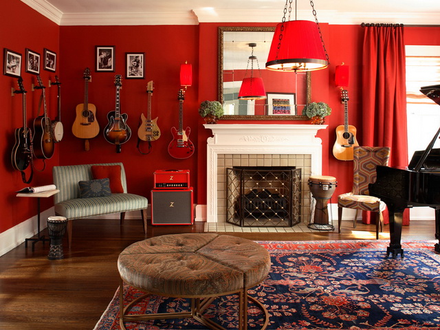
Living room
To make this room luxurious, it is enough to combine red curtains and furniture covers with dark parquet and light walls. If the picture is complemented by gilding, crystal, natural wood and velvet, the interior will look royal. Nevertheless, the red color for the living room can be used not only in classical styles, but also in Provence, country, minimalism - it finds application everywhere.

Bedroom
It is not necessary to introduce too bright red tones into the interior of the relaxation room - muted, delicate shades are suitable, which will contribute to relaxation. Mysteriousness, intimacy will give the bedroom the illumination of floor lamps or sconces with red lampshades. Brown furniture, forging, glass, crystal are perfect for reddish walls or textiles.
Children's room
Red is not used in rooms of young children: it can adversely affect the development of the child’s nervous system, and instills aggressiveness. But its light shades in the bedrooms of older girls and boys are a good solution. Color is suitable as an accent in the form of chairs, bed trim, stripes on the curtains.
Hallway
In the hallway, the corridor, you can combine a red tone with white, as well as with light gray shades. It is important to organize good lighting, because most often this room has no windows and seems cold.The tiles on the floor in a checkerboard pattern will dilute the interior (black and white or brown and white).

In what details to implement color
Designers use a bright, rich shade and its calm variations in almost all possible details, as well as in the main finish.
Floor, ceiling, walls
Depending on the purpose of the room, red wallpaper, tiles, wall painting are used. If wallpaper is planned, they can be monophonic or with a pattern, ornament. It is better to buy paper, fabric or non-woven linens in the bedroom; vinyl, suitable for the kitchen, toilet, corridor, living room. A good option for finishing one (accent) wall is a mural with the image of abstraction, fruit, floral compositions. The kitchen looks good tile on the apron, accent wall, in the living room in the loft style - brick, decorative stone.
The red floor is less common than the walls of this color. Usually we are talking about a laminate flooring of reddish wood tones. It is also possible to use red linoleum or tiles in the kitchen, in the bathroom. It is better to purchase a matte tile - it looks less elaborate. The red ceiling is most often stretch. It goes well with white or gold stucco moldings, moldings, borders, as well as with interesting spotlights.
to contents ↑
Furniture, textiles and decorations
Furniture can be a bright accent for a light or too boring room. If the room is small, you should limit yourself to only one large detail; for more spacious rooms, whole furniture sets are suitable. Leather or velvet, velor sofas look great: they will attract the eye, attract everyone's attention. You can decorate the sofa with pillows in a contrasting color (gray, beige).
The red chest of drawers looks no less interesting - carved, decorated in antique style, it will fit into vintage and rustic interior styles. Cabinets of saturated color are more often used in cabinets, hallways, although if there are facades of a muted red hue, such furniture will become a real decoration of the bedroom. A red bed is successfully combined with a wooden, golden headboard, and the furniture frame itself may have a bright color, but only a bedspread, a plaid. If desired, you can easily replace too juicy decor with a more relaxed one.

Of the textiles of reddish, scarlet, burgundy tones, curtains, carpets, bedspreads, capes for armchairs and chairs are most often used. Do not place too many accent items in the room, otherwise the whole room will turn into a solid red spot. Moderation in the use of red is the key to obtaining an interesting and comfortable interior perception that will not get bored with time!


