Color is the main aesthetic characteristic of a laminate. This parameter largely determines the organicity of this element in the overall picture of the interior. Before you go to the store, it is recommended that you carefully understand which colors of the laminate are combined. You also need to consider the interaction of shades between themselves and the environment.
- Color Matching Rules
- Skirting board compatibility with other decorative elements
- Laminate and baseboard
- Laminate and doors
- The choice of color depending on the type of room
- Laminate in different architectural styles
- Laminate Panel Names
- Compatibility of popular colors
- Red, gold, yellow
- Cool colors
- White color
- Dark colors
- Other colors
- Laminate imitation for different materials
- Multi-colored and painted laminate

Color Matching Rules
There are a number of basic rules regarding color:
- The interior should not have more than three primary colors. Otherwise, the room will look variegated and inharmonious. If the limit of base colors has already been exhausted, the laminate is selected under one of them.
- The color of the laminate does not have to 100% copy the base color of the interior. However, it is important that it looks like a basic one, does not contradict it. For example, red or honey is suitable for yellow.
- For rooms decorated in cold shades, use a laminate in a warm range.
- The snow-white interior is combined with floors of any color, except for excessively bright.
- The creation of moderately contrasting harmonious interiors is a trend of recent years. Similar options look more characteristic in comparison with pastel tones of classical interior solutions.

- The flooring is best combined with furniture if it is 1-2 tones lighter or darker.
- In the presence of a contrasting carpet, one coloring of the laminate and furniture is permissible.
- The merging light background - without contrasts - is boring. Such a room resembles a faceless office.
- The glossy finish looks luxurious. However, the feeling of naturalness of the materials is lost.
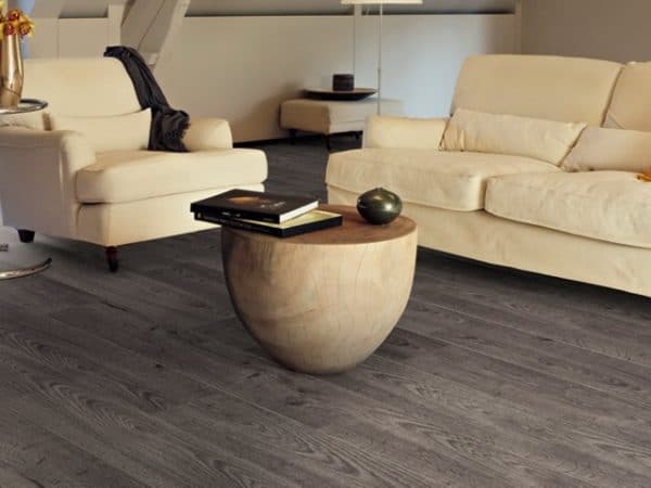
- Dark colors in matte finish give the material a natural rich look.
- The same color looks different when changing lighting.
Skirting board compatibility with other decorative elements
Laminate and baseboard
Skirting boards and laminate do not have to be the same color. However, a similar palette is desirable, since the sharp contrast between these elements will create unnecessary accents and reduce the attractiveness of the floor covering.
Advice! The color of the skirting board should be the middle between the darkest and the lightest in the room.
The color of the baseboard is selected according to the following criteria:
- baseboard of one shade with a laminate;
- baseboards and doors in the same color tone, but contrasting with the floor;
- baseboard and furniture of the same color in contrast with doors and laminate.

Laminate and doors
Most often, a laminate is selected not for furniture, walls or ceiling, but for the color of the door.
The rules for combining laminate and doors:
- Matching laminate and door colors is undesirable. However, this approach is acceptable if the room has other contrasting interior elements. Usually, doors and laminate of the same color are used in small rooms (entrance hall, corridor).
- A light laminate with the same light doors allows you to visually make the room more voluminous.
Below are the rules for harmonious color combinations of doors and floor coverings:
- Brown.Shades are different - from light brown to dark chocolate. They use the rule: they select a door 1-2 shades lighter and darker in color and vice versa. Platbands and slopes should be combined with the door. Furniture is recommended to choose a couple of tones lighter. Brown fits perfectly into the classic interior style and provence.
- Beige. Common color for doors. Suitable for light laminate. Milk-beige or white-golden flooring is recommended. Do not use doors with a reddish tint in this case.
- Walnut. Walnut doors combine with a lighter laminate. In combination with light beech or oak, these doors look sophisticated due to the contrast of colors. Dark walnut perfectly emphasizes classic interior design.

The choice of color depending on the type of room
The color scheme is determined by the type of room:
- In kitchens and living rooms it is recommended to use glossy surfaces if the task is to give the room a solemnity and a rich look.
- Small rooms (corridors, hallways) are not compatible with dark floors or doors. A dark background visually reduces space.
- A floor that is too light is not the best solution for the entrance hall, as the contamination inevitable in this room will be noticeable.
- In bedrooms and children's rooms it is better to use matte surfaces, they have a calming effect. The optimal color background of the laminate is light, which allows for a visual expansion of the space while maintaining coziness.
to contents ↑
Laminate in different architectural styles
Color is perceived in its own way in various styles of architecture:
- Classic. This style comes from conservatism, smooth lines. The classic interior looks expensive, old-fashioned. Colors are deep and soft with a matte finish. Natural elements prevail (wood, stone, fabrics, wool). In the classical style, a laminate should also be made. Imitation under oak, maple, beech, dark walnut, mahogany is suitable.
- Country. Style exploits deliberate rustic simplicity and functionality. Unpretentious natural materials are used. Color schemes are built around wood. Both vivid and muted color solutions are appropriate here - it all depends on the designer's idea. For a country style, a laminate is organically suitable for bleached oak, cherry or teak. Combinations of different types of wood, as well as specially worn surfaces, look great.
- Provence. Close to country, as it represents the rural style of the Mediterranean region of France. Soft light yellow tones, milky and grayish colors are characteristic. Artificial aging of materials is used.
- High tech. The style is based on clear cold tones. Pastel halftones are practically not used here. Gray, snow-white, platinum, steel, black are popular. Looks great laminate that simulates a metal or plastic surface.

- Minimalism. Close to hi-tech. It has even less decor, and the characteristic color is white.
- Baroque, Empire, Renaissance. Styles of different eras, but, like classic or neoclassic, are designed to clearly emphasize the richness of the environment. Unlike classical interiors, in baroque there is redundancy, pretentiousness, pomposity. Laminate imitates expensive wood, marble.
- Ecostyle. The direction of design, where the natural environment is at the forefront, is unprocessed natural materials. Cork wood, rough bark of other wood species, bamboo, genuine leather, linen are imitated. Various shades are used, if only the colors do not seem artificial and cold.
- Modernism. There are variations of style. For example, in the USA, the direction was called Art Deco. The style is based on the rejection of standard architectural solutions, canons, stereotypes. Abstractions, asymmetric elements and contrasts abound. The main role belongs to the game with colors and patterns. Any color of the laminate with various geometric patterns and variegated inserts is possible.
- Scandinavian style. It is considered a Scandinavian country variation and Provence.The main idea is rustic simplicity in the interior. There is a large amount of untreated wood. Furniture can be painted with oil paint. Imitation under plastic is used. The color background is light.
Laminate Panel Names
In retail networks, panel names often indicate not the color, but the similarity of the background with a particular tree (cloth, fruit, etc.).
The most popular shades of laminate in the classical style are:
- Birch;
- cherry;
- oak;
- wenge;
- walnut (dark and light).
In recent years, the above colors have been added:
- linen;
- coconut;
- jute.

If the task is to create an interior in neutral or pastel colors, it is recommended to use panels with the following names:
- ash;
- Birch;
- light oak;
- light alder.
Compatibility of popular colors
Red, gold, yellow
This group of colors is not combined with marine tones. Red, gold and yellow are not suitable for pink, purple and lilac colors.
Successful combinations are achieved with such colors:
- green;
- terracotta;
- Orange;
- brown.
Golden-red-yellow background is used in the following panels:
- cherry;
- Milan nut
- Linden.

The described shade is suitable for any interiors made in a bright temperament style (baroque, modern).
to contents ↑Cool colors
Among the cold colors, the following stand out:
- cream;
- oak;
- shades of gray;
- lactic.
Cold background gives the room severity, elegance, solemnity. Floors in such a tone are far from compatible with all interiors, as the room looks too formal and even uncomfortable. With a competent approach, such a background is appropriate in classics, hi-tech, minimalism. It is recommended to apply cold colors in hallways and offices. Particular attention should be paid to the compatibility of shades of laminate and doors.

to contents ↑The cold palette is perfectly complemented by white and black colors. However, it is not recommended to combine a cold background with other similar shades.
White color
For the floor, white is not the best option. It’s not even about the soiled coating, but about the complexity of creating an attractive color scheme in this case. It will also require other parts of the interior to be decorated in the same gamut. Doors, walls and furniture should be white. However, this background also has its advantages:
- Visually gives the room a larger volume.
- Good for kitchen.
- The main color for hi-tech style and minimalism, that is, where laconicism and a technological look of the interior are needed.

Dark colors
Dark tones are especially advantageous because they are suitable for any color. This laminate is combined with most interior styles. It is associated with expensive wood. The most common names for laminate panels:
- oak (stained or dark);
- wenge;
- chestnut.
Note! Door frames and window frames should be combined with the color of the floor.
Other colors
The compatibility of some other colors is presented in the table below.
| Laminate color | Color of other interior elements |
|---|---|
| Pastel beige | Darker colors. Ideal for wenge panels |
| Brown | Red, brown, or a combination of brown-red |
| Yellow, red, golden | Green, terracotta, orange, brown |
| Gray | Closest to gray. Contrast colors do not usually blend with gray. |
Laminate imitation for different materials
Depending on the style of the interior, using a laminate, you can imitate various materials:
- Classic wood. Any kind of wood is imitated: from luxurious looking mahogany or oak to elegant maple. Laminate for classic wood is installed in the respective interiors - for classic, baroque, empire, modern.
- Leather. Imitation skin looks rich.The laminate under crocodile skin looks especially respectable. In modern architectural interpretations of the classics, in modernism and hi-tech, it is possible to use a laminate for colored - up to red or white - leather.
- Metallic Shine of metal is appropriate in rooms where there are many glass or metal objects. The most suitable interior style for this is high-tech. Metallic fits perfectly into the design of the kitchen, children's playroom or night club.
- Under the stone. The color under the stone gives a feeling of reliability, durability of the floor. However, such an interior looks cold. This laminate is often used to decorate kitchens and hallways.

Multi-colored and painted laminate
In recent years, the trend towards applying various patterns to the laminate, as well as combining colors, is gaining popularity.
Figured installation is practiced in the following ways:
- alternate laying of laminate in different colors;
- perpendicular arrangement;
- diagonal styling;
- chess order;
- installation of a border;
- three-color scheme;
- tile design.

When choosing a color palette, the nature of the room is important. Some shades are appropriate for the kitchen or hallway, but not too suitable for the living room or study. When choosing, you need to be guided by artistic taste, interior design and architectural style.