Khaki belongs to the yellow-green-brown range. It is represented by a whole group of shades, varying in tone and saturation: from a little greenish with a brown tint to dusty, earthy.
- Color origin
- Neutral shade of khaki in the visual arts
- How to get khaki color
- Acrylic Khaki
- Khaki Brown
- Using blue and orange to create khaki
- How to change the finished color
- Getting a cold or dark shade
- Using the CMYK Model

Khaki also has other names: protective color, camouflage, as it is often used for tailoring military uniforms. Also, such shades are widely used in painting, design, repair work. How to get khaki color when mixing tones? The question is very relevant, because it is almost impossible to find it in its finished form, it is not included in the standard gamut of shades of gouache, watercolors.

Color origin
Initially, the word "khaki" as a color designation appeared in Britain in the middle of the 19th century, and it was borrowed from the Hindi language and translated "earthy hue, the color of the soil." Units of the Indian army in the service of the kingdom then wore khaki uniforms. The useful properties of the shade - the ability to be invisible on the ground and hide pollution - were soon borrowed by other states for army clothes. Khaki also quickly entered fashion trends, becoming an integral feature of casual style.
Previously, raw materials from mulberry wood (mulberry) were used for dyeing fabrics, which gave a grayish-yellow dye that was resistant to leaching. To make the color, the stems and mulberry inflorescences were collected, a thick extract was made from them. After linen or cotton cloth was immersed in the solution and kept for the right time.
to contents ↑Nowadays, synthetic dyes are mainly used for coloring matter. As for the use of khaki in painting, it can be made independently from any paints, the main thing is that basic colors are available.
The neutral shade of khaki in the visual arts
Protective shades, which have a more pronounced tone, look like a raw umber. They are widely used for dimming the brightness of other colors, as well as, with active dilution, for drawing flesh color. Thicker, more saturated khaki tones are used to decorate the earth, tree trunks, military-themed drawings.

Khaki is considered a neutral color. It goes well with many shades, it is not bright, screaming, therefore it does not irritate the eye and can be used as a background tone. Khaki belongs to the brown range, and you can create it by combining additional shades that are opposite each other in the color wheel (for example, red and green, blue and orange). However, the finished colors will vary greatly by the presence of a greenish, yellowish or gray undertone.It is quite difficult to achieve a strictly defined shade: you will have to experiment with paints.
to contents ↑How to get khaki color
The easiest way to make hacks is brown. If it is not available, you must first make a basic brown of paints: combine the primary colors (blue, red, yellow) among themselves in equal proportions. It is best to take materials with the help of a palette knife, so the probability of measuring out the same volume components is higher. Then, khaki is obtained on the basis of brown by combining with additional shades.
Another option for creating khaki is this: you can mix raw umber and titanium white. In appearance, the finished shade will be warm, grayish-green. It is perfect for drawing natural themes, and in interior design - for decorating walls with Venetian plaster. In the finished color, you can introduce a drop of yellow, for example, yellow cadmium, this will give warmth to the tone. To cool the shade, add a little blue paint.

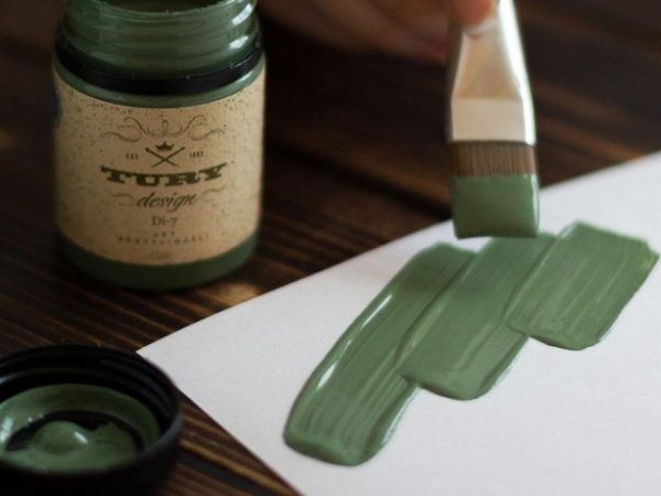
Acrylic Khaki
To get a beautiful shade of khaki, you can use any kind of paint, including acrylic. For work, you need red, yellow, blue, and also white. You can purchase any variation of the basic tones, although the finished shades can vary significantly from each other.
In addition to acrylic paints, for work you will need:
- tassels;
- a glass of water;
- palette;
- palette knife;
- paper towels to clean the palette knife.

First you need to place on the palette equal parts of the base paints, laying them with a palette knife on different cells. Then you should combine the colors in one cell of the palette, where a little white was previously introduced. As a result, a brown tone of a sufficiently high saturation will be obtained. If you introduce more white paint into it, the brightness will decrease, but it is not recommended to brighten the brown in advance. Further, from this color you can make khaki by mixing tones.
to contents ↑Khaki Brown
The easiest option to make khaki is to drop a little green paint in brown. Since the camouflage tone is complex and multifaceted, it is better to introduce green paint in small parts so as not to spoil the idea. It is advisable to keep ready a sample in the form of a photo, drawing, computer image, so as not to be mistaken in creating color.
If the tone is too green, yellow paint will help give it a sandy glow. You can darken, “flush” the hacks with a scanty amount of black paint. Often, instead of black, artists add gray (a mixture of black and white), because a saturated coal color with careless movement can simply spoil the paint.

Using blue and orange to create khaki
Another popular method for creating khaki is to mix blue with orange. Usually colors are taken in equal proportions, but tonality can always be changed by experimenting. Other colors are also added to the finished mixture:
- red - for a warm shade;
- green - to give a "natural" note;
- purple to darken.
How to change the finished color
It happens that the prepared shade of khaki does not suit the user. It can be completely redone in accordance with the requirements and objectives. For example, to give the camouflage color a reflection of coffee with milk, you can add more brown, and then dilute the mass with white. Small doses of white paint should be administered until a result is achieved.
Red paint can also be involved in changing the shade of khaki. It makes it deeper, softer, warmer, and the yellow color provides a lighter, sunny color. The whole gamut of blue in a small amount will make the protective background cooler, with gray notes, closer to the shade of the earth.To increase the brightness and contrast, you need to enter dark tones (black, dark purple), and to create dusty, muted shades - mix steel notes.
to contents ↑
Getting a cold or dark shade
Khaki is an interesting shade that can “absorb” the warmth or coldness of the colors added to it. Blue, dark blue, sky, turquoise tones, if necessary, can cool the paint created by the artist. Typically, such shades are perfect for drawing tree trunks in winter, reflecting the structure of the fur. If the tone is too blue, you can always enter a little red or yellow to correct the situation.
Black paint is used to darken the khaki, although it is quite difficult to make the right color correctly. When too much black is introduced, the khaki becomes cloudy, gloomy, so you must be careful. An interesting shade for displaying twilight scenes, dark trees can be done when replacing black with ultramarine: the tone will be muffled, but quite expressive.

Using the CMYK Model
Using the CMYK color model, you can also find the right shade of khaki. This scheme of tone formation is widely used in printing for process printing, it includes cyan, magenta, yellow, as well as the tone of the magenta (part of the magenta spectrum). Using graphic editors, you can accurately select the proportions of mixing colors to get a camouflage tone. The created color is used in graphic design. It will look exactly as the user intended, because computer modeling helps to eliminate errors that occur when manually mixing paints.