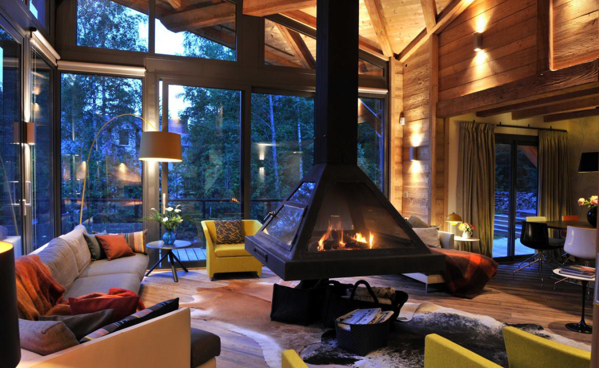
Often, after a decision is made to change the interior, the owners encounter a number of difficulties. You must choose the right color scheme for the main walls and decoration elements. If interesting options do not come to mind, you can pay attention to special selections of winter shade combinations. Stylish and beautiful color combinations will bring fresh notes to the interior and give a festive mood.
- Winter distortion
- Winter colors - which look good in the interior
- Lavender
- Marsh
- Navy blue
- Linen
- Olive
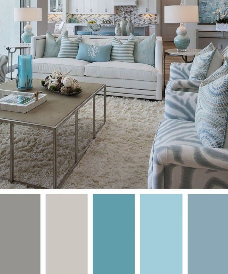
- Gray
- Mistakes in choosing colors - how to prevent
- The best combinations
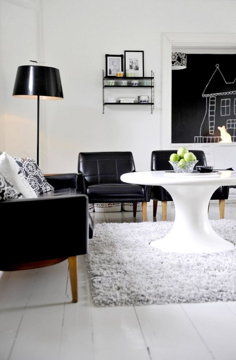
- White and black
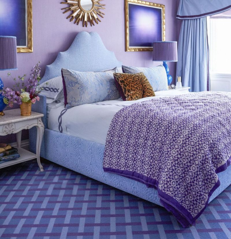
- Purple and blue
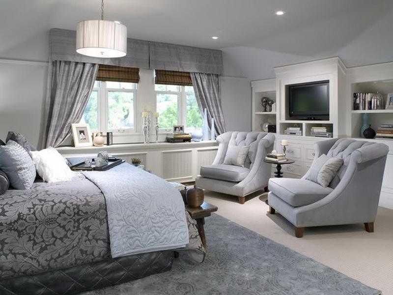
- Silver and light gray
- White and emerald
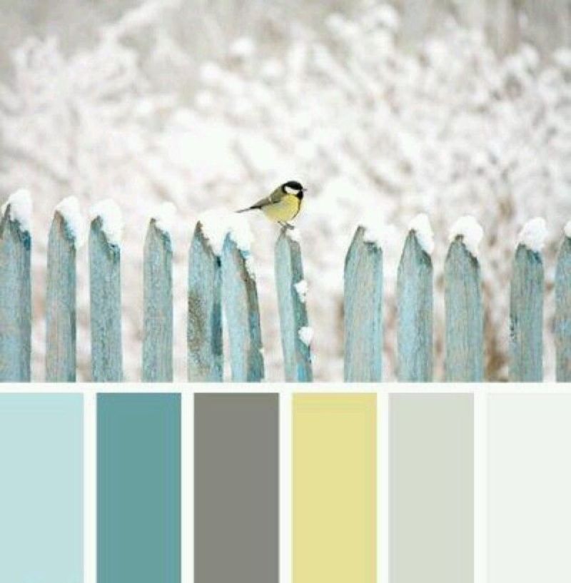
- Dark gray and yellow
Winter distortion
In winter, the days become cloudy, cloudy, darkens much faster than in summer. Sunlight is not so bright, it enters poorly and diffuses into the windows, which is why even the saturated tones in the house begin to appear dull, gloomy, and light ones completely lose their color, appear faded.

A significant part of the day in winter has to be spent under artificial lighting, so it is recommended to immediately think carefully about the type of light sources and the shade of the light flux that they give. In many ways, the perception of color by the eye depends on lighting:
- ordinary incandescent lamps “mix” a little yellowness into all the colors, making them warmer, more saturated;
- fluorescent lamps give the surfaces a cool glow, from which even warm colors become colder, fade;
- halogen lamps almost do not distort shades, since their glow resembles the sun (natural).
Winter colors - which look good in the interior
When choosing basic shades for a room, individual wishes, type and number of light sources, suitable combinations of tones are taken into account. Shades depend on the chosen style, as well as on the type of finish - wallpaper, paint, panels, tiles, etc. The color intensity is also due to the amount of decor, small details. In principle, any shade is suitable for the winter interior, but some are considered the most fashionable and luxurious.
Lavender
The delicate floral color has a relaxing, calming effect, which is why it is ideal for the bedroom. He will set up a good rest, he will look fresh and interesting. In addition to the bedroom, you can use lavender in the living room, made in the style of chic, Provence, minimalism, classic. Lavender is best combined with green, brown, white.
The brighter the light, the richer the lavender will look, but it is almost impossible to thicken it to excessive gloom. If the room is on the south side, you can give the color a little coolness by using fluorescent lights. Under incandescent bulbs, on the contrary, it will look warming.
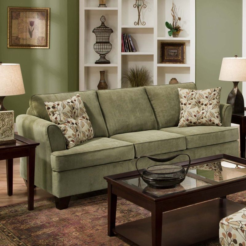
Marsh
Not too dark swamp color will be an excellent basis for the interior, because it is soft, discreet, ideal for a bedroom, study, living room, dining room. The swamp pattern on the wallpaper, furniture, decor and accents looks quite bright and stylish. Despite the calm, the color will provide the room with colorfulness, nobility. In a yellowish light it seems even warmer, in a cold glow it remains neutral. The best "companions" for the swamp are:
- beige;
- brown;
- yellow.
Navy blue
A rich, elegant dark blue color is ideal for upholstery, design accent walls in the bedroom, living room, office. It perfectly combines with white, light yellow, emerald, papyrus.
White-blue and white-papyrus combinations elegantly fit into the classical style, look harmonious and inspire thoughts of stability, calmness. Dark blue calms, so it suits those who regularly experience stress, dreams of relaxing.
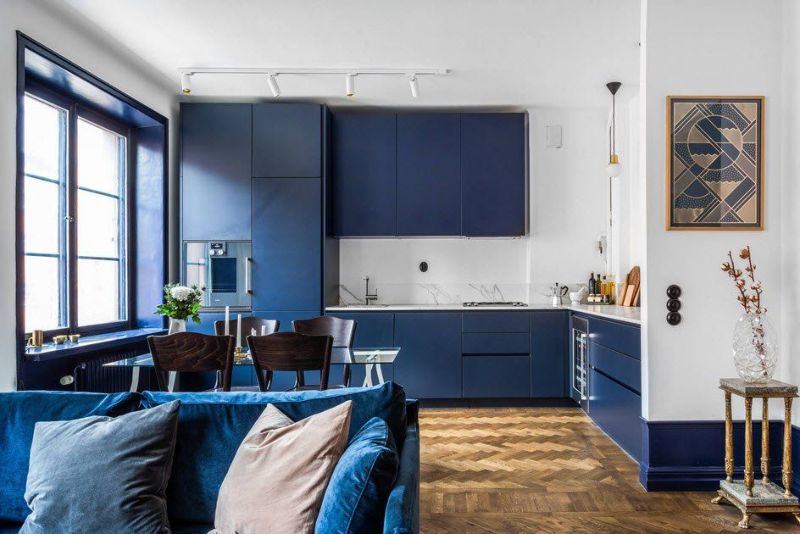
In combination with greens, blue looks unusual, deep and even somewhat fantastic. Best of all, this tandem fits into the marine style. Adding yellow saturates the blue with energy, gives warmth and coziness. Dark blue can replace black in small rooms, because it does not look so oppressive.
to contents ↑Linen
Flaxseed is a very light shade of brown. Due to its neutrality, it is used as a base for wall decoration. You can also put flaxen colored furniture in the room, which looks stylish and unobtrusive. Linen is well combined with any warm and cold colors, suitable for absolutely any room. The color of unpainted linen is ideal for classics, neoclassics, ethno, Provence, country, eco-style, it is practically not changed by warm and cold light sources.
Olive
Olive is another calm, neutral tone that can be attributed to the natural. This soft, natural shade is suitable for decoration of soft corners, dining area, wall upholstery in the kitchen, living room, bedroom. Using the color of olive decorate furniture, curtains.
Under cool streams of artificial light, olive becomes more saturated, and under warm it warms up, creating a cozy atmosphere. When combined with bright green shades, olive smoothes out the overstate of the latter. Together with wine, cherry, dark violet, he adds volume to the decoration and things.
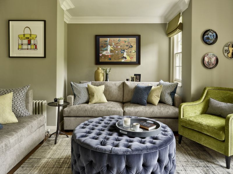
Olive is used in classic and modern styles paired with such colors:
- beige;
- aquamarine;
- golden;
- dark brown.
Gray
No wonder gray is considered a classic and completely neutral color. As a base, it is perfect for classics, minimalism, high-tech, modern, many other styles. In a light variation, gray will be a great substitute for white and beige. It calms, tunes in a positive way, helps to relax.
Mistakes in choosing colors - how to prevent
When choosing color combinations for a winter interior, you need to take into account that too complex colors open differently in the morning and evening, under artificial lighting. The darker the paint, the less light it reflects.
The amount of reflected light is measured by a special indicator - light reflectance (LRV,%), which is always written on paint packages. For example, black tends to 0%, and white to 100%. Thus, the paint with a high coefficient of light reflection will look paler on the walls.
In rooms where there is little light, it is worth painting the walls and decorating most of the decor with the most light colors. If the room is large, and there are many windows in it, they overlook the sunny side, you can safely use dark, bright, saturated colors in the decoration.
Another great option for any room is to make the walls and furniture light, and with the help of dark tones to draw bright strokes, as if to give the room structure. The lower the ceilings, the brighter the walls in the room should be.
Do not use a lot of white in the winter interior, especially in its glossy version. Of course, white combines well with any other shade, but it gives the room a cold, detached. It is better to use only matte white in moderation, or even replace it with milk, ivory, beige, caramel.
to contents ↑The best combinations
To select the perfect combination in practice, it is recommended to carry out trial colors on a special board or a small piece of plywood. This will help evaluate how beautiful the individual color combinations look.
to contents ↑
White and black
Dark objects against white snow - a traditional view from the window in winter. The cold season can not boast of an abundance of bright colors - it is calm, measured, quiet. The use of the classic combination of black and white in a winter interior will give the atmosphere relaxation, elegance.
In fact, black and white combinations are appropriate in any room and every season. Their only negative is inexpressiveness.. You can add saturation by diversifying materials, textures, for example, introducing black leather, white fur, knitwear into the interior.
Purple and blue
These colors together make it possible to make the room bright, unusual, quite catchy, refreshing. The main thing is not to abuse the dark purple color so as not to give an atmosphere of obsession. It is advisable to decorate the walls with a blue tone, placing purple accents. For example, in a bedroom it can be a bedspread, a set of bed linen, a picture on the wall. Another option for combining colors is the use of light, delicate shades of blue and purple, which, as it were, merge, pass into each other in the main finish.
Silver and light gray
The combination of silver and a dull, weightless gray hue reminds you of a winter evening when snow glistens in the light of street lamps. In the interior, such a tandem looks amazingly stylish, has a delicate, refined taste.
It is recommended to introduce silver color in dosage - in the form of candlesticks, pillows, curtains, vases, paintings or mirrors.
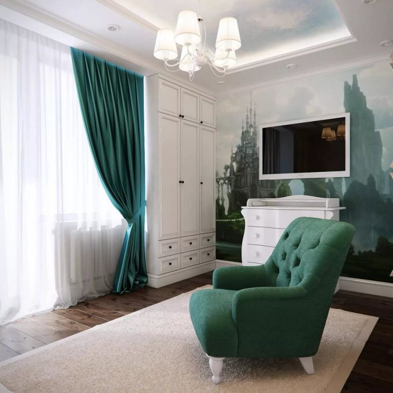
White and emerald
Such a combination literally breathes life, while it is very comfortable perceived by the human eye. It makes one think of magic, jewelry, luxury and elegance. White is the perfect companion for the emerald. Together they look beautiful in the design of the bedroom, living room and even the kitchen, where emerald accessories and textiles stand out against the background of a white headset.
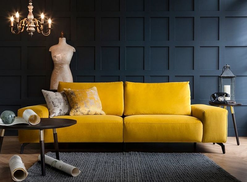
Dark gray and yellow
This combination is considered quite complex and unusual. As a rule, with a competent introduction to the interior, it looks very stylish. Do not make the room too dark shades of gray or introduce this color in abundance, so as not to make the room gloomy. Yellow, on the contrary, should not be faded - it will simply be lost against the general background. The best solution is to make a mid-gray base, complement it with rich yellow details and white accents.
In a beautifully designed room, I want to stay as long as possible. It is nice to spend time alone with yourself or with relatives, friends. Properly applying the tips for the winter transformation of housing, there is a chance to make it cozy, relaxing and comfortable in every way!


