A successful combination of colors is the basis for the formation of a stylish, harmonious and holistic interior. For the convenience of the designer, artist, and also the designer, a color wheel was invented - a conventional form of a color matching system that exists in the form of different samples.
- Color wheel definition
- Circle device
- Itten's color wheel
- Goethe color wheel
- Oswald color wheel
- Newton's color wheel
- Itten's circle and color harmonies - how to use
- Monochrome combination
- Complementary or contrasting combination
- Classical triad - combination of 3 colors
- Analog combination of 2-5 colors
- Separately complementary combination or contrasting triad
- Tetrad - rectangular diagram
- Square pattern
- Hexagonal pattern
- Combinations of individual tones
- Neutral tones
- Warm colors
- Cold shades
- Digital circle online

Color wheel definition
The color wheel (wheel) is widely used in design and colorization. In fact, this is a special rule that helps you navigate in the variety of colors, create the necessary shades in any color model. In other words, a circle is a way of continuity of color transitions. Sectors of the figure are painted in various tones, which are placed in a special order. Their mutual arrangement is due to the laws of colorization (color theory), so the circle helps to select harmonious combinations of shades.

Designers perceive the color wheel as a "cheat sheet", which reflects all possible color schemes. You can watch it online or pick it up in hard copy. Nevertheless, a number of third-party factors affect the selection of shades taking into account the data of the circle. Experts note that the color spectrum is perceived subjectively and greatly depends on the rest of the composition in the room. Also, the size of painted surfaces and their shape affect the perception of color, so in each case you have to make an individual decision.
to contents ↑Circle device
Now the color wheel is the basic color design tool. Its basis is 3 tones: red, blue, yellow. The result of their combination is other shades, which are also reflected in the "cheat sheet".
There are different types of color circles, differing in the number of sectors present in them. Any circle includes warm and cold zones, which can be seen visually: red, orange, yellow belong to the first zone, blue, blue, green - to the second.

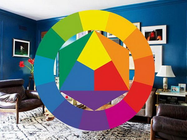
Itten's color wheel
It is this form of presentation of flowers is now the most popular. In the color ring of Johannes Itten, 12 sectors were first identified, so now it is considered a classic. All 12 colors are arranged in a circle so that the contrasting tones are in opposite zones.
In the center of Itten's ring is a triangle with basic tones (blue, yellow, red), which when mixed allow you to get all the other colors. The triangle is surrounded by a hexagon in which three shades are drawn, obtained by mixing equal shares of the base colors (purple, orange, green). The next layer around the circumference are other shades of green, yellow, blue, red, orange, and purple spectra.

Goethe color wheel
The poet, the thinker Goethe also had his own view on the construction of the color wheel. He noted the existence of so-called "pure tones" that cannot be obtained by mixing paints. In a Goethe circle, these colors alternate with complementary ones (orange, violet, green), which are obtained by pairing the main ones. Despite the fact that Goethe’s ring closes on this, he also noted that all other shades were received when combining the previous ones.


Oswald color wheel
Oswald’s great circle is based on the harmony of color combinations, that is, on the pleasant sensations that a person experiences when evaluating a combination of tones. To determine such combinations, the scientist conducted many studies, the result of which was the streamlining of existing shades.
As in other systems, the main palette in the center is highlighted in this circle, but it includes red, blue, green (a modern RGB color model is built on these tones). Then the circle is divided into 12 sectors (12 shades), each of which consists of several layers in order of increasing color intensity to the edges. In this and other models there is no black and white colors, since the first is perceived as the maximum possible saturation of the tone, and the second as its absence.

Newton's color wheel
Isaac Newton was the first to try to bring all visible colors into a single system and draw a color wheel. Newton's ring includes seven sectors - red, yellow, orange, blue, blue, green, purple. Later, the scientist added purple to the circle, placing it between red and purple.
Despite the flaws that Itten later corrected (the circle of the latter is considered the most convenient for designers and artists), it was Newton who formulated the first laws of optical mixing. The scientist also determined that the combination of purple and red turns purple, and introduced it into the color model. He also outlined the idea of mixing tones when observing the decomposition of a ray of light.

Itten's circle and color harmonies - how to use
Experienced designers rarely use the circle, they have a special flair and valuable work skills, therefore they are able to form a harmonious interior even without theoretical knowledge. Itten's circle will help beginners - the most convenient color combination model that allows you to choose the right simple and complex combinations.
How to use the Itten circle? There are several types of color matching that are obtained by rotating the model. You can combine tones with the methods described below.
to contents ↑Monochrome combination
This scheme is considered the easiest to use. It includes shades of one color - more saturated and light. For example, if you work in an online program, then when you hover the arrow on a blue tone, various shades of blue appear in the window.

Complementary or contrasting combination
Additional (complementary) colors are opposite to each other on the color wheel, therefore they are also called contrasting (red and green are an example of contrast). Their combination always looks bright, interesting, many combinations resemble natural ones: you just have to look at the bed with strawberries. To organize such a color scheme, you need to take shades with maximum saturation, although adherence to a sense of proportion is mandatory. Otherwise, such contrasting duets can cause irritation.

Classical triad - combination of 3 colors
The triad of colors is formed by combining in the interior shades located at the same distance from each other, that is, equidistant. This combination looks impressive, including when using pastel shades. Nevertheless, for the harmony of the image, you need to choose one color and make it primary, and apply the other two for emphasis.

Analog combination of 2-5 colors
In Itten's circle, the adjacent tones, when combined, give a calm, disposable, cozy impression. They can be from two to five, while two to three are considered ideal. Three colors is an analog triad. Analog combinations are widely found in nature, are harmonious, pleasing to the eyes (for example, yellow, yellow-orange, yellow-green in the same interior). Any of the flowers should also be made important, the rest - complementary or accent.

Separately complementary combination or contrasting triad
Here, instead of opposing tones, adjacent colors are used. The result is a contrasting, but not too eye-straining interior. The easiest option is to use a contrasting triad in the form of a primary and two additional related-contrasting colors (they are on the right and left of the additional tone).

Tetrad - rectangular diagram
This model consists of four tones, each pair is complementary (contrasting to each other). There are many options for using this combination. You can get even the most striking combinations that the child will like, but one tone must be the main one, and the rest - additional. Otherwise, the interior will not look harmonious.

Square pattern
The square scheme resembles a rectangular one, but all the tones in it are equidistant in a circle. The appearance of the room will be lively, dynamic. An example is the inclusion in the interior of blue-green, yellow, red-orange, purple.

Hexagonal pattern
Typically, only experienced designers use this design because it is considered the most complex. A hexagon is entered into the color wheel, and three pairs of complementary colors become the base.

Combinations of individual tones
Each sector of the circle is graded in light and darker tones, starting from the center and heading to the edge. Also, all the colors reflected in the circle can be divided into warm, cold and neutral, which will help with the selection of the necessary combinations.
Neutral tones
Neutral categories include gray tones, as well as black and white colors. They are suitable for any shade, perfectly combined with each other. Nevertheless, the interior, made in only one of the neutral colors, is considered boring, and sometimes gloomy, so you must definitely add bright details to it. For example, if you decide to design a room in gray tones, it is worth introducing accents of such shades:
- pink;
- crimson;
- yellow;
- Orange;
- red.

Warm colors
The spectrum of warm tones in the color model is wide. They are favorably perceived by the eye, give a feeling of comfort and light. Nevertheless, to choose successful combinations only from this group is not always possible. For example, it is better to add neutral white, black or cold blue to warm red. A combination of burgundy with gray, blue or cool green will also look great.
Beautiful combinations of warm colors are also found. For example, brown and peach, light orange look perfect together. Pretty fashionable is the tandem of yellow, red, orange. But most often when decorating the interior, it is precisely warm-cold duets that are used, for example, chocolate and mint, pink and blue, orange and turquoise.

Cold shades
Colors ranging from green to purple are considered cold. This is an association with water, grass, they bring coolness, refresh on a hot day, give a feeling of peace. A good combination for the home is recognized as a dark blue color with red diluted with white.
Pink, orange, red, coral details should be added to the cold turquoise, an incredibly stylish composition will turn out. A tandem such as blue and yellow is considered successful: they are great for creating a spring mood. If you carefully look at the color wheel and use one of the described models, you will probably be able to choose the perfect colorful palette for your home, which will be pleasant and joyful to be in!
to contents ↑Digital circle online
The online application allows you to choose a combination of colors for all of the above color schemes.