Fuchsia is one of the shades of bright pink. It is very saturated, has a slightly purple glow. Color got its name from the houseplant of the same name, which was grown by humans 150 years ago. Initially, the shade was used only in the creation of women's clothing, but now fuchsia is popular in the interior: it can be seen in the photo in the most fashionable design magazines.
- About color: properties, characteristics and psychology
- Variety of shades
- Compatibility and compatibility with other colors
- Interior Design Examples
- In the living room
- On the kitchen
- In the bedroom
- In the nursery
- In the bathroom
- Color in textiles and decor
About color: properties, characteristics and psychology
You can get fuchsia by mixing red, pink, purple, lilac and blue. Color belongs to the category of extravagant, it is juicy, bright, relaxed, life-affirming and traditionally ranked as feminine shades. According to feng shui, fuchsia symbolizes love, romance and goodness, but only when used in small quantities. Without dosed use, this shade is associated with a bad taste, frivolity.

Fuchsia is a cold color, raspberry, lilac, and lilac are considered related to it, although their combination is unacceptable. In the design of the interior, this shade has been used for more than 30 years, but many note that it quickly gets bored. Most often, fuchsia is used in the design of rooms for young fashionistas or young girls, but in the form of separate elements it is suitable for:
- a bathtub;
- kitchens;
- Libraries
- cabinet;
- home theater;
- bedrooms;
- living room.
Hot pink, when used correctly, can not only decorate the interior, but also fix minor defects, flaws or designer's mistakes. It happens that a room with an abundance of white, gray, beige shades looks boring, and bright pink details give it a positive energy and vibrancy. Of course, juicy fuchsia is not suitable for creating a background, it can not serve as a basic color: it will interfere with relaxation, will disturb the nervous system, although during depression it will distract from gloomy thoughts.

to contents ↑Psychologists endow fuchsia with traits of eroticism and ardor. In their opinion, people in love choose a color subconsciously, it also attracts workers in creative, creative professions. It is believed that this shade has an interlocutor, makes the conversation more relaxed. Due to the risk of oversaturation, it is not recommended to combine more than two bright colors in the interior, if one of them is fuchsia.
Variety of shades
Fuchsia has not many varieties, such as beige, which includes more than 1000 shades. The palest subtone is antique fuchsia, it is the only one suitable for background design, since it does not cause irritation, but relaxes. Other shades of fuchsia are as follows:
- Hollywood Light Cherry. The bright shade, which is very fond of directors and actors, it is widely used at all kinds of awards, carpets and participates in the outfits of stars.
- Pink fuchsia. The color resembles the previous, but less saturated, although deeper, because a subton of red is added to it. It is perfect for accenting and zoning in the interior.
- Fuchsia Kraola. Color combines saturation and medium brightness, while it includes a little more blue, because it partially resembles the shade of a magenta.
- Fandango. It is a classic embodiment of fuchsia, bright and stylish tone. It is created from an antique function, which has added brightness. The color is suitable for finishing curtains, rugs, pillows, plaids on sofas.

Compatibility and compatibility with other colors
With fuchsia, the shades that exist in nature are best combined. For example, a beautiful combination of colors will be with green, although these tones are bright, so their number in the interior should be limited. You can complement the design with green souvenirs, panels, textiles, although a simple setting of plants is suitable.
Designers are very fond of such a combination as fuchsia with purple and pink. But "color overdose" should not be allowed - it will greatly hurt your eyes, you will have to forget about relaxation. Fuchsia is combined with bright blue, but because of the aggressiveness, both colors are used solely to focus attention. In the interior of a girl’s room, it is possible to use orange, mustard, coupled with fuchsia - up to 10% of each color, but no more than 2 bright colors at once. At the same time, the walls need to be made plain and dim. It is permissible to apply water-based paints or decorative plaster, to stick modest wallpaper without a pattern, and glass wallpaper for painting.
Calm combinations are:
- Fuchsia and silver gray. Noble, elegant combination, suitable for bedroom, kitchen, bathroom, living room. In the interior, you can add a little black, wet asphalt, anthracite - for a change.
- Fuchsia and brown, chocolate. The background for such a gamut should be white, beige, milky. The interior will create a feeling of warmth, stability.
The table below shows the compatibility of fuchsia and other shades that are most often used in the design of apartments and houses:
| Color | Light shades of fuchsia | Bright shades of fuchsia |
|---|---|---|
| The black | Combined | Can only be used in large rooms. |
| Blue | Combined as a background. | Combined |
| Blue | Not compatible | Combined |
| Red | Combined as a background. | Combined |
| Orange | Not compatible | Accented |
| Yellow | Combined | Combined |
| Gray | Combined as a background. | Combined |
| White | Combined | Combined |
| Pink | Combined | Combined |
Interior Design Examples
Most often, fuchsia is used in such styles as pop art, postmodernism, disco, glamor, boho, expressionism, as well as Indian ethno, avant-garde, barbie style. There are a number of design techniques that help to use all the advantages of color:
- when painting walls in a neutral tone, one of them can be distinguished by fuchsia;
- a dark floor in combination with light walls is an excellent option for adding small accents of bright pink;
- furniture in this shade should be simple, without elaborate forms (usually this is used in the kitchen);
- textiles of different shades of fuchsia will help to refresh the interior or give vigor to a too calm style;
- boring textiles can easily be replaced with new ones, and you can sew interesting pillows and wraps cheaply and with your own hands;
- fuchsia on curtains looks better if it is not represented by a very large pattern;
- bright pink curtains with wide vertical stripes look annoying.

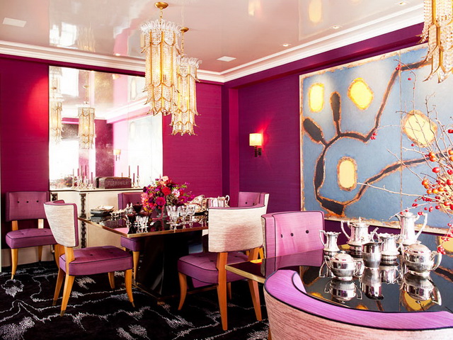
In the living room
Juicy colors of fuchsia in the hall are used, as a rule, for various textile products: pillows, rugs, rugs, napkins on a coffee table. Gentle, light shades, you can beautifully design a fireplace zone, walls. The upholstery of a sofa of bright color with an ornament of a contrasting shade looks luxurious, especially when velvet and velor are the material.
Another option for using bright pink in the living room is pasting one wall with murals with his participation, for example, in the form of a picture in white. This will make the room attractive, unusual, memorable. Also, paintings, including modular, other accessories in fuchsia shades will look original. Too many bright accents are not required, it is better to observe their minimum number.

On the kitchen
Upholstery of kitchen furniture of such a dynamic color will look fresh, energetic, attractive.But you need to apply color carefully, especially if the kitchen goes into the dining room. The tone should be warm, and among the shades of fuchsia there are quite cold colors (for example, kraola). Only warm tones are perfect for decorating your dining or work area.
If the kitchen is large, you can decorate in rich pink tones bar counters, table, other large elements in combination with white or silver color. A bright photo print with an abstract pattern will look good on a kitchen apron. But the wallpaper of this color is not suitable for the kitchen, it is better not to take risks even with pale shades of pink.

In the bedroom
The bedroom will look calm and natural only with the right emphasis. You can not make the room dark or too bright, besides fuchsia increases energy, and peace is important for the bedroom. It is best to decorate the room with not too catchy murals in delicate pink and purple colors and add a more vivid picture, bas-relief, fresco.

For this room, a combined ceiling, finished with white stucco and small elements (for example, beams) of fuchsia color, is suitable. The ideal option is to use only bright pink textiles in combination with elements of nature (wood, plants).
to contents ↑In the nursery
Color is mainly used for decorating girls' bedrooms. In its pale component, it is used to a limited extent, since it can provoke a depressive mood in a child. It is better to surround the baby with juicy tones - this contributes to the development of creative inclinations. Bright accents of fuchsia in combination with light shades of white, beige, yellow are what the young princess needs for comfort and an interesting pastime.

In the bathroom
Bright shades - Hollywood Cherry, Craiola - when decorating the interior of the bathroom, need to be combined with silver, gray or white finishes. Combinations with dark ones, especially with black tones, are permissible only in a large room. The fact is that hot pink, coupled with most dark colors visually narrows the space, although they make it more elegant, stylish.
An interesting technique in the design of the bathroom is the delimitation of zones using fuchsia. For example, they isolate the wall by the bathtub, the area of the sink or shower. At the same time, it is better to choose a tile that is plain, discreet, otherwise there is a risk of getting an oversaturated interior. You can also design a bathroom in bright colors and place bright pink sconces, a mirror frame, textiles, soap and brush accessories, cornices in it.

Color in textiles and decor
Fuchsia textiles are an ideal option for its implementation in living space. Even the brightest tones on the fabric look softer, muffled. If the color gets bored, the textile elements can be replaced with new ones without serious losses, then how to make a second repair, to buy furniture will be more difficult.
Accents must also be placed more carefully. They are neatly distributed throughout the room, diluting the basic shades. You can apply saturated colors in tablecloths, pillows, bedspreads, curtains. Sewing new covers is capable of completely changing the appearance of furniture, and they can include different fuchsia tones.

In the kitchen, sometimes hanging bright towels, potholders, napkins, a fresh tablecloth is enough, and the room will sparkle with new colors. Pink lampshades will look original in the bedroom, knitted pouffes in the living room: the choice of elements for decoration and decoration is huge. For cramped rooms, a couple of bright accents are enough that will attract attention and provide the room with style, luxury and novelty.


