The rich burgundy color in the interior cannot be called the know-how of modern design. This shade appeared a couple of centuries ago on the walls of rooms of noble estates. Today, Bordeaux continues to be associated with luxury and aristocracy, adding to any interior a bit of its nobility, as well as the spirit of elegance of the 19th century.
- Color features
- The color value for each style
- Color combinations
- Bordeaux in detail
- Burgundy wallpaper
- Burgundy ceiling
- Burgundy floor
- Burgundy curtains
- Burgundy carpet in the interior
- Burgundy furniture in the interior
- The use of burgundy in rooms
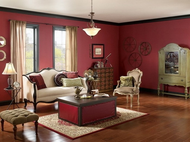
- Living room
- Bedroom
- Children
- Kitchen
- Bathroom and toilet
- Hallway
- Balcony
- Best couple
- Burgundy and black
- Burgundy and white
- Burgundy and light gray
Color features
The burgundy hue appeared as a result of the fusion of red and brown, which means it has the qualities of these colors. Red gave him his brightness, impulsivity and some audacity, and the influence of brown slightly cooled his ardor, adding calm and depth. Different proportions of mixing colors, as well as interspersing with other shades, divided the Bordeaux palette into many tones: ruby, wine, Marsala, burgundy, sangria, cherry, etc.

to contents ↑Varieties of elite wines from France, Spain and Italy gave their names to most shades of burgundy. Apparently, this causes strong associations with sophistication and wealth. In the walls of a Burgundy-colored room, I don’t want to do daily household chores, it attracts relaxation and rest. Therefore, the choice of this shade is characteristic of mature individuals with a delicate taste and a craving for luxury.
The color value for each style
Since the tones of noble wines have come into the interior for a long time, they should also be searched for in style for centuries. Classicism and empire, baroque and rococo - styles that organically fit decoration, furniture or decorative elements of burgundy color. Carving, an abundance of stucco molding, gilded details - the company in which he feels most comfortable. But this does not mean that modern styles have written off the shade, leaving it to museum interiors. Burgundy tones are present in the palette of the popular Art Deco, which also gravitates to luxury and pomp. Color can be the only bright accent of the interior in the spirit of minimalism, paint glossy high-tech surfaces or even merge into a riot of pop art colors.

Color combinations
Like all shades of red, burgundy is used to switching attention to itself, so the other colors of the interior will either be his faithful retinue, or will perform on an equal footing. The traditional combination of wine tones - with gold decor, woody brown, as well as with light pastel shades. They are not afraid of a dispute with bright rich colors: grassy green, cheerful yellow, deep blue, subtle purple.
to contents ↑Bordeaux in detail
With all its nobility and charm, the burgundy shade has several nuances that are worth remembering, trusting it with its interior:
- This color is recommended to be used in dosage. Especially in the living rooms. Bordeaux is a shade of red, although more calm and sophisticated.In large quantities, it is able to influence the psyche, so it is necessary to neutralize the pressure with the help of light tones.
- A lover of pomposity and solemnity, burgundy was not used to crowding in small-sized rooms, visually making the dimensions of the space even more modest. It is better to let this color into a small room only as an accent, diluting the light gamut.
- It is worth remembering the burgundy love of light, both natural and artificial. Since the shade has the ability to absorb light, the room must have a sufficient number of lighting fixtures.
to contents ↑
Burgundy wallpaper
The languid wine is suitable for painting walls of a fairly spacious and bright room. If it seems that the burgundy will "eat" too much space, you can give it only one wall, choosing a shade as an accent, rather than the main color. The burgundy is endowed with a unique set of qualities: it gives the room a solemnity and at the same time contributes to concentration, attunes to creation. Therefore, the best burgundy wallpaper will fit into the interior of the living room or office.
The wallpaper of this shade with a classic ornament, floral patterns in the style of Art Nouveau or art deco graphics looks impressive and elegant. Another version of the wallpaper decor is inspired by the classic design of the last century: a gallery of photos, paintings, portraits, mirrors and sconces on a plain burgundy surface.

Burgundy ceiling
The burgundy ceiling is a rather risky decision that needs to be approached correctly. Firstly, the ceiling should be located high enough, otherwise it will visually exert pressure. To make the burgundy ceiling not “fall” onto the residents, but “soar”, you can make its surface glossy and well highlight. Secondly, not every room is suitable for the realization of this extravagant idea: for example, in a bedroom from a zest, it will quickly turn into a flaw.
to contents ↑Burgundy floor
The burgundy color floor automatically adjusts the design of the entire room. You can not allow the shade of furniture to repeat the color of the flooring, ideally it is worth giving preference to the setting in bright colors. Just as the red carpet obliges you to strictly follow the dress code, the red floor makes you carefully think through the rest of the interior.

Burgundy curtains
Curtains of the color of ripe cherry or burgundy wine are also the dominant interior detail requiring support. A fabric combining a burgundy shade with gold braid or an ornament in bright colors is suitable for the living room, and blackout curtains, plain or with dark decor, are created for the bedroom. Their opaque fabric will not allow sunlight to disturb the sleep of residents. It is important to complement the curtains with a light tulle so that the atmosphere does not seem gloomy.
to contents ↑Burgundy carpet in the interior
Perhaps, burgundy is the traditional carpet color. Today, in addition to the Persian ornament familiar to everyone, designers offer a lot of options for designing and placing carpet in the interior. It can be plain or printed, with a long or short pile, cover the floor almost completely or zoning the room, emphasizing a certain area.

Burgundy furniture in the interior
When choosing burgundy furniture, one should be guided by the same rules as in other cases of using this shade in the interior. If burgundy is chosen as the main tone of the furniture, then it is advisable to make all other details light, with the exception of the interior of the office. If the objects of wine color play the role of accents, for example, a bright sofa or armchair, then the rest of the design depends on the prevailing style.
to contents ↑The use of burgundy in rooms
The use of burgundy color in the interior of residential premises should be approached with caution and knowledge. Although the fusion of red and brown gave an undeniably beautiful shade, far from everywhere it will be equally appropriate.
Living room
Representative and elegant, burgundy feels best in the interior of the living room. The room hosts all the celebrations, meeting guests, which means that the nature of this shade is revealed most fully. Here you can not be shy and complement the rich wine color with a decor typical of the palace style. Stucco molding, patina, furniture made of natural wood, soft velvet upholstery, textile wallpapers, mirrors and crystal will recreate the atmosphere of noble receptions. And so that the room does not finally turn into a throne room, you should entrust its design to the hands of a talented designer who knows how to balance on the verge of the past and the present.

Bedroom
If the screaming scarlet is in most cases forbidden to enter the bedroom, then to the more calm and sophisticated burgundy this door is open. But with some conditions. An excess of bright wine shades can lead the bedroom interior towards vulgarity. To avoid this, you need to remember the purpose of the room - to restore strength, relax. The color combinations here should be soft, contrasts should be smooth. A combination of a deep, impressive burgundy with a delicate, youthful pink, with milky yellow, with ivory or light gray will look cozy and elegant.
to contents ↑Children
Adding bright colors to the interior of the nursery, it is worth remembering their influence on the mental state of the owner of the room. The psyche of children is at the stage of formation, so it is especially susceptible to influence from the outside. Being a descendant of red, burgundy is able to increase the activity of the child, cause anxiety and even aggression. Therefore, in the design of the nursery it is better to limit yourself to a few accents, for example, to purchase a burgundy chair or a chandelier.
to contents ↑Kitchen
Not all tones of an aristocratic burgundy are good for decorating a kitchen. And the point here is not at all the visual effects, but the establishment of the digestive process! Cold burgundy shades do not contribute to an increase in appetite, which means that a kitchen made in these colors is unlikely to give inspiration for culinary creativity. But a warm burgundy, on the contrary, looks quite appetizing. It can become the main color of a kitchen set, be used as a shade of walls, floor or ceiling (but only one thing) or appear in the form of catchy accents.

Bathroom and toilet
Perhaps the most democratic rooms, in no way infringing on the imagination of designers or owners. Cold burgundy, soft marsala, a gentle shade of sangria, and the bathroom is ready for any experiment. You can use the proven script and make it a corner of classicism with warm burgundy walls, a mirror in a gilded frame and a cast-iron bathtub on massive legs. And you can show courage and pick up a pair of burgundy juicy green, ice blue or sunny yellow.
to contents ↑Hallway
Burgundy walls in the hallway - the choice of extraordinary personalities. Having decided on it, the modest size and lack of natural light will need to be compensated by light-colored furniture and an abundance of spotlights.

Balcony
Despite the small area, the balcony area is a very good place for applying burgundy color: good lighting and a large area of glazing, especially panoramic, dissolve the boundaries of the room. And if tenants are breeding indoor plants, choosing a shade of Bordeaux will give an amazing combination of colors.
Best couple
Burgundy in the interior is used to occupy a dominant position, allowing the rest of the shades to just bask in the rays of their glory. In order not to make a mistake and choose the best company for this impressive color, you can use the following combinations checked by designers with other tones.
Burgundy and black
Gothic and dark at first glance, a combination of burgundy and black is suitable not only for the interior of a medieval castle, it may well exist in a modern apartment with some conditions:
- all main areas of the room should be highlighted with artificial light;
- obligatory presence of light furniture and decor elements;
- the ceiling should remain bright;
- Glossy surfaces are welcome.

Burgundy and white
This combination does not require additional recommendations; it is equally suitable for all rooms. White will allow the burgundy to reveal in all its splendor, without switching attention to itself. In response, burgundy gratefully emphasizes the main advantages of white: purity and freshness.

Burgundy and light gray
A calm and peaceful combination is also suitable for the design of any room. Gray will slightly calm the impulsiveness of the burgundy, smooth out the excessive sharpness of the interior, giving residents the opportunity to relax and rest.


